Pattern library
UI Patterns
A UI pattern library built for coding agents. 40 patterns, each shipping a copy-paste prompt that rebuilds it inside your own codebase — plus a live preview and the source behind it.
One block per pattern. Pick a district to filter.
Every pattern, three ways
01 Preview
The pattern running live in an isolated frame, in whichever theme you are reading in.
02 Source
Its markup, styles and behaviour, plus a single runnable file carrying its own palette.
03 Prompt
A written spec that rebuilds the pattern from scratch — including why each decision is the way it is. Paste it into Claude Code, Cursor, or any coding agent.
The prompts are the point. Each one is written to survive being handed to an agent with no other context: it names the surfaces the pattern belongs on, spells out the constraint that makes it work, and calls out the failure it exists to prevent. Nothing here is a dependency you install.
Need a whole page rather than a piece of one? The Page Design Library holds complete, self-contained pages, each with the prompt that rebuilds it.
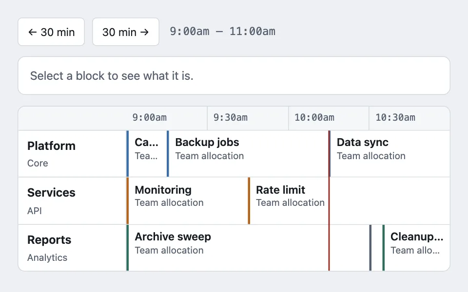
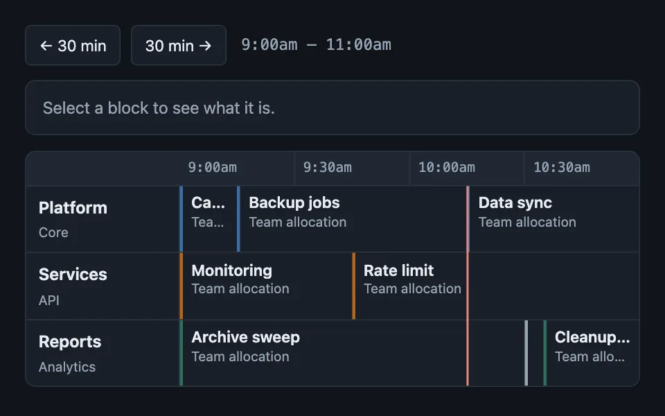
Windowed schedule grid
Rows of resources against a fixed time window, where each block is sized by its overlap with the window rather than by its own duration. Good for room booking board, conference agenda, TV channel guide scheduletimelinegridflexboxtime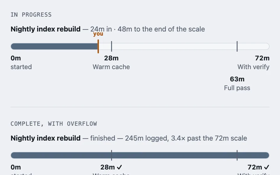
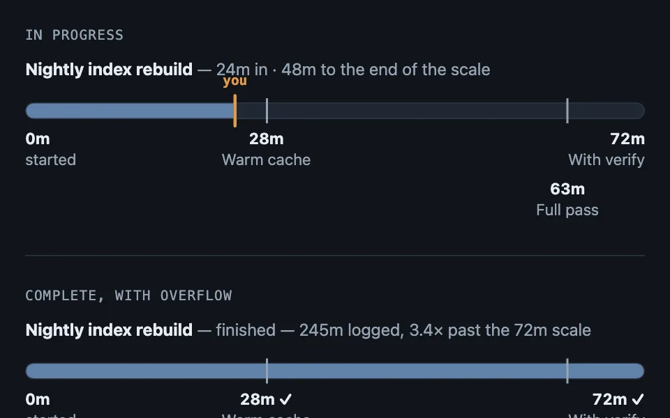
Benchmark progress bar
Places a raw figure on a scale of external benchmarks instead of printing it plain, so a number becomes "most of the way to the long estimate" — with the inverted form, where the track itself is banded into zones, for the cases where the limit is the scale. Good for course progress against module estimates, project spend against past projects, latency against published service tiers progressbenchmarkscss-onlydata-vizempty-state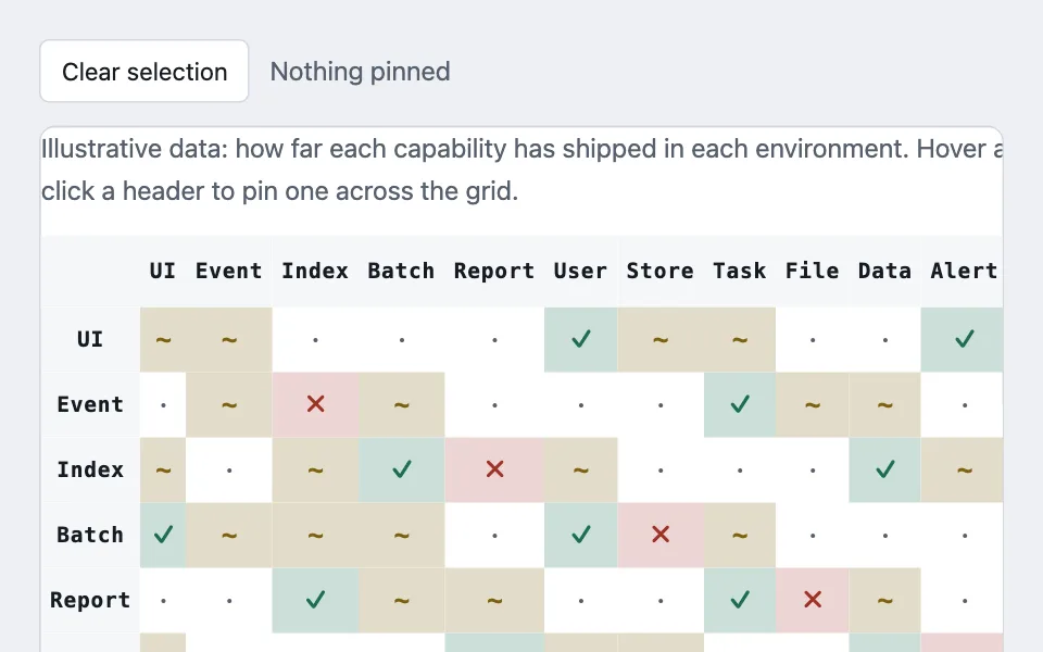
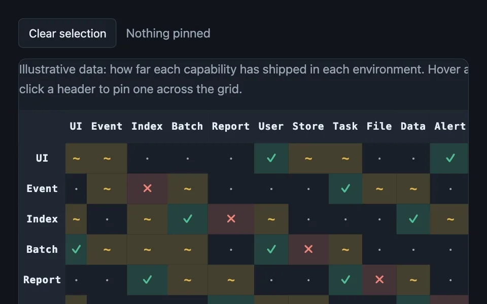
Cross-highlight matrix
A two-axis lookup table with both headers sticky, hover lighting the full row and column at once, and a durable click-to-pin selection for touch. Good for type effectiveness chart, compatibility matrix, permissions grid tablematrixstickyaccessibilityhover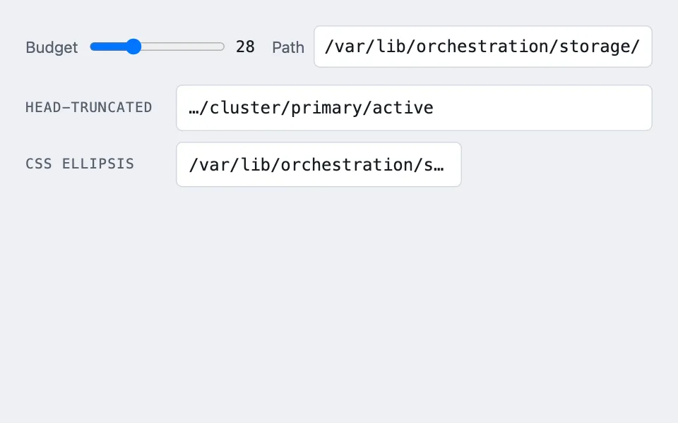
Left-truncating paths
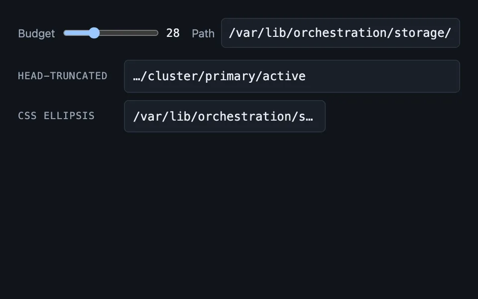
Shortens a long path by dropping whole segments from the left, because the tail is what tells two paths apart — the opposite of what CSS ellipsis throws away. Good for file browser breadcrumbs, import paths in a stack trace, nested category labels truncationpathstext-overflowbreadcrumbsfile-systems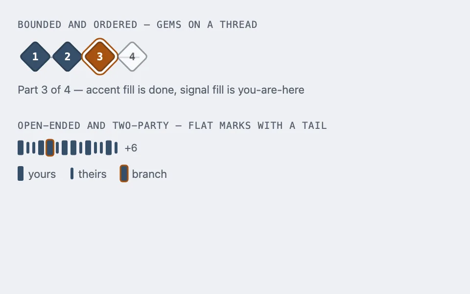
Shape-mark sequence
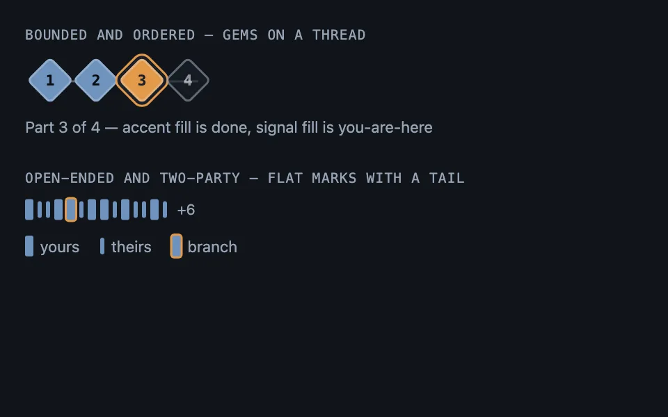
A sequence compressed into a row of small marks whose shape carries the state, in two forms — gems on a thread for a bounded ordered track, flat marks with a “+N” tail for an open-ended exchange — with neither ever drawing furniture that asserts something untrue — and a third, the reward ladder, where a mark can be earned, next, or still promised. Good for multi-part series navigation, wizard and onboarding steps, course module sequences steppersparklineseriestruncationcss-onlyno-assets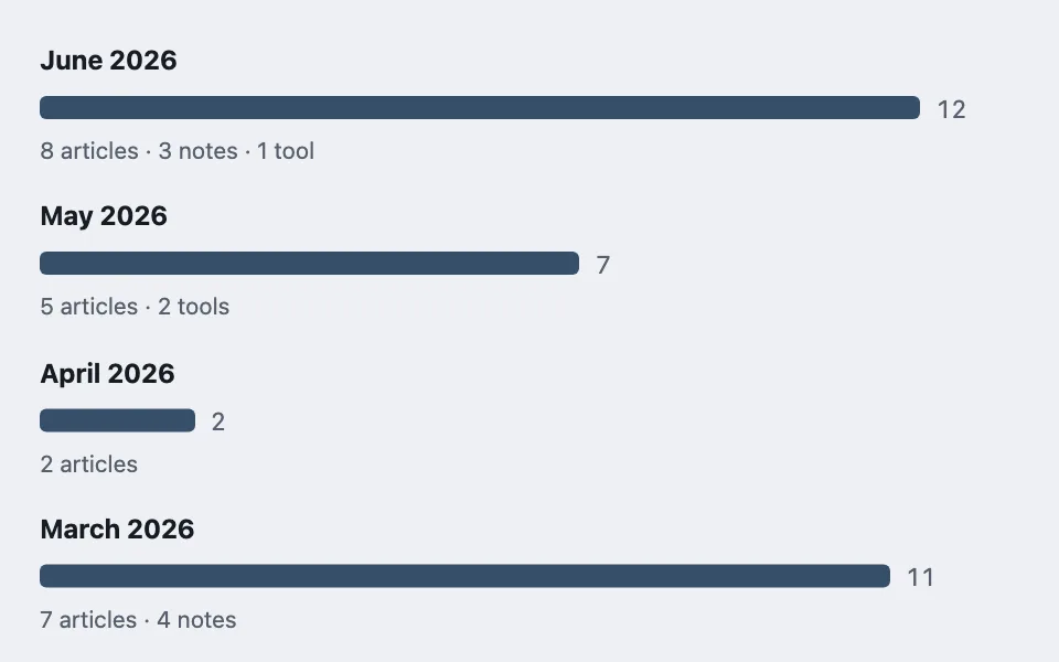
Linked month bars
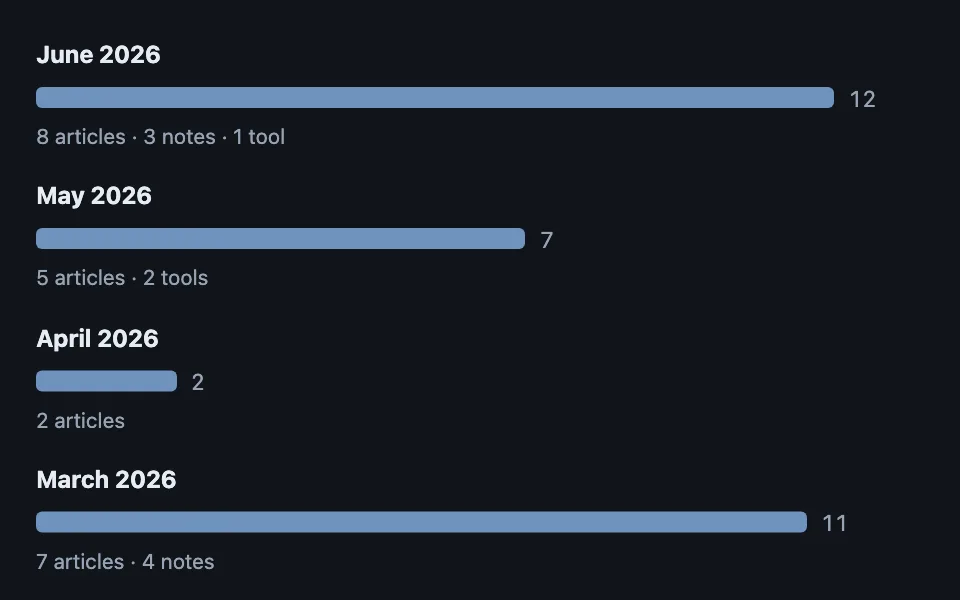
A month-by-month volume timeline built from plain divs where every aggregate row links to the filtered view that produced it — the bar shows the shape, the link does the work. Good for archive pages grouped by month, activity history overviews, usage reports with drill-down timelinedrill-downcss-onlydata-vizno-assets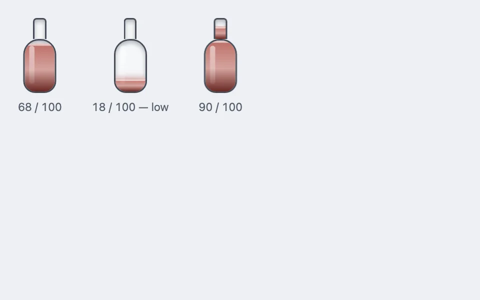
Glass vial meter
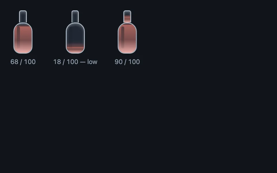
A vertical potion-vial meter whose liquid fills a wide bulb first and then rises into a narrow neck, with meniscus and sheen drawn as gradients and a pulsing low-state — all CSS, no images. Good for remaining quota or budget displays, game health and resource meters, reading or scroll progress with personality meterskeuomorphiccss-onlyreduced-motionno-assets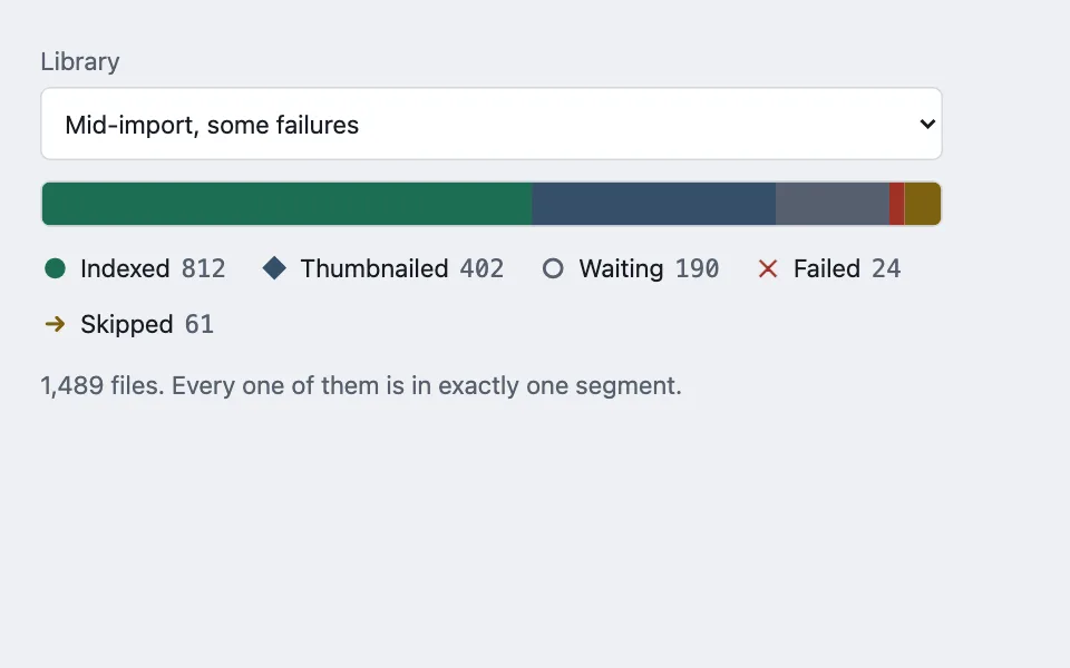
Partitioned stage bar
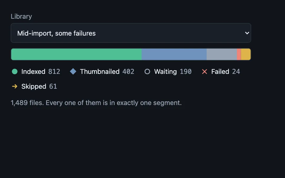
Progress for work that has several possible endings, drawn as a census rather than a fraction: the bar is always full, every segment is one stage of the same population, and a stage with nothing in it is removed instead of being drawn at zero width. Good for an import or scan over many files, a batch upload with per-item outcomes, a migration running across records progressstacked-barbatchlegendstatusaria-label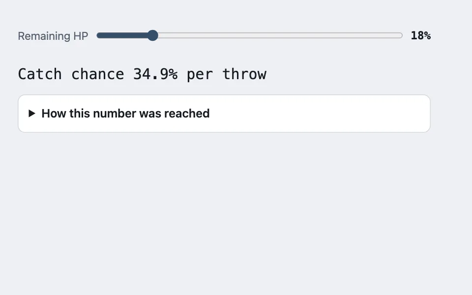
Term-by-term derivation
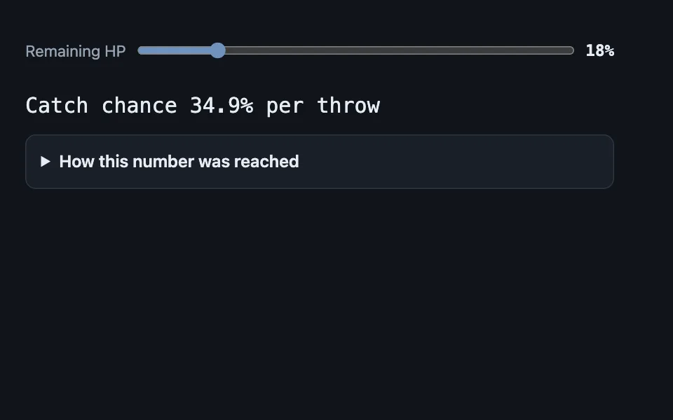
A computed figure shown with the audit trail behind it: the formula once with the live inputs already substituted, then one row per term carrying its value and a sentence about what that term does — collapsed by default, because the number is the product and the derivation is the receipt. Good for a pricing or quote breakdown, a loan or amortization calculator, a score, rating, or ranking readout explainabilitycalculatordisclosureformulatabular-numsdetails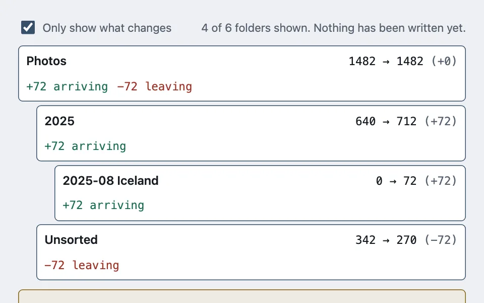
Plan preview tree
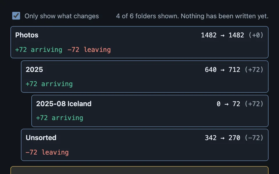
A dry run shown as a before-and-after tree: every node carries its count now, its count after, and the arrivals and departures that make up the difference — with status rolling up the tree so "hide what does not change" is one filter rather than a recursive walk. Good for a file organise or move operation, a bulk rename preview, an import that will create folders dry-rundifftreepreviewbulk-operationconfirmation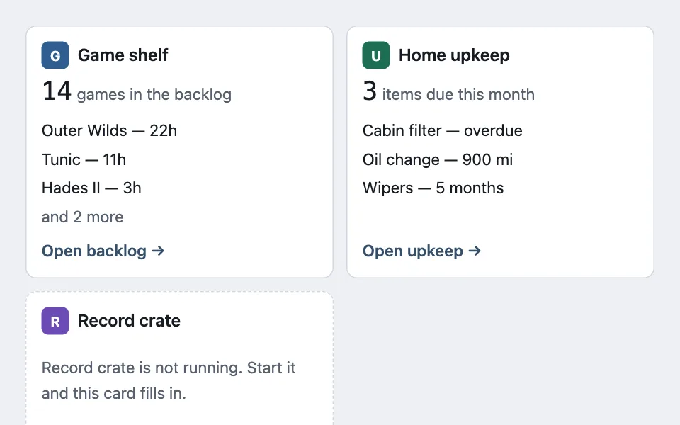
Uniform slot shell
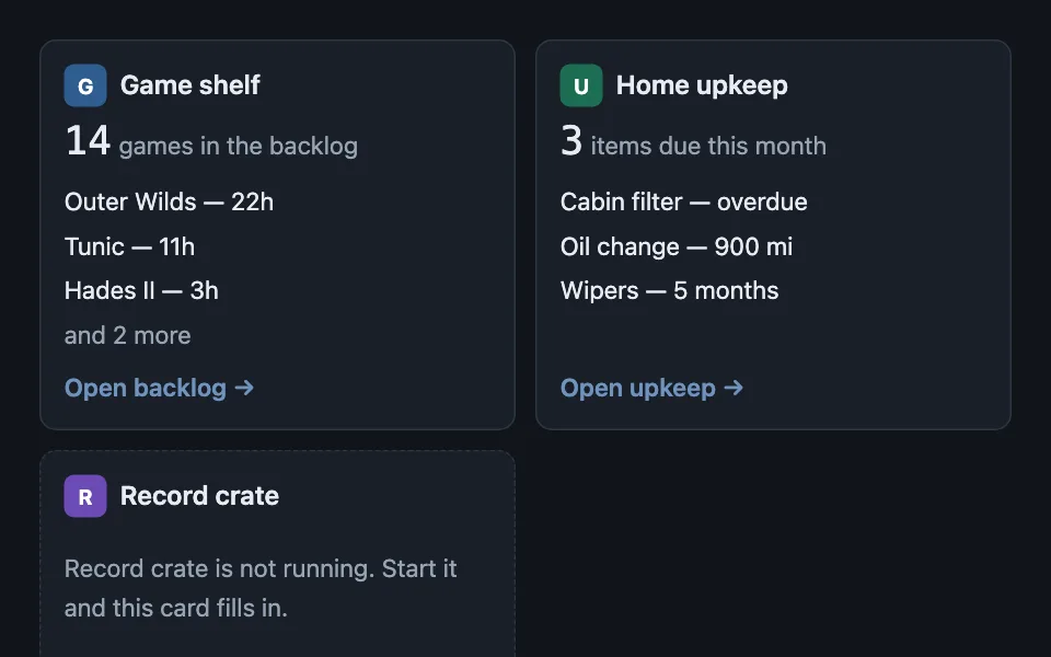
One card shell that many independent sources render through — a mark, one headline figure, a capped list with an overflow count, a footer link — where the shell does the capping rather than trusting each source, and an unavailable source is named specifically instead of showing a generic error. Good for a dashboard of widgets from separate services, a home screen aggregating several apps, an integrations overview page dashboardwidgetscardsempty-stateerror-stategrid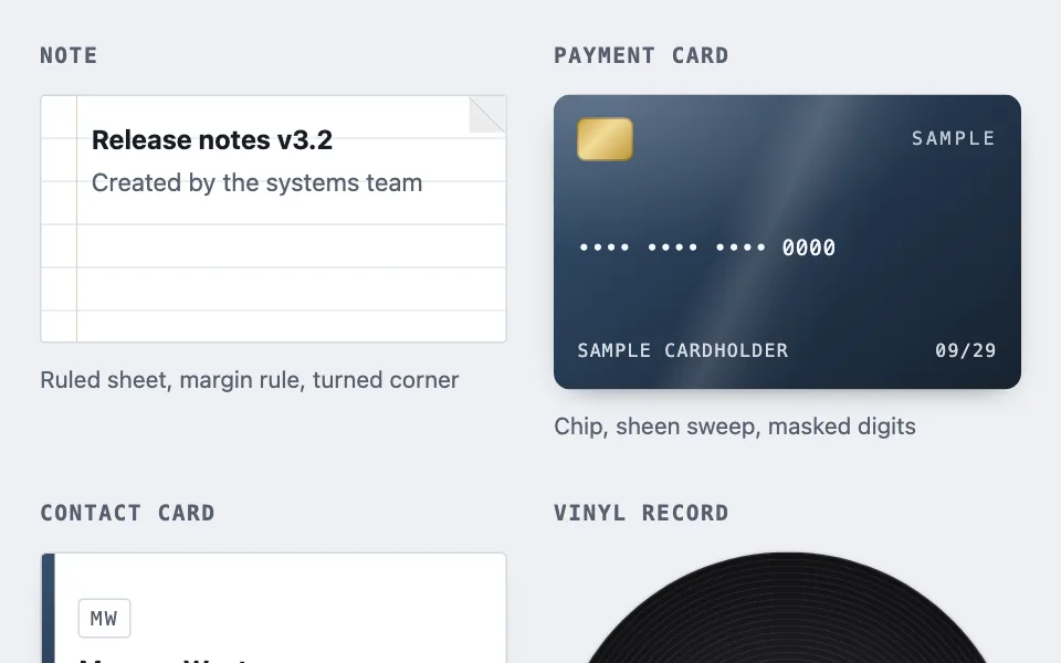
Object-shaped cards
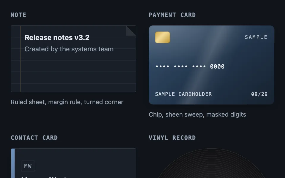
Where a record stands for a physical thing, the card is drawn as that thing. Nine variations — note, payment card, contact card, vinyl record, disc, instant print, folder, notebook, and a device shell holding live content — all in gradients, with no image assets. Good for file browser, document library, wallet and billing screens cardscss-onlygradientsvariationsno-assetsskeuomorphic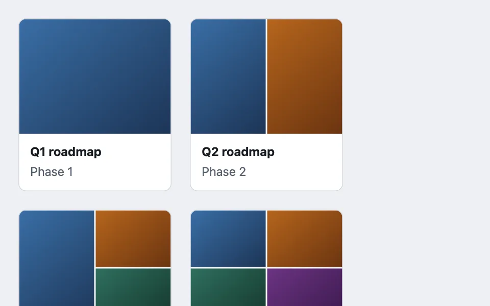
Adaptive tile mosaic
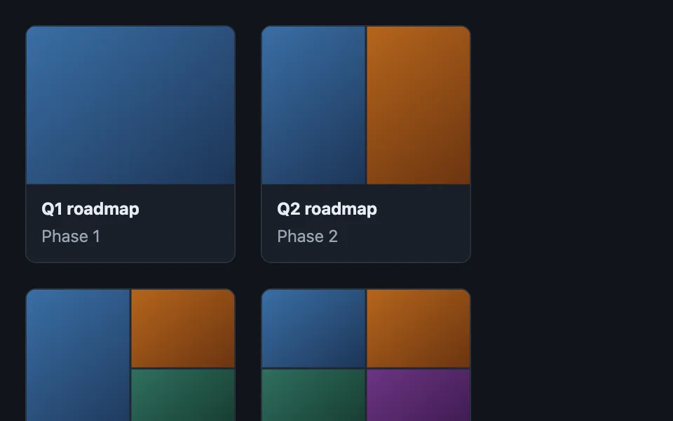
A container with no artwork of its own draws one from up to four member tiles, with the grid tracks following the tile count so the frame is always full. Good for playlist cover art, photo album thumbnails, folder covers in a file browser css-gridcss-onlyno-assetscardslayout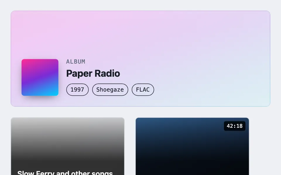

Ground-scrimmed artwork
Text printed over artwork nobody has reviewed, scrimmed to an alpha that can be written down rather than guessed. Five geometries — a blurred header, a flat-held tile band, a pill the size of one label, a directionless wash, and a glass lens whose panel blurs the same art continuing behind it — chosen by whether the ink is a theme token or fixed, and by how much of the art the information is allowed to cover. Good for album or book detail header, movie and show detail pages, user-uploaded cover art layoutcss-onlygradientscontrastno-assetsherocards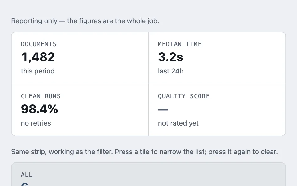
Hairline stat strip
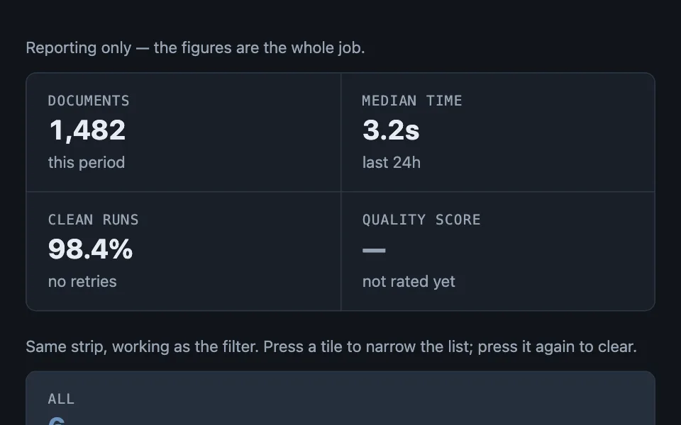
A row of stat tiles joined by hairlines that are grid gap, not borders — the container paints the border color and the tiles paint the surface, so separators never double up or break when the row wraps — in a reporting form and in a second form where each tile is the filter for the list beneath it. Good for summary strip at the top of a detail page, dashboard KPI row, account usage overview statscss-gridcss-onlyhairlineno-assets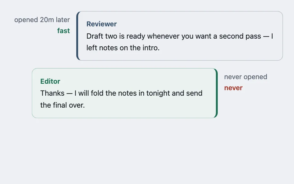
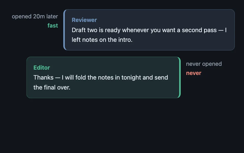
Annotated transcript
Conversation bubbles where the fill is the speaker’s pale tint but body text stays at the page ink, the speaker’s strong color is a spine on the outer edge that flips sides for own messages, and per-message metadata lives in a fixed gutter beside the bubble. Good for interview and Q&A articles, support ticket transcripts, annotated email or chat exchanges conversationgutterstatus-rolescontrastcss-only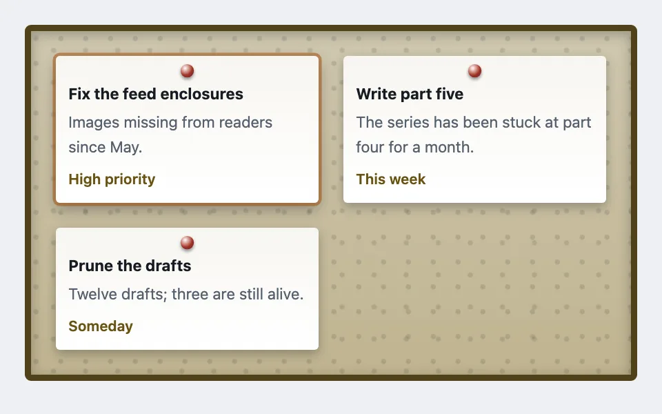
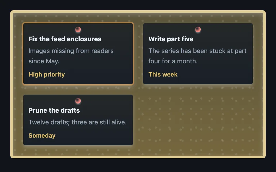
Cork notice board
A grid of pinned paper notes on a cork board where every texture — cork speckle, timber frame, the 3D pushpin — is layered CSS gradients, with no image assets at all. Good for community or team notice board, playful task and bounty lists, event and announcement walls skeuomorphicgradientsno-assetscardscss-only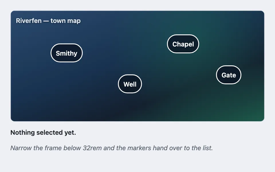
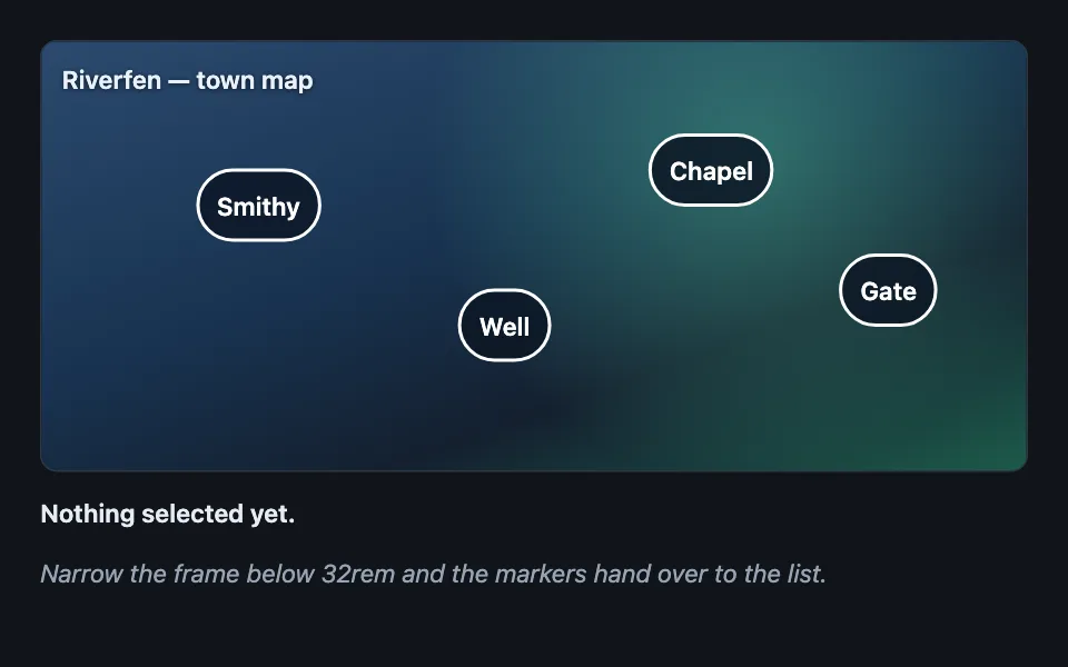
Hotspot marker layer
Interactive markers placed at percentage coordinates over a picture held at a fixed aspect ratio, where the layer passes clicks through to everything beneath it and the markers become an ordinary list when the frame is too narrow to hit them. Good for an annotated screenshot in documentation, a floor plan or seating chart, a game map with points of interest hotspotspointer-eventsaspect-ratiocontainer-queryoverlayresponsive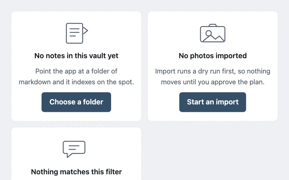
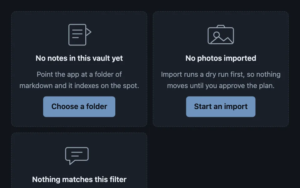
Line-art empty states
A family of inline drawings for empty surfaces, each stroked entirely in the inherited text colour so it themes itself and never ships an asset — hidden from assistive tech, because the headline and the sentence beneath are what actually carry the meaning. Good for a library before the first import, a message or document list with nothing in it, a folder picker before a folder is chosen empty-statesvgcurrentcolorillustrationaria-hiddenno-assets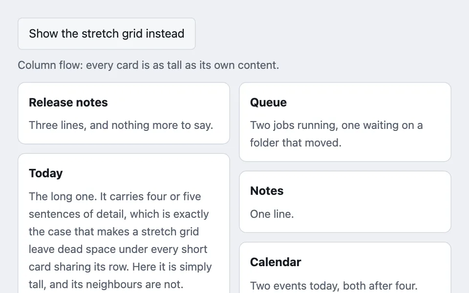
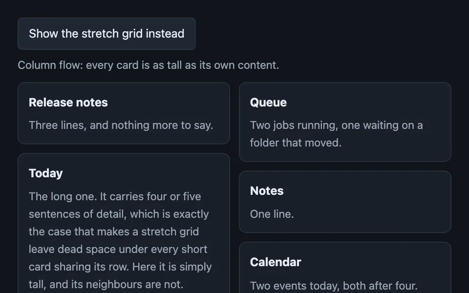
Column-flow wall
Cards flowing down columns instead of across rows, so none of them stretches to match the tallest member of its row — with the reading-order cost stated plainly, because that is what decides whether the layout is allowed. Good for a wall of independent dashboard cards, a pinboard of notes of different lengths, a gallery of quotes or testimonials masonrycolumnsbreak-insidereading-ordercardsresponsive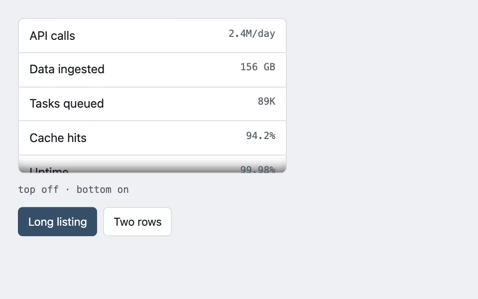
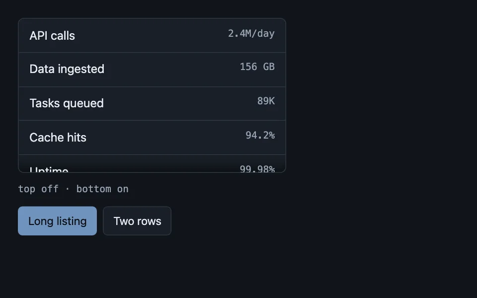
Scroll edge shadows
An inset shadow on a scroll container, shown only on the edge that actually has more content behind it, so the shadow reports state instead of decorating. Good for sidebar navigation panels, dropdown menus, drawer and modal contents scrollingaffordancelistsoverflowprogressive-disclosure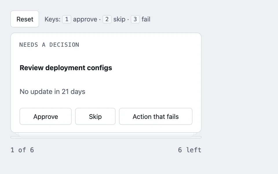
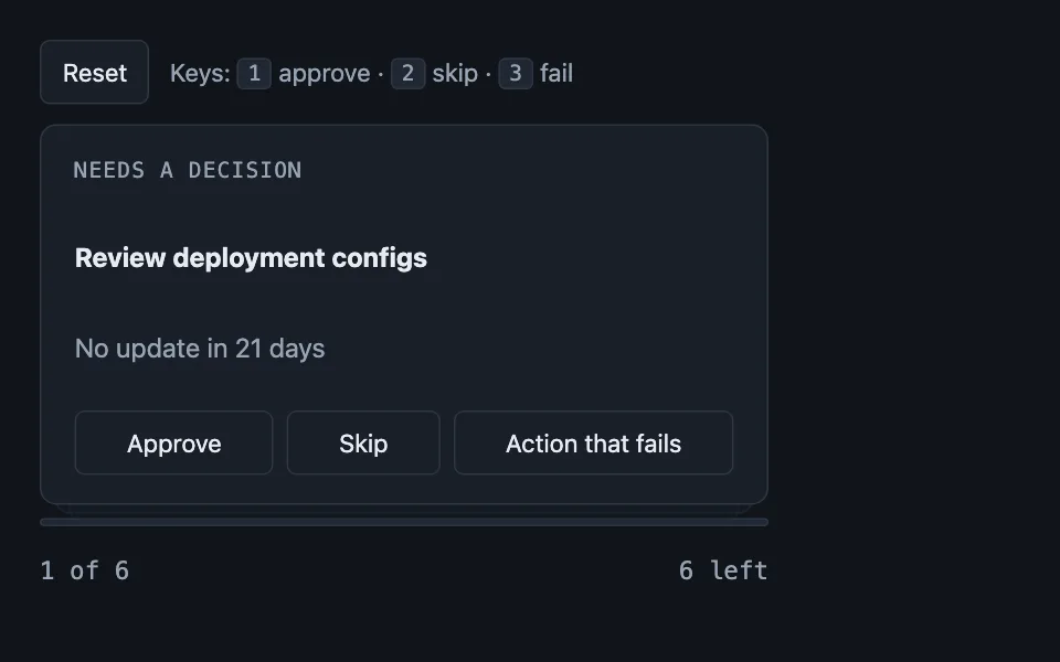
Frozen-batch deck
A one-card-at-a-time review queue whose batch is snapshotted at mount, because the list it was handed shrinks underneath it as each card is acted on — with the rules for the two card shapes it usually carries, a reveal card and a two-up comparison. Good for triage queues, approval workflows, content moderation queuereview-flowanimationkeyboardreduced-motion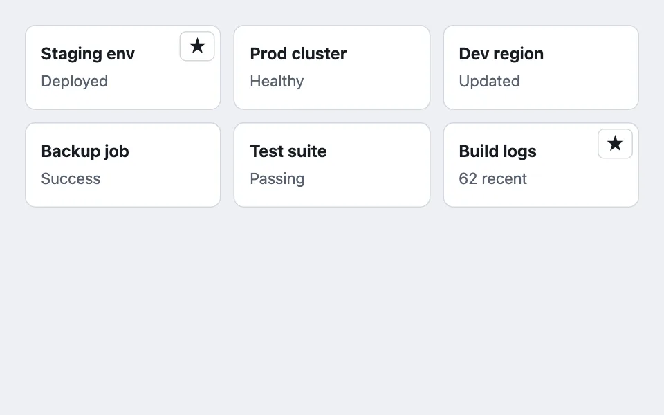
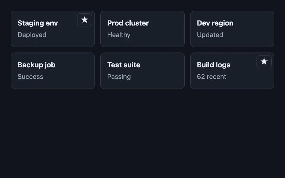
Controls beside the anchor
Per-card controls that sit visually on top of a card whose whole surface is a link, without nesting an interactive element inside the anchor that invalid HTML forbids. Good for pin or unpin on a card, favorite and star listings, archive from a grid cardsaccessibilitykeyboardfocus-withingrid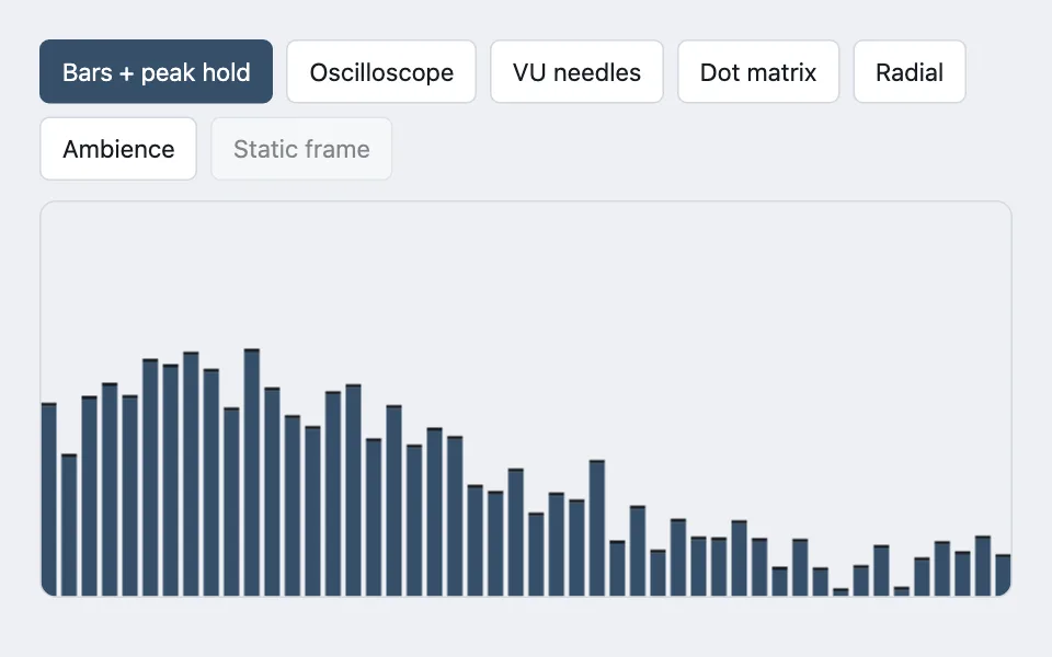
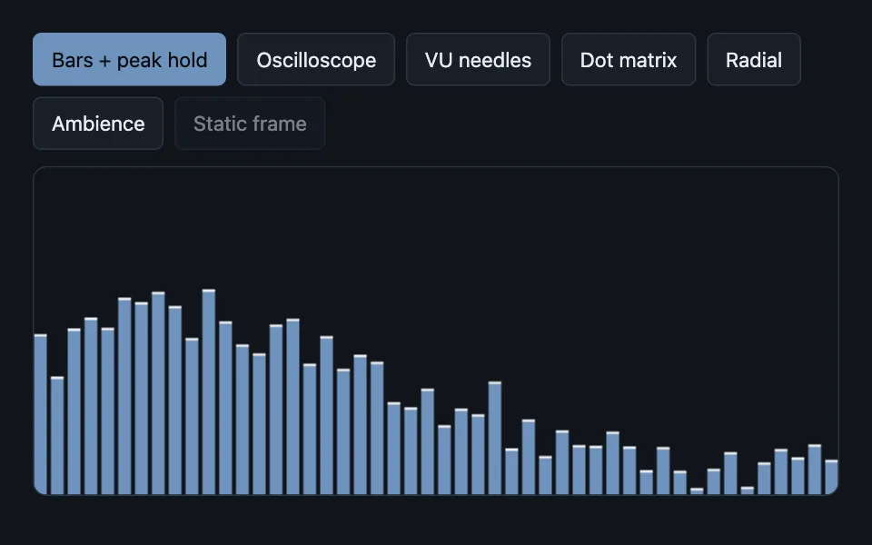
Pluggable canvas visualizer
One canvas, a registry of draw modes, and the rule that each mode owns its entire frame — including the background — so a persistence mode can wash instead of clear. Good for audio visualizer modes, metrics sparkline that switches to a heatmap, live signal displays canvasvisualizationregistryanimationreduced-motion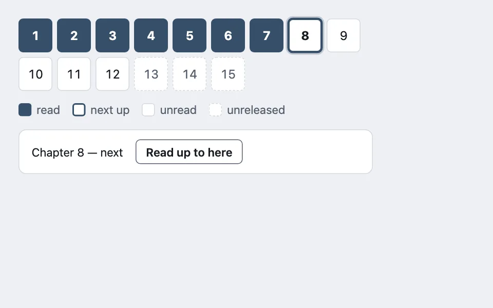
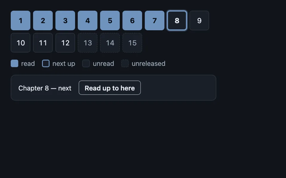
Roving-grid board
A dense grid of state cells that is one tab stop with arrow-key navigation, where each state differs in fill, border weight, and border style at once — and clicking selects but never writes. Good for episode or chapter trackers, habit and streak grids, seat or slot pickers keyboardroving-tabindexaccessibilitystatesdense-data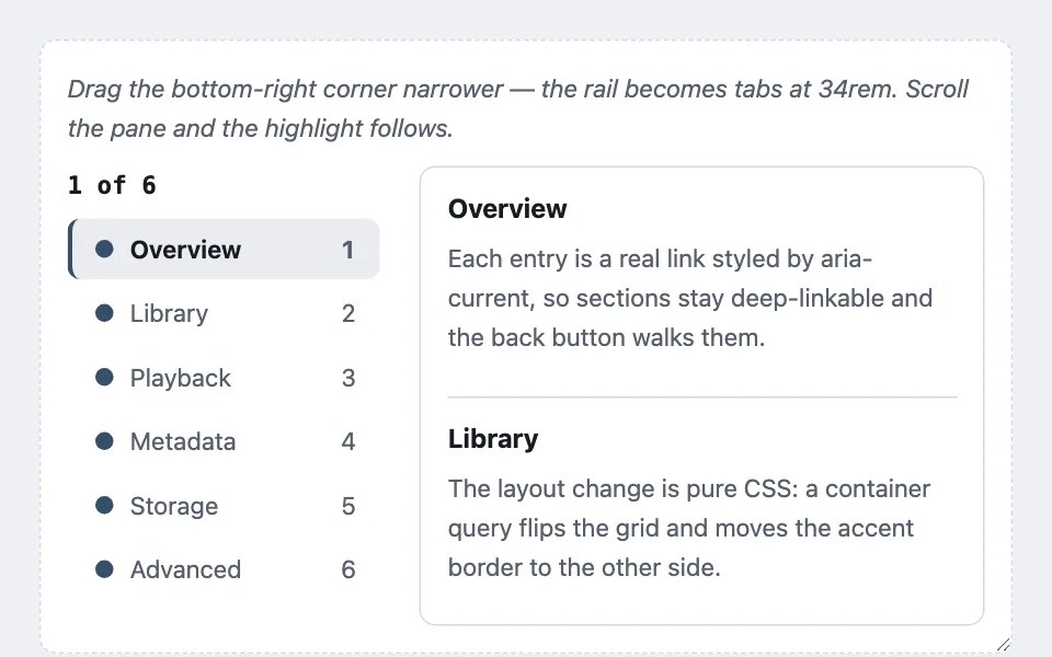
Section rail
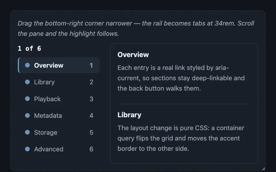
Section navigation that is a sticky vertical rail on wide screens and a wrapping tab row on narrow ones from the same markup, with an optional observer layer that tracks reading position rather than last-heading-crossed. Good for long-form article tables of contents, settings page section nav, detail page with many sections navigationtocresponsivearia-currentintersection-observercontainer-queriessticky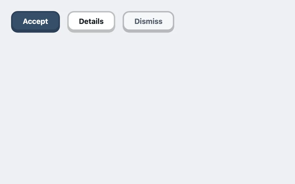

Ledge-press buttons
Buttons that sit proud of the panel on a solid unblurred ledge shadow and travel down exactly onto it when pressed — with the ledge tint mixed toward ink so the mechanic flips correctly between themes on its own. Good for primary calls to action in playful products, game and quiz interfaces, kiosk and touch-first screens buttonsskeuomorphicpresstokenscss-only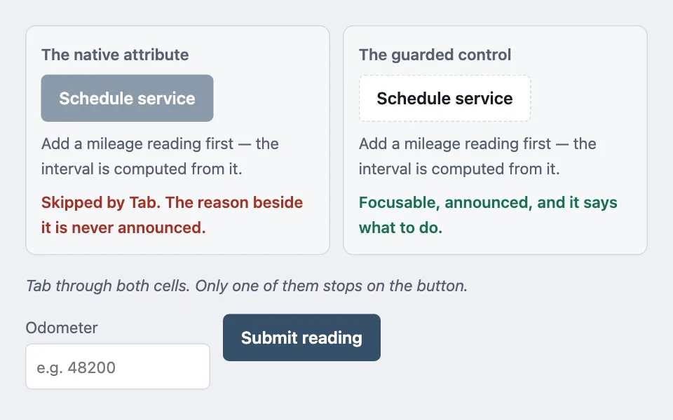
Guarded control
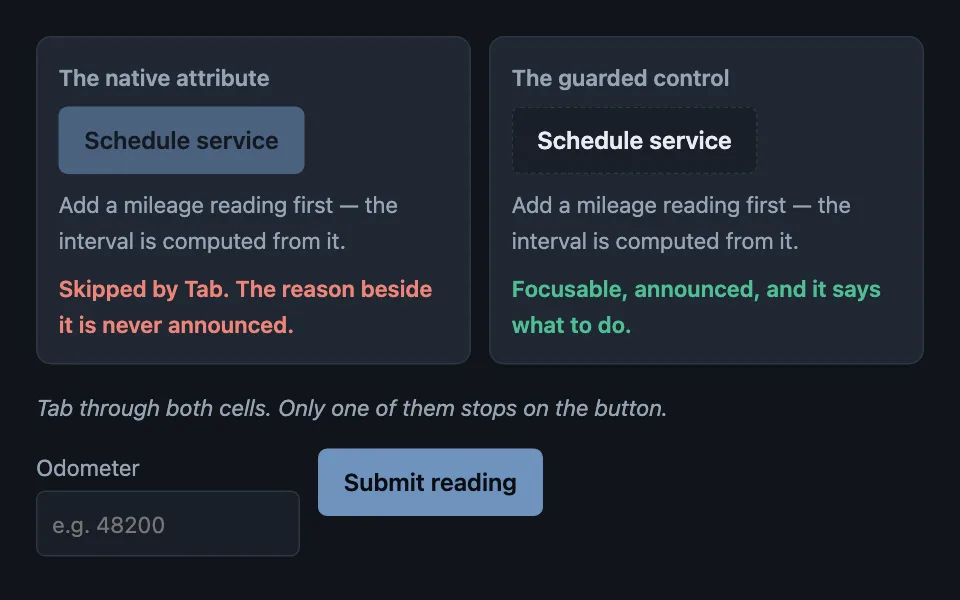
A control blocked by a precondition someone can fix stays in the tab order, carries the reason as real text, and refuses the action in its handler — because the native disabled attribute takes the control and its explanation out of reach together. Good for a save button waiting on a required field, an action that needs a higher permission level, a submit blocked until a file finishes uploading aria-disableddisabledpreconditionskeyboardaria-describedbyforms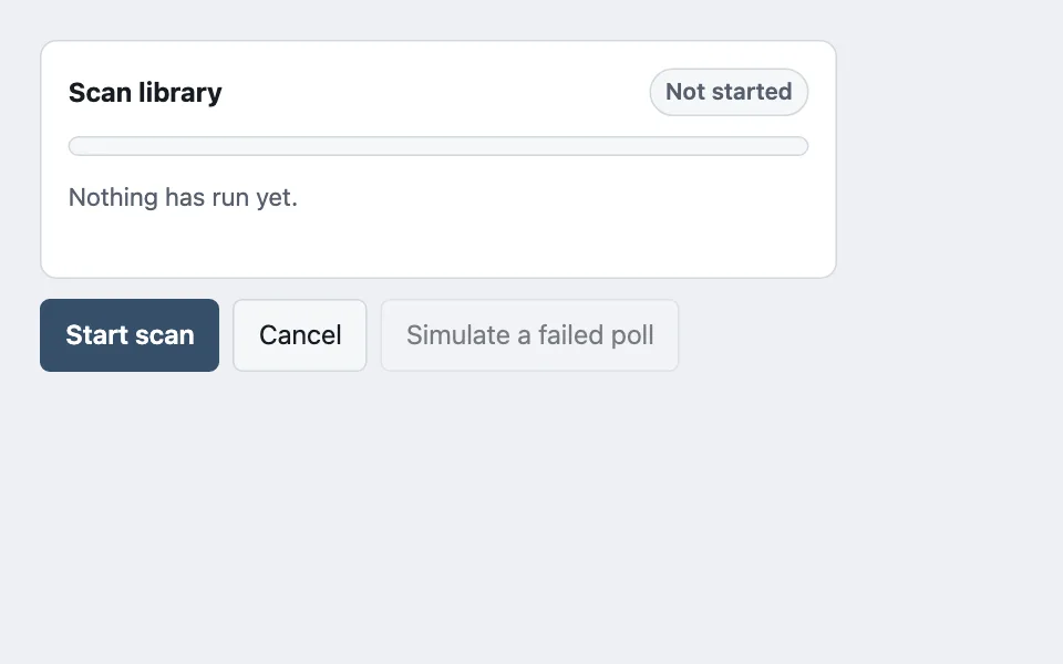
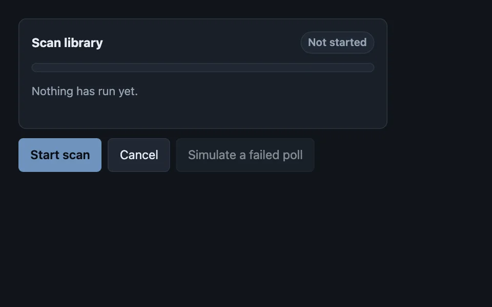
Polled job card
One card covering every state a background job passes through, where an unknown total switches the bar to indeterminate with a running count rather than inventing a percentage, and a failed poll is treated as transient instead of ending the job. Good for a library scan or import, a long export or report build, a bulk download queue progresspollingbackground-jobindeterminatearia-busyreduced-motion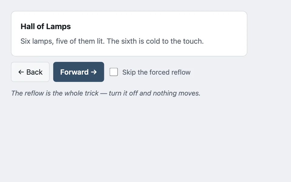
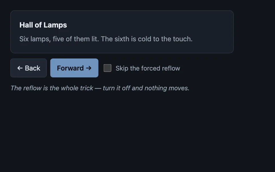
Entry-transform motion
Motion between two rendered states when the old DOM is already gone: the new content is snapped to the transform that reproduces where it came from, then released to identity — with the forced reflow between those two writes that stops the browser collapsing them into no animation at all. Good for paging through search results, stepping through a wizard, moving between rooms or scenes animationtransitionsreflowreduced-motionnavigationlayout-effect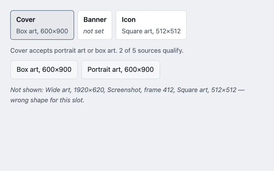
Slot-first picker
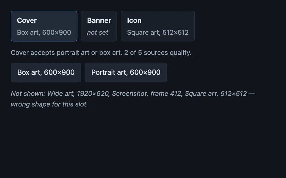
Assignment that starts at the destination rather than the value: the slots are shown first with whatever currently fills them, and choosing one narrows the catalogue to the kinds that slot accepts, with the rejected sources named rather than silently missing. Good for assigning artwork to cover, banner, and icon slots, choosing which image is the thumbnail, mapping columns to fields during an import assignmentpickeraria-pressedfilteringformsdata-driven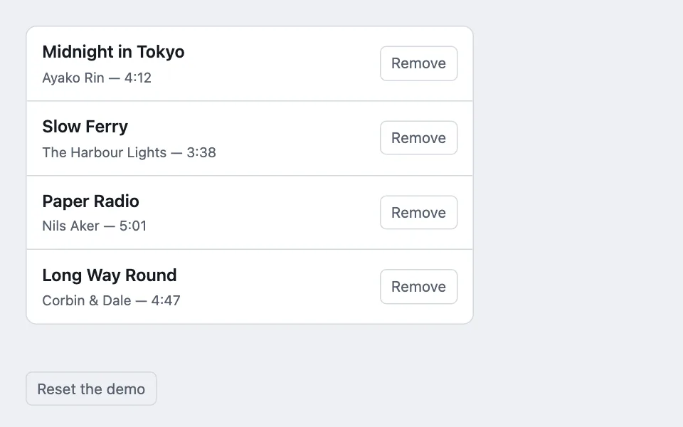
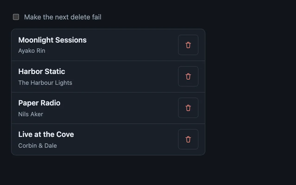
Undo toast
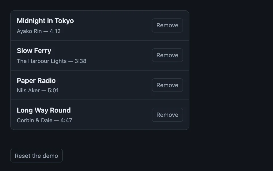
A destructive action with no confirmation dialog: the row leaves the list on the press, the delete is held behind a toast, and it commits when the toast expires rather than when anything is clicked. Good for removing tracks from a playlist, deleting photos from an album, archiving items from a list undotoastdestructivearia-livereduced-motion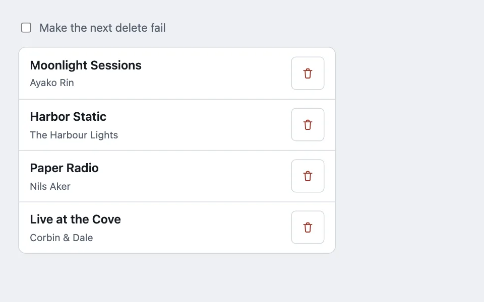
Blast-radius confirm
A destructive delete that cannot be deferred or undone gets a confirm dialog that names everything it cascades, blocks every dismissal while it runs, and resets its error and its options on every open. Good for deleting an album or playlist that cascades to other records, removing an account with attached history, deleting a project with files and comments beneath it confirm-dialogdestructivecascadedialog-elementforms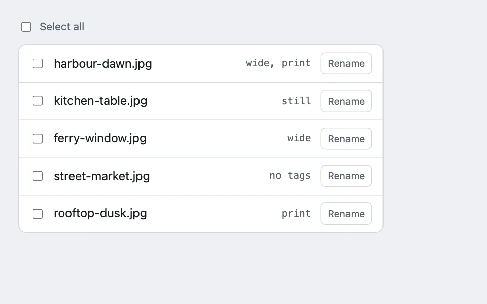
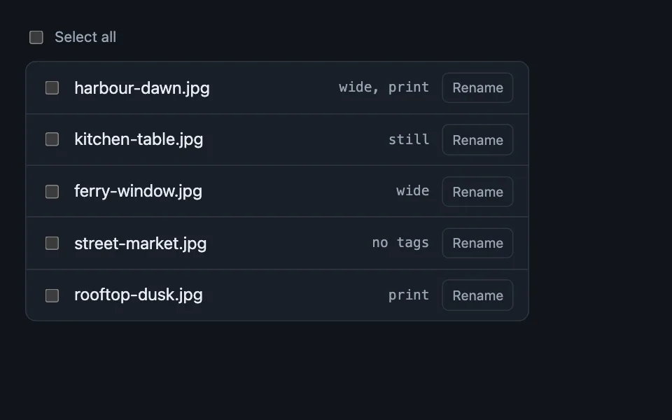
Batch action bar
A bar that exists only while something is selected: it states the count in words, caps at five actions, and switches off the per-row controls beneath it so there is one live scope at a time — with the editing half, where a field the selection disagrees about reads Mixed and a multi-value edit takes a mode rather than a value. Good for selecting photos in a library, bulk tagging a media collection, file browser multi-select selectionbulk-actionstoolbarcheckboxindeterminatebulk-editmixed-values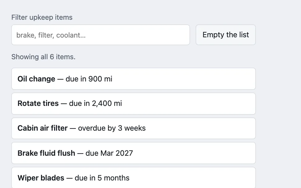
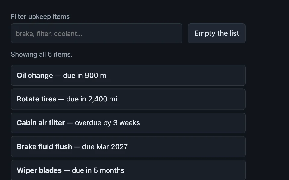
Filtered to zero
The three empty states a list actually has — never filled, filtered to nothing, and everything cleared on purpose — written as three different screens, because the copy that helps in one is wrong in the other two. Good for a searchable settings or library list, a filtered inbox or queue, a tag or facet archive page empty-statefiltersearchzero-resultsaria-livecopywriting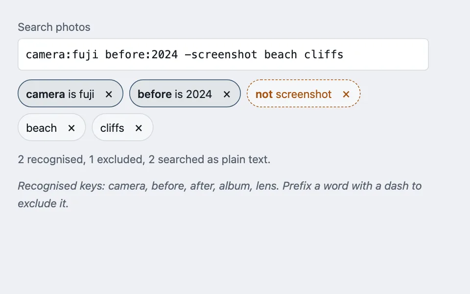
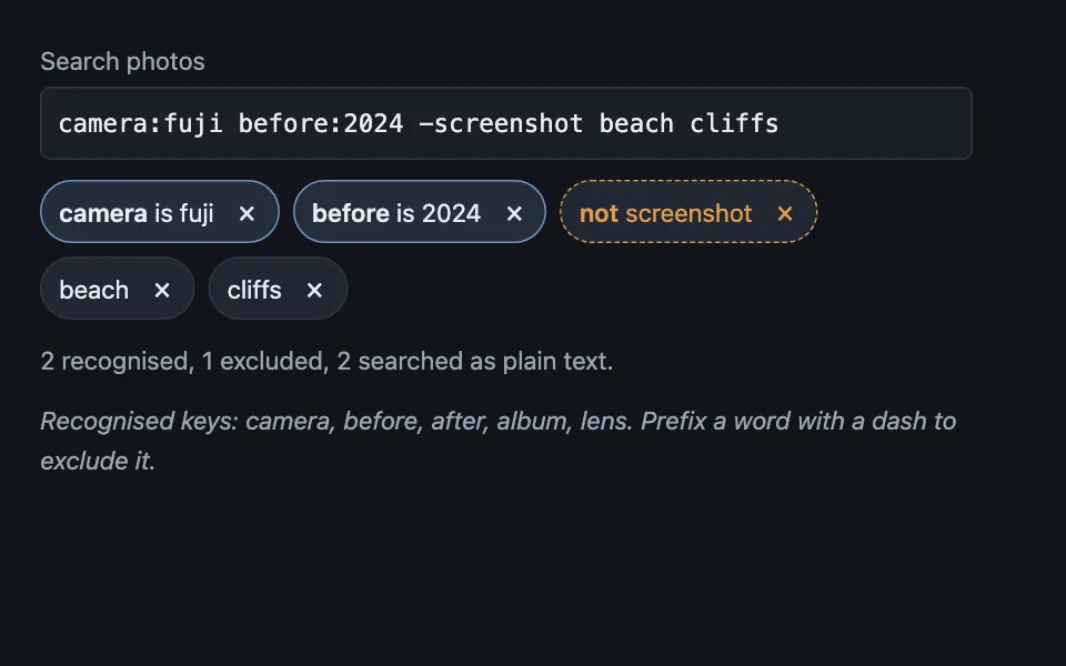
Parsed query chips
A search box that echoes back how it read the text: every recognised qualifier becomes its own removable chip, exclusions say "not" in words rather than relying on a leading dash, and anything unrecognised is shown as plain text rather than silently dropped. Good for a photo or media library search, an issue tracker with query syntax, a log or transcript search searchquery-syntaxchipsfacetsparsingaria-live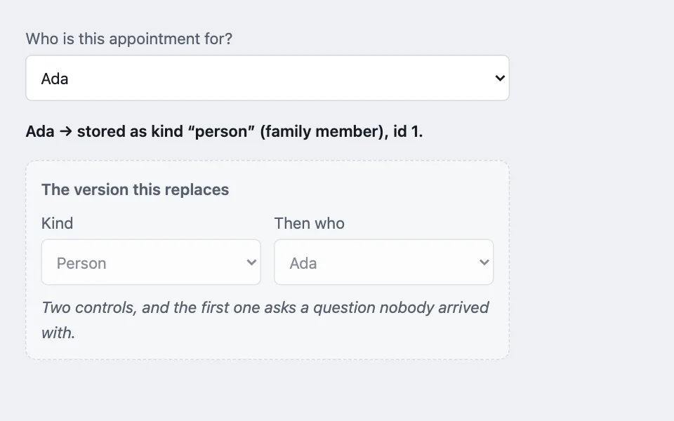
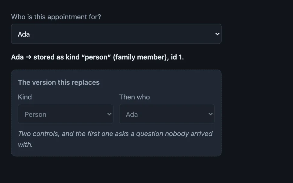
Compound-value picker
One grouped select whose option value carries both the kind of thing and its id, so someone names the thing they already had in mind instead of first answering a question about categories that only the schema cares about. Good for assigning a record to a person or a group, picking an owner that may be a user or a team, choosing a payee that may be a person or a company selectoptgrouppolymorphicformsdependent-fieldskeyboard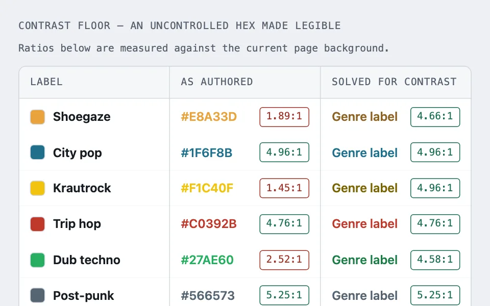
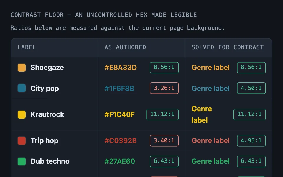
Ground-referenced color
Two jobs solved against the page’s own ground token rather than a synthetic white or black — walking an uncontrolled brand hex until it clears a 4.5:1 floor, and mixing an ordered intensity ramp across a full year of linked days — so both invert correctly between themes from one expression. Good for user-picked tag colors, third-party brand colors, channel or label colors on a dashboard colorcontrastcolor-mixaccessibilitywcagthemingyear-map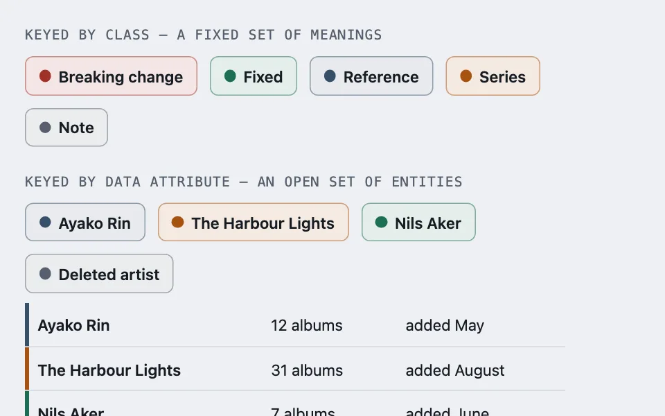
Single-property color variants
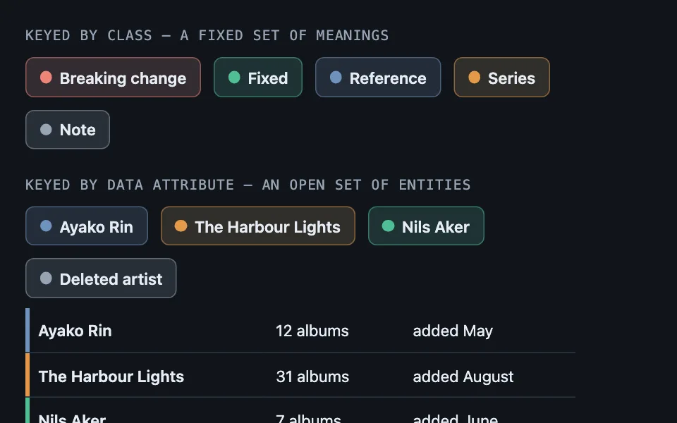
No component ever holds a hex: one custom property carries the hue, a base rule derives the border, fill, spine, and dot from it at fixed strengths, and each variant sets that one property — keyed by class for semantic tones, by data attribute for entity identity, or derived from the name once the entity set has no end. Good for category and status badges, label systems in issue trackers, callout and admonition variants colorcolor-mixcustom-propertiesthemingdata-attributesbadges