Hotspot marker layer
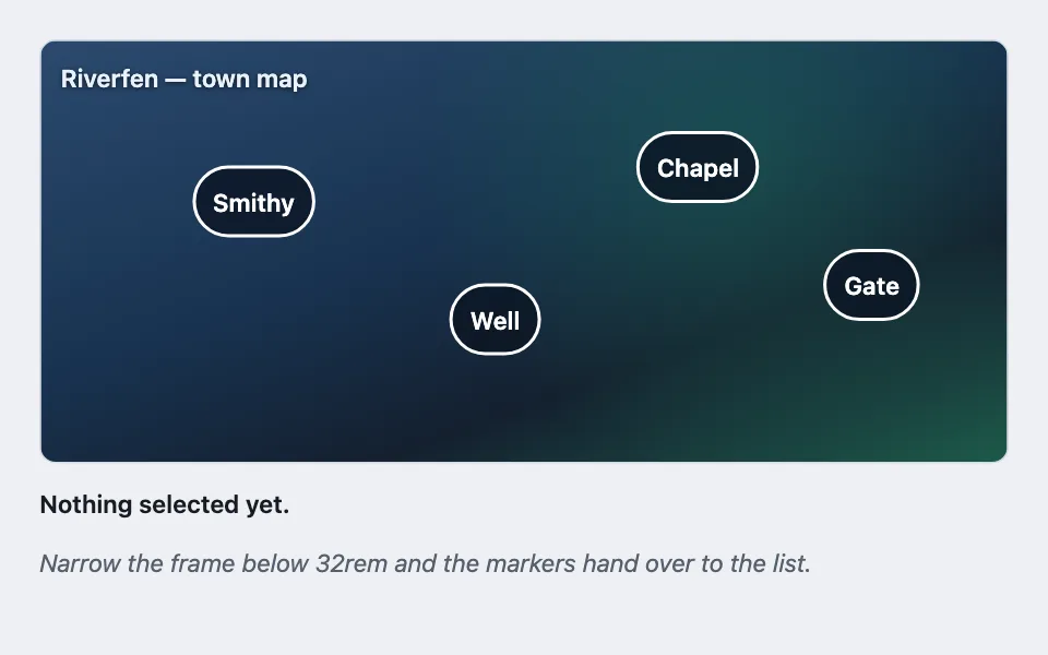
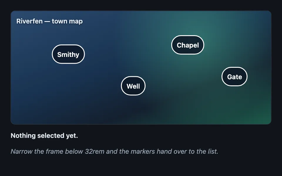
Interactive markers placed at percentage coordinates over a picture held at a fixed aspect ratio, where the layer passes clicks through to everything beneath it and the markers become an ordinary list when the frame is too narrow to hit them.
Reach for it when building
- an annotated screenshot in documentation
- a floor plan or seating chart
- a game map with points of interest
- a product photo with feature callouts
- a diagram with clickable regions
- a photo with tagged people or places
<div class="hml-demo">
	<div class="hml-frame">
		<p class="hml-caption">Riverfen — town map</p>

		<div class="hml-layer" id="hml-layer"></div>
	</div>

	<ul class="hml-list" id="hml-list" aria-label="Places in Riverfen"></ul>

	<p class="hml-out" id="hml-out" role="status">Nothing selected yet.</p>
	<p class="hml-hint">Narrow the frame below 32rem and the markers hand over to the list.</p>
</div>
Colors come from shared theme tokens — --surface, --ink, --border, --accent and friends — so this CSS carries no palette
of its own. Use Runnable file to copy the tokens along with it.
.hml-demo { container-type: inline-size; display: flex; flex-direction: column; gap: 0.75rem; max-width: 640px; }

/* Percentage coordinates need a box whose shape is known before the image
   loads, or the same marker lands in two places at two widths. */
.hml-frame {
	position: relative;
	aspect-ratio: 16 / 7;
	max-width: 100%;
	border: 1px solid var(--border);
	border-radius: var(--radius);
	overflow: hidden;
	background:
		radial-gradient(circle at 72% 26%, color-mix(in oklab, var(--ok) 45%, transparent), transparent 42%),
		linear-gradient(160deg, #2b4a6f, #18324f 45%, #14202f 70%, #1d5a4a);
}

.hml-caption {
	position: absolute;
	inset: 0.6rem auto auto 0.75rem;
	margin: 0;
	font-size: 0.9375rem;
	font-weight: 600;
	color: #eaf1fb;
	text-shadow: 0 1px 3px rgba(0, 0, 0, 0.65);
}

/* The layer covers the caption too, so it must not take the clicks. Each marker
   opts back in individually. */
.hml-layer { position: absolute; inset: 0; pointer-events: none; }

.hml-marker {
	position: absolute;
	transform: translate(-50%, -50%);
	pointer-events: auto;
	min-height: 44px;
	min-width: 44px;
	padding: 0.35rem 0.65rem;
	border-radius: 999px;
	border: 2px solid #ffffff;
	background: rgba(12, 22, 36, 0.85);
	color: #ffffff;
	font: inherit;
	font-size: 0.9375rem;
	font-weight: 600;
	cursor: pointer;
}

/* Same token pairing the rest of the library uses for an "active" fill and its
   guaranteed-readable ink, so hover holds contrast on both ends of the theme
   without a one-off hex that was only ever tuned against the light theme. */
.hml-marker:hover { background: var(--accent); color: var(--accent-ink); }
.hml-marker[aria-pressed='true'] { background: #ffffff; color: #101b2b; }

.hml-list { list-style: none; margin: 0; padding: 0; display: none; flex-direction: column; gap: 0.375rem; }

.hml-list button {
	font: inherit;
	width: 100%;
	text-align: left;
	min-height: 44px;
	padding: 0.5rem 0.7rem;
	border-radius: calc(var(--radius) - 4px);
	border: 1px solid var(--border);
	background: var(--surface);
	color: var(--ink);
	cursor: pointer;
}

/* Below the width where a 44px target can sit anywhere sensible, the picture
   keeps its caption and the list takes over the interaction. */
@container (max-width: 32rem) {
	.hml-layer { display: none; }
	.hml-list { display: flex; }
}

.hml-out { margin: 0; font-size: 0.9375rem; color: var(--ink); font-weight: 600; min-height: 1.6em; }
.hml-hint { margin: 0; font-size: 0.9375rem; color: var(--dim); font-style: italic; }
const SPOTS = [
{ id: 'smithy', x: 22, y: 38, name: 'Smithy', note: 'Repairs, and one quest nobody has taken.' },
{ id: 'well', x: 47, y: 66, name: 'Well', note: 'Rumours refresh here once a day.' },
{ id: 'chapel', x: 68, y: 30, name: 'Chapel', note: 'Two party members are waiting inside.' },
{ id: 'gate', x: 86, y: 58, name: 'Gate', note: 'Leads out to the fen road.' }
];
const layer = document.getElementById('hml-layer');
const list = document.getElementById('hml-list');
const out = document.getElementById('hml-out');
let selected = null;
function select(spot) {
selected = spot.id;
out.textContent = spot.name + ' — ' + spot.note;
for (const button of layer.querySelectorAll('.hml-marker')) {
button.setAttribute('aria-pressed', button.dataset.id === spot.id ? 'true' : 'false');
}
}
for (const spot of SPOTS) {
const marker = document.createElement('button');
marker.type = 'button';
marker.className = 'hml-marker';
marker.dataset.id = spot.id;
marker.style.left = spot.x + '%';
marker.style.top = spot.y + '%';
marker.textContent = spot.name;
marker.setAttribute('aria-pressed', 'false');
marker.addEventListener('click', () => select(spot));
layer.append(marker);
const row = document.createElement('li');
const button = document.createElement('button');
button.type = 'button';
button.textContent = spot.name + ' — ' + spot.note;
button.addEventListener('click', () => select(spot));
row.append(button);
list.append(row);
}Paste this into an agent to rebuild the pattern from scratch.
Place interactive markers on a picture. The frame holds a fixed aspect ratio, each marker is positioned as a percentage of that frame and anchored on its own centre, and below a certain width the markers hand over to a plain list beneath the picture.
Reach for this for annotated screenshots, floor plans, seating charts, maps with points of interest, and product photos with callouts. Walk away when the positions are not meaningful — a grid of thumbnails is a grid, and anything you would be tempted to lay out on an invisible grid belongs in a real one.
The rule that makes it work: **the layer spans the frame with `inset: 0`, so it gets `pointer-events: none` and every marker takes `pointer-events: auto` back.** Without it, the layer silently swallows every click on anything beneath — captions, links, the image itself — and nothing looks wrong. Worse, a synthetic `element.click()` in a test passes anyway, because that skips hit-testing entirely. Verify it with `document.elementFromPoint` at the coordinate, which is the only check that catches this.
**The frame needs an explicit `aspect-ratio`.** Percentage coordinates are meaningless against a box whose shape is not known until an image loads, and the same marker will land in two different places at two viewport widths. Set the ratio on the frame, let the picture fill it, and never let content stretch the box.
Anchor each marker on its own centre with a translate of minus half in both directions, so the coordinate means the point rather than the corner of a pill. Give every marker a 44px minimum in both directions through padding.
Below the width where a 44px target cannot sit anywhere sensible, hide the layer and show the list. Use a container query on the wrapper rather than a viewport media query — the frame can be in a sidebar on a wide screen, and it is the frame's width that decides whether the markers are reachable.
**Show exactly one of the two at any width, and let `display: none` do the hiding.** The same container query that switches the layout also has to be the only thing that decides what a screen reader sees: hide the layer and show the list below the threshold, and the reverse above it, with nothing marked `aria-hidden`. Markers are real buttons carrying the place's name as their own text content, not icons standing in for a label, so whichever one is on screen reads correctly on its own. Never `aria-hide` a layer that holds focusable buttons — a hidden container still passes keyboard focus to the buttons inside it, so a screen reader user can tab onto a control that was just announced as not there, and above the container's breakpoint that layer is the only copy of the places in the page at all.
The picture can be a CSS gradient in a demo, but everything on top has to hold its contrast against the worst region of the real image — those markers are fixed-colour furniture on artwork nobody reviewed, and a white-on-dark pill fails the moment someone uploads a snow scene.