Cork notice board
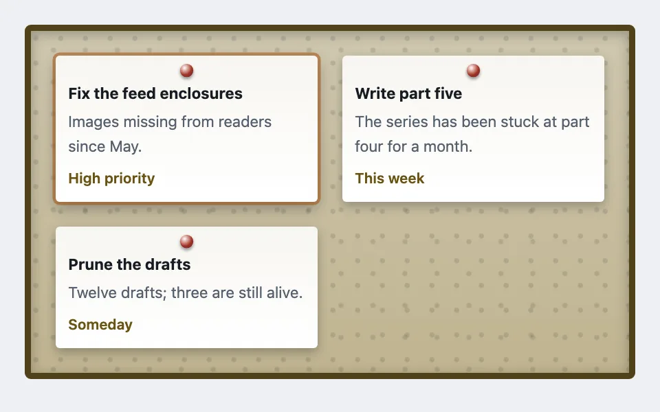
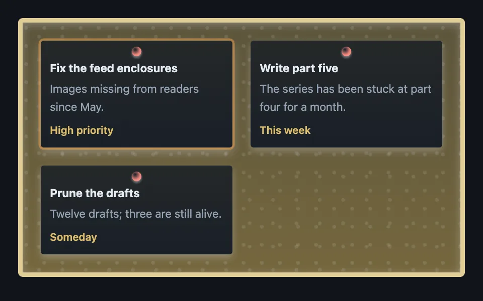
A grid of pinned paper notes on a cork board where every texture — cork speckle, timber frame, the 3D pushpin — is layered CSS gradients, with no image assets at all.
Reach for it when building
- community or team notice board
- playful task and bounty lists
- event and announcement walls
- kids or classroom interfaces
- game-styled quest boards
<div class="cnb-board">
	<div class="cnb-note cnb-selected">
		<b>Fix the feed enclosures</b>
		<p>Images missing from readers since May.</p>
		<span class="cnb-reward">High priority</span>
	</div>
	<div class="cnb-note">
		<b>Write part five</b>
		<p>The series has been stuck at part four for a month.</p>
		<span class="cnb-reward">This week</span>
	</div>
	<div class="cnb-note">
		<b>Prune the drafts</b>
		<p>Twelve drafts; three are still alive.</p>
		<span class="cnb-reward">Someday</span>
	</div>
</div>
Colors come from shared theme tokens — --surface, --ink, --border, --accent and friends — so this CSS carries no palette
of its own. Use Runnable file to copy the tokens along with it.
.cnb-board {
	display: grid;
	grid-template-columns: repeat(auto-fill, minmax(11rem, 1fr));
	gap: 1.5rem;
	padding: 1.5rem;
	border: 6px solid color-mix(in srgb, var(--warn) 55%, var(--ink));
	border-radius: 6px;
	/* Cork is two radial speckle layers at different tile sizes — the phase
	   mismatch is what stops the repeat from reading as a grid — over a
	   two-stop tan gradient derived from the warning hue. */
	background-image:
		radial-gradient(circle at 20% 30%, color-mix(in srgb, var(--ink) 12%, transparent) 0 2px, transparent 3px),
		radial-gradient(circle at 70% 60%, color-mix(in srgb, var(--ink) 12%, transparent) 0 2px, transparent 3px),
		linear-gradient(
			180deg,
			color-mix(in srgb, var(--warn) 32%, var(--surface-2)),
			color-mix(in srgb, var(--warn) 45%, var(--surface-2))
		);
	background-size: 24px 24px, 31px 31px, auto;
	box-shadow: inset 0 3px 12px color-mix(in srgb, var(--ink) 30%, transparent);
	max-width: 680px;
}

.cnb-note {
	position: relative;
	background: linear-gradient(
		180deg,
		color-mix(in srgb, var(--warn) 6%, var(--surface)),
		var(--surface)
	);
	color: var(--ink);
	border-radius: 4px;
	/* Extra top padding leaves room for the pin. */
	padding: 1.5rem 0.75rem 0.75rem;
	box-shadow: 0 4px 10px color-mix(in srgb, var(--ink) 30%, transparent);
	font-size: 0.9375rem;
}

.cnb-selected {
	box-shadow:
		0 0 0 3px color-mix(in srgb, var(--signal) 55%, transparent),
		0 6px 14px color-mix(in srgb, var(--ink) 35%, transparent);
}

/* The pushpin: one radial gradient with an off-center highlight reads as a
   sphere, and a small drop shadow lifts it off the paper. */
.cnb-note::before {
	content: '';
	position: absolute;
	top: 8px;
	left: 50%;
	transform: translateX(-50%);
	width: 13px;
	height: 13px;
	border-radius: 50%;
	background: radial-gradient(
		circle at 35% 30%,
		var(--surface),
		var(--bad) 55%,
		color-mix(in srgb, var(--bad) 60%, var(--ink))
	);
	box-shadow: 0 2px 3px color-mix(in srgb, var(--ink) 45%, transparent);
}

.cnb-note b { display: block; margin-bottom: 0.2rem; }
.cnb-note p { margin: 0 0 0.4rem; color: var(--dim); }

.cnb-reward {
	color: color-mix(in srgb, var(--warn) 80%, var(--ink));
	font-size: 0.875rem;
	font-weight: 600;
}
Paste this into an agent to rebuild the pattern from scratch.
Build a notice board of pinned paper notes where every material — cork, timber, paper, pushpin — is drawn with CSS gradients, and no image assets exist anywhere in the pattern.
The board is a responsive auto-fill grid inside a thick timber frame (a 6px border in a wood tone mixed from the theme's warm hue and ink). Cork texture is three stacked background layers: two `radial-gradient` speckle layers tiled at deliberately different `background-size` values (24px and 31px) so their phases never line up and the repeat stops reading as a grid, over a soft two-stop vertical tan gradient. An inset box-shadow sinks the board surface behind the frame.
Each note is a paper card with a faint warm-tinted vertical gradient, a small radius, and a real drop shadow. Give it extra top padding, then draw the pushpin as a `::before`: a 13px circle whose entire three-dimensionality is one radial gradient with the highlight pulled off-center (`circle at 35% 30%`) running highlight, body color, darkened edge — plus a 2px drop shadow onto the paper. That single gradient is the pattern's showpiece; resist the urge to add more layers to it.
A selected note gets a ring via box-shadow in the signal color stacked over a slightly deeper drop shadow, never a border change that would shift layout.
Derive every material tone with color-mix from the theme's tokens (warm hue, ink, surface) rather than hard-coded browns, so the board darkens plausibly in dark mode instead of glowing. Check both themes: skeuomorphic patterns fail dark mode more often than flat ones, because their "materials" carry baked-in assumptions about ambient light.