Ground-scrimmed artwork
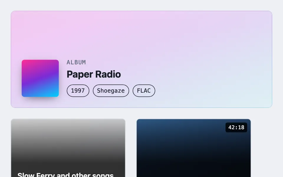
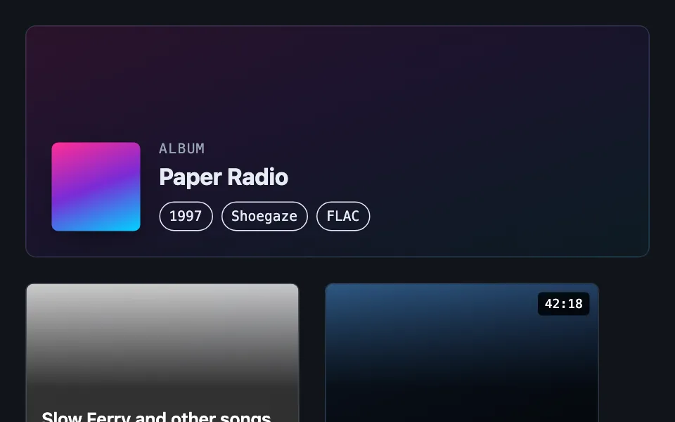
Text printed over artwork nobody has reviewed, scrimmed to an alpha that can be written down rather than guessed. Five geometries — a blurred header, a flat-held tile band, a pill the size of one label, a directionless wash, and a glass lens whose panel blurs the same art continuing behind it — chosen by whether the ink is a theme token or fixed, and by how much of the art the information is allowed to cover.
Reach for it when building
- album or book detail header
- movie and show detail pages
- user-uploaded cover art
- podcast episode headers
- media grid tiles
- photo grid captions
- game library covers
- streaming catalogue rows
<div class="gsa-demo">
	<div class="gsa-hero">
		<div class="gsa-hero-media gsa-art-hot" aria-hidden="true"></div>
		<div class="gsa-hero-scrim" aria-hidden="true"></div>
		<div class="gsa-hero-content">
			<div class="gsa-hero-cover gsa-art-hot"></div>
			<div class="gsa-hero-text">
				<p class="gsa-eyebrow">Album</p>
				<h3 class="gsa-hero-title">Paper Radio</h3>
				<div class="gsa-badges">
					<span class="gsa-badge">1997</span>
					<span class="gsa-badge">Shoegaze</span>
					<span class="gsa-badge">FLAC</span>
				</div>
			</div>
		</div>
	</div>

	<div class="gsa-tiles">
		<div class="gsa-tile">
			<div class="gsa-tile-art gsa-art-pale" aria-hidden="true"></div>
			<div class="gsa-tile-scrim" aria-hidden="true"></div>
			<div class="gsa-tile-text">
				<span class="gsa-tile-title">Slow Ferry and other songs for the long way round</span>
				<span class="gsa-tile-meta">The Harbour Lights — 11 tracks</span>
			</div>
		</div>
		<div class="gsa-tile">
			<div class="gsa-tile-art gsa-art-deep" aria-hidden="true"></div>
			<div class="gsa-tile-scrim" aria-hidden="true"></div>
			<span class="gsa-pill">42:18</span>
			<div class="gsa-tile-text">
				<span class="gsa-tile-title">Midnight in Tokyo</span>
				<span class="gsa-tile-meta">Ayako Rin — 9 tracks</span>
			</div>
		</div>
	</div>

	<div class="gsa-wash">
		<div class="gsa-wash-art gsa-art-hot" aria-hidden="true"></div>
		<div class="gsa-wash-veil" aria-hidden="true"></div>
		<div class="gsa-wash-text">
			<p class="gsa-eyebrow">Now playing</p>
			<h3 class="gsa-wash-title">Long Way Round</h3>
			<p class="gsa-wash-body">A flat wash of the surface token at 88%, with no gradient and no direction. Because the wash is a token rather than a fixed black, it inverts with the theme on its own and the text can stay theme ink.</p>
		</div>
	</div>
</div>

<div class="gsa-lens-demo">
	<h4 class="gsa-lens-heading">Variation five — the glass lens</h4>
	<div class="gsa-lens">
		<div class="gsa-lens-art gsa-art-hot" aria-hidden="true"></div>
		<div class="gsa-lens-panel">
			<p class="gsa-eyebrow">Now playing</p>
			<h3 class="gsa-lens-title">Static Season</h3>
			<p class="gsa-lens-body">Sharp art continues behind this panel — the panel blurs the same picture rather than covering it with a fade. 72% of the ground is the measured floor: any lighter and the worst case, a dark theme over bright art like this, drops under 4.5:1.</p>
			<div class="gsa-badges">
				<span class="gsa-badge">FLAC</span>
				<span class="gsa-badge">42:18</span>
			</div>
		</div>
	</div>
	<p class="gsa-lens-note">Every line of text above, including the body copy, is full-strength ink, never the dimmed token. Hierarchy comes from size and weight instead.</p>
</div>
Colors come from shared theme tokens — --surface, --ink, --border, --accent and friends — so this CSS carries no palette
of its own. Use Runnable file to copy the tokens along with it.
.gsa-demo { display: flex; flex-direction: column; gap: 1.5rem; }

/* Stand-ins for artwork the page does not control. The pale and the hot
   one are the cases that break a scrim; the deep one is the easy case. */
.gsa-art-hot { background-image: linear-gradient(160deg, #ff2d95 0%, #7a2bd6 50%, #00d4ff 100%); }
.gsa-art-pale { background-image: linear-gradient(160deg, #ffffff 0%, #f2f4f7 60%, #e6eaef 100%); }
.gsa-art-deep { background-image: linear-gradient(160deg, #3a6ea5 0%, #1d3557 60%, #0d1b2a 100%); }

/* ---------------------------------------------------------------
   Variation one — theme-ink header.
   The text is var(--ink), so the scrim has to be var(--ground).
   --------------------------------------------------------------- */

.gsa-hero {
	position: relative;
	overflow: hidden;
	min-height: 220px;
	border-radius: var(--radius);
	border: 1px solid var(--border);
	padding: 1.5rem;
	display: flex;
	align-items: flex-end;
}

/* scale(1.3) is required, not decorative: a 22px blur samples past the
   element's own edges, and without the extra scale that sampling pulls in
   transparent pixels and fades the border into the page. */
.gsa-hero-media {
	position: absolute;
	inset: 0;
	background-size: cover;
	background-position: center;
	transform: scale(1.3);
	filter: blur(22px) saturate(1.1) brightness(1.32);
}

/* Light gets less lift and less saturation than dark. Lifting a saturated
   source image toward white produces hot, over-saturated colors that a
   grey outline badge cannot sit on top of; dark mode has more headroom. */
[data-theme='dark'] .gsa-hero-media {
	filter: blur(22px) saturate(1.4) brightness(0.55);
}

/* The page's own ground at high alpha, not fixed black or white, so the
   text lands on very nearly the color the theme was already contrast-
   checked against and one rule covers every theme. The 78% floor is
   load-bearing: at 160deg the weak end of the gradient sits over the
   bottom-left, exactly where the title and its outline badges sit, so
   the floor alone has to carry full legibility. */
.gsa-hero-scrim {
	position: absolute;
	inset: 0;
	background-image: linear-gradient(
		160deg,
		color-mix(in srgb, var(--ground) 78%, transparent),
		color-mix(in srgb, var(--ground) 92%, transparent)
	);
}

.gsa-hero-content {
	position: relative;
	display: flex;
	gap: 1.1rem;
	align-items: flex-end;
	flex-wrap: wrap;
	min-width: 0;
}

.gsa-hero-cover {
	width: 84px;
	height: 84px;
	border-radius: 6px;
	flex: 0 0 auto;
	background-size: cover;
	background-position: center;
	box-shadow: 0 6px 20px -8px rgba(0, 0, 0, 0.7);
}

.gsa-hero-text { flex: 1 1 200px; min-width: 0; }

.gsa-eyebrow {
	margin: 0 0 0.15rem;
	font-family: var(--mono);
	font-size: 0.8125rem;
	letter-spacing: 0.08em;
	text-transform: uppercase;
	color: var(--dim);
}

.gsa-hero-title { margin: 0; font-size: 1.375rem; line-height: 1.25; color: var(--ink); }

.gsa-badges { display: flex; gap: 0.5rem; flex-wrap: wrap; margin-top: 0.6rem; }

.gsa-badge {
	font-family: var(--mono);
	font-size: 0.8125rem;
	padding: 0.15rem 0.55rem;
	border-radius: 999px;
	border: 1px solid currentColor;
	color: var(--ink);
}

/* ---------------------------------------------------------------
   Variation two — fixed-ink tile.
   The text is a fixed white, so the scrim is a fixed black held flat.
   --------------------------------------------------------------- */

.gsa-tiles { display: flex; gap: 1.5rem; flex-wrap: wrap; }

.gsa-tile {
	/* The single source of truth: the gradient's flat point and the text
	   box's height are both derived from this one value, so the CSS band
	   cannot quietly outgrow the region a contrast check measured. */
	--gsa-hold: 50%;
	position: relative;
	overflow: hidden;
	width: 260px;
	height: 200px;
	border-radius: 8px;
	border: 1px solid var(--border);
	flex: 0 0 auto;
}

.gsa-tile-art {
	position: absolute;
	inset: 0;
	background-size: cover;
	background-position: center;
}

/* Ramps from a light scrim at the top to a dark one at --gsa-hold, then
   holds flat for the rest of the tile — CSS gradients continue the final
   stop's color past its own position with no further declaration needed.
   Every pixel under the text sits on the exact same alpha. */
.gsa-tile-scrim {
	position: absolute;
	inset: 0;
	background: linear-gradient(180deg, rgba(0, 0, 0, 0.2), rgba(0, 0, 0, 0.8) var(--gsa-hold));
}

.gsa-tile-text {
	position: absolute;
	inset: auto 0 0 0;
	max-height: calc(100% - var(--gsa-hold));
	overflow: hidden;
	padding: 0.75rem 0.9rem;
	display: flex;
	flex-direction: column;
	gap: 2px;
}

/* Fixed white/grey ink, deliberately not a theme token: this text sits on
   the scrim and the artwork, never on the page ground, so it is solved
   against the scrim's own worst case rather than against the theme. */
.gsa-tile-title { color: #ffffff; font-weight: 600; font-size: 1.0625rem; line-height: 1.3; }
.gsa-tile-meta { color: #e3e3e3; font-size: 0.875rem; }

/* ---------------------------------------------------------------
   Variation three — a pill for one short label.
   Same fixed-ink reasoning as the tile, but the scrim is the size
   of the words rather than a band across the artwork.
   --------------------------------------------------------------- */

.gsa-pill {
	position: absolute;
	top: 0.5rem;
	right: 0.5rem;
	/* Opaque enough to be arithmetic rather than a hope: 0.82 black under
	   white text clears 13:1 over even a pure-white frame. */
	background: rgba(0, 0, 0, 0.82);
	color: #ffffff;
	font-family: var(--mono);
	font-size: 0.75rem;
	padding: 0.1rem 0.4rem;
	border-radius: 4px;
}

/* ---------------------------------------------------------------
   Variation four — a flat wash with no direction at all.
   --------------------------------------------------------------- */

.gsa-wash {
	position: relative;
	overflow: hidden;
	border-radius: var(--radius);
	border: 1px solid var(--border);
	padding: 1.5rem;
	min-height: 180px;
}

.gsa-wash-art {
	position: absolute;
	inset: 0;
	background-size: cover;
	background-position: center;
}

/* No gradient and no anchor edge: one flat alpha of a theme token over the
   whole panel. Every pixel of text sits on the same value, so there is no
   weak end to reason about — and being a token, it inverts by itself. */
.gsa-wash-veil {
	position: absolute;
	inset: 0;
	background: color-mix(in srgb, var(--surface) 88%, transparent);
}

.gsa-wash-text { position: relative; max-width: 46ch; }

.gsa-wash-title { margin: 0 0 0.4rem; font-size: 1.25rem; color: var(--ink); }

.gsa-wash-body { margin: 0; font-size: 0.9375rem; color: var(--dim); }

/* ---------------------------------------------------------------
   Variation five — the glass lens.
   Sharp, full-bleed art with a backdrop-filter panel over its lower
   part, rather than a scrim laid across the whole picture. Appended;
   shares no selectors with the four variations above. */

.gsa-lens-demo { display: flex; flex-direction: column; gap: 0.75rem; margin-top: 1.5rem; padding-top: 1.5rem; border-top: 1px dashed var(--border); }

.gsa-lens-heading { margin: 0; font-size: 1.0625rem; }

.gsa-lens {
	position: relative;
	overflow: hidden;
	min-height: 260px;
	border-radius: var(--radius);
	border: 1px solid var(--border);
	display: flex;
	align-items: flex-end;
}

/* SHARP and full bleed — nothing blurs this layer itself. The lens panel
   below blurs the same picture continuing behind it; this art layer is
   what makes that continuity possible. */
.gsa-lens-art {
	position: absolute;
	inset: 0;
}

/* The measured floor: 72% of --ground is as see-through as this can go.
   Worst case is a dark scheme over bright art — 65% measures 4.26:1 and
   fails, 72% measures 5.38:1. Blur is not part of that arithmetic: a
   uniformly bright image is exactly as bright after a 24px blur, so the
   backdrop-filter below is read only as texture removal, never as a
   contrast contribution. */
.gsa-lens-panel {
	position: relative;
	width: 100%;
	padding: 1.25rem 1.5rem;
	background: color-mix(in srgb, var(--ground) 72%, transparent);
	backdrop-filter: blur(24px) saturate(1.3);
	-webkit-backdrop-filter: blur(24px) saturate(1.3);
}

/* Every glyph in the lens is full strength, enforced here rather than left
   to each caller to remember. Dimmed text does not clear AA over artwork
   at any usable ground — it measures roughly 3.85:1 even at 94% — so
   hierarchy inside the lens comes from size and weight, never opacity. */
.gsa-lens-panel * {
	color: var(--ink);
}

.gsa-lens-title { margin: 0.2rem 0 0.4rem; font-size: 1.25rem; line-height: 1.25; }

.gsa-lens-body { margin: 0; font-size: 0.9375rem; max-width: 52ch; }

.gsa-lens-note { margin: 0; font-size: 0.875rem; color: var(--dim); }
Paste this into an agent to rebuild the pattern from scratch.
Build a surface that prints text directly over artwork the page does not control — user uploads, third-party covers, syndicated thumbnails, anything nobody has reviewed for how legible text would be on top of it. The requirement is that it degrades gracefully whatever image lands in it: a near-black cover, a near-white cover, and a violently saturated cover all have to produce a readable title with no per-image tuning.
Everything below follows from one rule. The scrim's alpha has to be a number you can write down, because that number is what lets you composite it against the worst-case artwork and check the result before shipping. A scrim you eyeballed is not checkable, and neither is a text-shadow — refuse text-shadow as a substitute even though it looks similar, because its effect on effective contrast depends on the exact pixels underneath, which is precisely the property this pattern exists to eliminate.
What the scrim is made of is decided by one question: does the text use theme tokens, or a fixed ink?
**When the text is theme ink, scrim with the ground.** A detail-page header whose title is var(--ink) needs a scrim of the page's own ground color at high alpha — a linear-gradient from roughly 78% to 92% of the ground, laid at a diagonal — never a fixed black-to-transparent or white-to-transparent ramp. The text then sits on very nearly the same color the rest of the theme's text was already contrast-checked against, so one rule covers every theme instead of needing a light variant and a dark variant. The floor matters on its own: with a shallow diagonal, the weak end of the gradient lands exactly where the title and badges are anchored, so the floor alone — not the ramp — carries full legibility. A floor much below 78%, tested against a saturated cover, will visibly fail.
**When the text is a fixed white, scrim with a fixed black and hold it flat.** A compact tile whose title sits on the artwork itself is solved against the scrim's own worst case rather than against the page, so its ink is a fixed white-and-grey pair and its scrim is fixed black. Here the failure mode is different: with a straight top-to-bottom ramp, each line of text lands on whatever alpha the gradient happens to reach at that pixel row, so a one-line title and a two-line title sit on different contrast values and neither is a number a test can assert. Fix it with a two-phase gradient — specify only two stops, a light one at the top and a dark one at a fixed hold point, and let the gradient carry that final color forward unchanged for the rest of the box, which CSS does with no further declaration. Everything below the hold point is one constant alpha no matter how the title wraps.
Then cap the text region to exactly that held band, and derive both the gradient's hold point and the text box's ceiling from the same custom property, read by the background declaration and by a max-height: calc(100% - value) on the text container. Deriving them from one number is what keeps the promise: move the hold point and the text box's ceiling moves with it, so the band that was measured is the band that can never be exceeded. With the alpha fixed, the worst case is arithmetic rather than a range — black held around 0.8 over even a near-white image composites to a mid-dark grey that plain white text clears comfortably.
Two details specific to the header variation. Blur the enlarged backdrop past the point where any detail survives, around 22px, because a blurred backdrop cannot compete with foreground text whatever shapes were in the original. Push that blurred layer toward the current theme's luminance with brightness(), and treat the two themes asymmetrically: dark takes a strong push toward black, roughly brightness(0.55) with elevated saturation, because it has headroom before things look muddy; light needs the opposite direction with noticeably less force, around brightness(1.32) with saturation barely raised, because pushing a saturated color toward white produces harsh hues that a grey outline badge cannot survive. Lifting toward white is the harder direction — give it less lift, not more. Apply transform: scale(1.3) to that layer as well, since a large blur samples past the element's own edges and without the extra scale it pulls in transparent pixels and fades the border into the page. Keep the foreground thumbnail sharp: it establishes what the backdrop actually is, now that the backdrop has been blurred past recognition.
**When one short label is all you need, make the scrim the size of the label.** A duration, a rating, a count in the corner of a thumbnail does not need a band across the artwork. A small opaque pill — fixed black around 0.82 alpha with fixed white text — clears 13:1 over even a pure-white frame, and the arithmetic is as enumerable as the tile's. Reach for this before reaching for a full caption band you do not need.
**When the panel can stay a single flat plane with no gradient at all, scrim with the surface token and hold every pixel to one alpha.** A wash behind a short blurb — a now-playing strip, a pull-quote over a texture, anywhere the text block is short enough that no line ever nears a weak edge — does not need a ramp to solve for: color-mix the page's own `--surface` at 88% over the whole panel, flat, with no direction and no anchor edge. Every pixel of text sits on the same value, so unlike the header's diagonal there is no weak corner to check, and because the fill is a token rather than a fixed colour, it inverts with the theme on its own. Reach for this only where the text block is short and unlikely to grow past what the wash covers; a caption that could grow into a heading needs the header's floor and its bookkeeping, not this shortcut.
**When there is no room for a panel at all, use an opaque outline, not a shadow.** This is the honest answer to the text-shadow refusal above. Text sitting directly on unpredictable art with nothing behind it — a label on a map, a caption on a full-bleed image — can be given a real outline: render it as SVG text with stroke set to a background token, a stroke-width around 2.5, and paint-order: stroke fill so the stroke is painted under the glyph rather than over it. That is an opaque halo at a fixed width, colour-matched to the theme, and unlike a blurred shadow its effect does not depend on the pixels underneath. It is the one substitute for a scrim that is still a number. This demo does not build it — there is no SVG-stroke example on the page, only the scrims that need one — so treat this paragraph as the technique to reach for the day a caption has to sit on raw art with nothing behind it at all.
Three more failures worth knowing, because each one has been shipped:
**Percentage gradient stops under fixed-height content.** If the gradient's hold point is a percentage of container height but the caption block is a fixed pixel height, then at a short crop the caption rides up into the weak end of the ramp — measured as low as 0.13 alpha in the wild, propped up by a text-shadow doing a scrim's job. Define the held stop in pixels, or give the text container a min-height, so the ramp scales with the content rather than the container.
**A weak stop exactly where content begins.** Setting the lightest stop at around 12–30% of the ground at precisely the edge where the first line of text or the first control sits forces ad-hoc patching of every element that lands there. Either start the weak end heavier — 65–70% and up — or push the content down past it. Patching per element is a sign the geometry is wrong.
**A translucent tinted disc behind fixed-colour text.** A badge filled with a theme colour at low opacity, with its text pinned to one near-white value across every theme, fails the contrast floor even over dark artwork, because the pairing was never checked independently of what sits beneath it. Fill and ink have to be chosen together.
Choose the tile variation on dense card-per-record layouts where a separate caption strip would cost too much vertical space. Choose the header variation where there is room to spare. Where there is room to spare *and* the artwork is already curated against a checked background color, use neither — a solid band beneath the image is simpler and this machinery is solving a problem you do not have.
**A fifth geometry: sharp art behind a genuinely glass panel, using `backdrop-filter` rather than a second blurred copy of the image.** The header variation above fakes glass by rendering a separately blurred, scaled duplicate of the art as its own layer; the lens renders the art once, sharp and full-bleed, and blurs it optically where the panel sits over it. The panel covers only the lower part of the artwork — the rest stays untouched and is the part actually being looked at.
**72% of the ground is the measured floor, and it does not move for taste.** The binding case is a dark scheme over bright artwork: at 65% the panel measures 4.26:1 against near-white text and fails; at 72% it measures 5.38:1. Light mode is nowhere near binding at the same number — 9.24:1 — so the floor is set by the harder theme, not by the average of the two.
**Blur is not part of the contrast arithmetic.** A `backdrop-filter: blur()` removes local detail — the shapes and edges that make an image distracting behind text — but a uniformly bright region is exactly as bright after a 24px blur as before it. Compute the floor from the panel's alpha alone, on the assumption that the art behind it could be a flat color at its worst luminance, and treat the blur as a legibility aid for texture, never as a contrast contributor.
**No dimmed text inside the lens, anywhere, including labels.** Dimmed measures roughly 3.85:1 even against a 94% ground, short of the 4.5:1 floor — there is no alpha in a usable range where a secondary text color clears AA over artwork. Force every line inside the panel to full ink and build hierarchy from size and weight instead. Do this once, with a rule that targets everything inside the panel, rather than trusting each caller to remember it for every label and badge they add.
**Stacked translucent layers multiply, they do not add.** The demo below shows the panel alone, over unscrimmed art, because that covers the common case. When the lens instead sits over artwork that already carries its own page-level scrim — a fixed backdrop behind the whole layout — the art actually reaching a glyph is `(1 − panel alpha) × (1 − scrim alpha)`, not `1 − panel alpha` by itself. A 92% panel over an already-scrimmed 40% backdrop leaves `0.08 × 0.60 = 4.8%` of the art visible at that pixel — inside the tolerance dimmed text needs, but only because the two numbers were solved together. Raise either alpha on its own and the other has to move with it, or the combination drifts past what was checked.
**A fixed full-page backdrop needs isolation on its container, or it paints over content it should sit behind.** A negatively-stacked, absolutely- or fixed-positioned layer ignores the paint order of non-positioned siblings and renders above them regardless of where it sits in the DOM — a negative z-index alone does not contain it. Setting `isolation: isolate` on the layer's container confines that negative stacking to inside the container, so the backdrop lands behind the container's own content and nowhere else.
The lens demo below reuses the same gradient stand-ins and theme tokens as the four variations above it — check the panel's floor against both themes, since the failing case lives in only one of them.