Column-flow wall
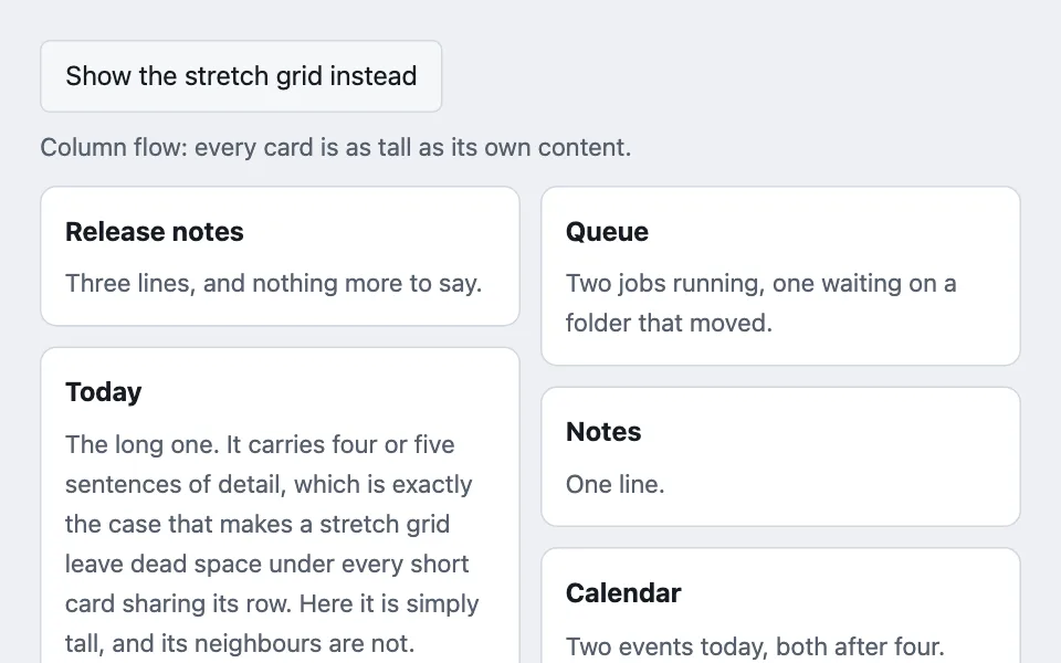
Cards flowing down columns instead of across rows, so none of them stretches to match the tallest member of its row — with the reading-order cost stated plainly, because that is what decides whether the layout is allowed.
Reach for it when building
- a wall of independent dashboard cards
- a pinboard of notes of different lengths
- a gallery of quotes or testimonials
- a feed of short updates
- search results with wildly uneven summaries
- a link or bookmark board
<div class="cfw-demo">
	<div class="cfw-bar">
		<button type="button" class="cfw-btn" id="cfw-toggle" aria-pressed="false">Show the stretch grid instead</button>
		<p class="cfw-note" id="cfw-note">Column flow: every card is as tall as its own content.</p>
	</div>

	<div class="cfw-wall" id="cfw-wall">
		<div class="cfw-card"><h3>Release notes</h3><p>Three lines, and nothing more to say.</p></div>
		<div class="cfw-card"><h3>Today</h3><p>The long one. It carries four or five sentences of detail, which is exactly the case that makes a stretch grid leave dead space under every short card sharing its row. Here it is simply tall, and its neighbours are not.</p></div>
		<div class="cfw-card"><h3>Weather</h3><p>18°C, clear.</p></div>
		<div class="cfw-card"><h3>Queue</h3><p>Two jobs running, one waiting on a folder that moved.</p></div>
		<div class="cfw-card"><h3>Notes</h3><p>One line.</p></div>
		<div class="cfw-card"><h3>Calendar</h3><p>Two events today, both after four.</p></div>
	</div>
</div>
Colors come from shared theme tokens — --surface, --ink, --border, --accent and friends — so this CSS carries no palette
of its own. Use Runnable file to copy the tokens along with it.
.cfw-demo { display: flex; flex-direction: column; gap: 0.75rem; }

.cfw-bar { display: flex; flex-wrap: wrap; gap: 0.5rem 1rem; align-items: center; }

.cfw-btn {
	font: inherit;
	min-height: 44px;
	padding: 0.5rem 0.9rem;
	border-radius: calc(var(--radius) - 4px);
	border: 1px solid var(--border);
	background: var(--surface-2);
	color: var(--ink);
	cursor: pointer;
}

.cfw-note { margin: 0; font-size: 0.9375rem; color: var(--dim); }

/* Column flow. The gap between stacked cards is each card's own bottom margin,
   because column-gap only separates the columns. */
.cfw-wall { columns: 3 13rem; column-gap: 0.75rem; }
.cfw-card { break-inside: avoid; margin: 0 0 0.75rem; }

/* The comparison: same cards, row-based grid, every card stretched to the
   tallest in its row. */
.cfw-wall[data-mode='stretch'] {
	columns: auto;
	display: grid;
	grid-template-columns: repeat(auto-fit, minmax(13rem, 1fr));
	gap: 0.75rem;
}

.cfw-wall[data-mode='stretch'] .cfw-card { margin: 0; }

.cfw-card {
	padding: 0.875rem;
	border: 1px solid var(--border);
	border-radius: var(--radius);
	background: var(--surface);
}

.cfw-card h3 { margin: 0 0 0.35rem; font-size: 1rem; }
.cfw-card p { margin: 0; font-size: 0.9375rem; color: var(--dim); }
const wall = document.getElementById('cfw-wall');
const toggle = document.getElementById('cfw-toggle');
const note = document.getElementById('cfw-note');
toggle.addEventListener('click', () => {
const stretched = wall.dataset.mode === 'stretch';
if (stretched) {
delete wall.dataset.mode;
} else {
wall.dataset.mode = 'stretch';
}
toggle.setAttribute('aria-pressed', stretched ? 'false' : 'true');
toggle.textContent = stretched ? 'Show the stretch grid instead' : 'Show the column flow instead';
note.textContent = stretched
? 'Column flow: every card is as tall as its own content.'
: 'Stretch grid: every card matches the tallest in its row, so the short ones carry dead space.';
});Paste this into an agent to rebuild the pattern from scratch.
Lay cards out down columns rather than across rows, so no card is stretched to match the tallest thing beside it.
Reach for this for walls of genuinely independent cards of uneven height: dashboard panels, a pinboard of notes, quotes, short updates. Walk away the moment order matters — which is more often than it looks.
The rule that makes it work, and the reason to walk away: **reading order runs down each column, not across the page.** Card two sits below card one in the first column, and card four may be at the top of the second. That is fine for six unrelated panels and wrong for anything ranked, chronological, or numbered — a "top ten" in column flow reads 1, 2, 3, 4 down the left and nobody can tell. Sequence order is the walk-away condition, and it is the one people skip because the layout looks good in the screenshot.
Use CSS columns with `break-inside: avoid` on the children. Set the gap between stacked cards as each card's own bottom margin: `column-gap` separates the columns and does nothing vertically, so a wall built with `gap` alone ends up with cards touching.
Give the column rule a minimum width as well as a count — `columns: 3 13rem` — so the browser drops to two columns and then one as space runs out, with no media queries of your own.
Keyboard and screen-reader order follow the DOM, which is the column order, not the visual order. That mismatch is invisible until someone tabs through it, and it is a second reason to keep this to content where order carries no meaning.
Do not reach for this to fix one card being too tall. A single outlier is a content problem — truncate it, or give it a deliberate two-row span in a real grid — and rearranging the whole layout around it costs everything above.
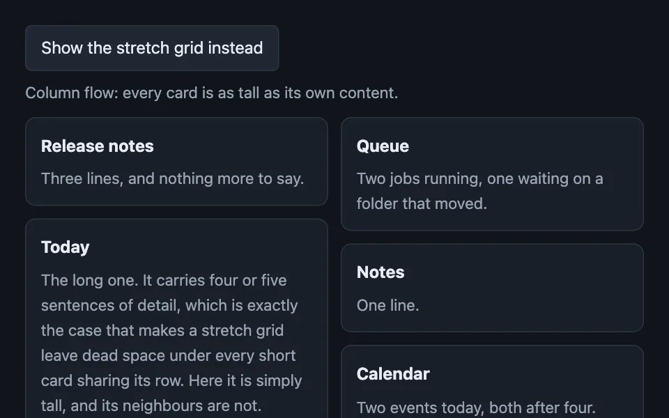
Every colour comes from theme custom properties, and the card surface has to keep a visible edge against the page ground in both themes, since nothing else separates one card from the next in a column.