Controls on an unknown fill
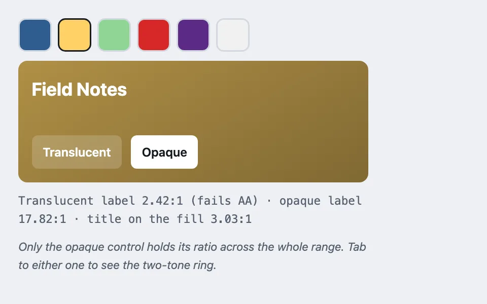
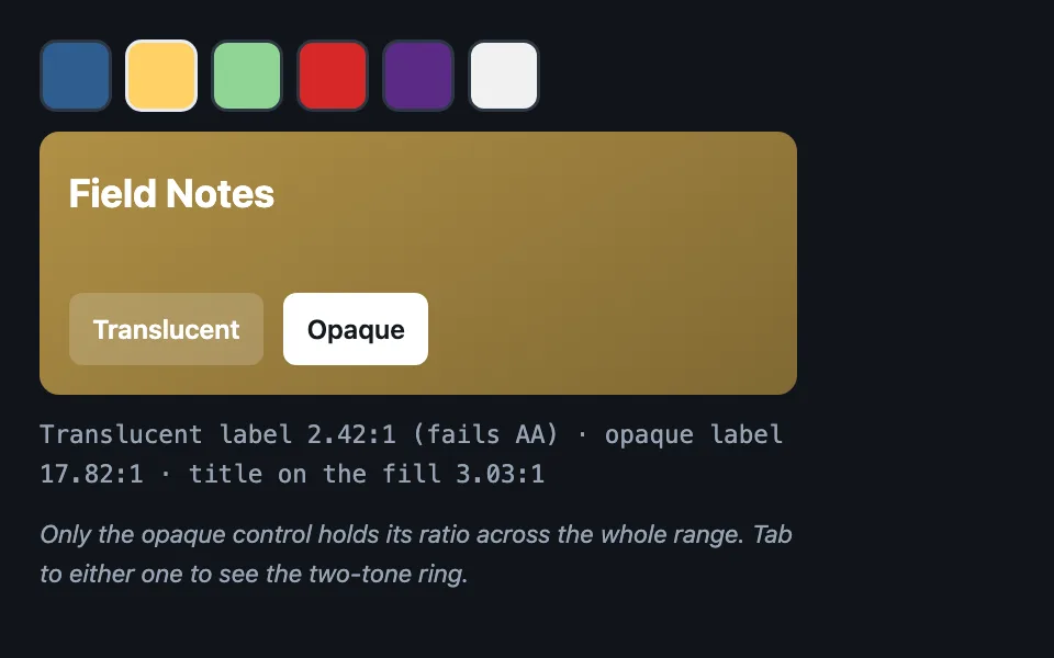
Furniture placed on a surface whose colour arrives from outside — every control opaque rather than translucent, the fill darkened as a gradient so large text clears its ratio, and a two-tone focus ring that survives both ends of the brand range.
Reach for it when building
- app or product tiles in a launcher
- a card tinted with a team or project colour
- playlist and album covers with controls on top
- category tiles coloured by taxonomy
- a integration list where each row wears its vendor colour
- any surface whose background a user or a vendor picks
<div class="cuf-demo">
	<div class="cuf-swatches" id="cuf-swatches" role="group" aria-label="Brand colour"></div>

	<div class="cuf-tile" id="cuf-tile">
		<h3 class="cuf-name">Field Notes</h3>
		<div class="cuf-controls">
			<button type="button" class="cuf-ctl cuf-translucent">Translucent</button>
			<button type="button" class="cuf-ctl cuf-opaque">Opaque</button>
		</div>
	</div>

	<p class="cuf-readout" id="cuf-readout"></p>
	<p class="cuf-hint">Only the opaque control holds its ratio across the whole range. Tab to either one to see the two-tone ring.</p>
</div>
Colors come from shared theme tokens — --surface, --ink, --border, --accent and friends — so this CSS carries no palette
of its own. Use Runnable file to copy the tokens along with it.
.cuf-demo { display: flex; flex-direction: column; gap: 0.75rem; max-width: 460px; }

.cuf-swatches { display: flex; flex-wrap: wrap; gap: 0.5rem; }

.cuf-swatch {
	width: 44px;
	height: 44px;
	border-radius: 10px;
	border: 2px solid var(--border);
	cursor: pointer;
	padding: 0;
}

.cuf-swatch[aria-pressed='true'] { border-color: var(--ink); }

/* The fill is a gradient darkening toward black rather than a flat hex: that is
   what buys the large white title its 3:1 on the pale end of the range. */
.cuf-tile {
	border-radius: 12px;
	padding: 1.1rem;
	min-height: 10rem;
	display: flex;
	flex-direction: column;
	justify-content: space-between;
	gap: 1rem;
}

.cuf-name { margin: 0; font-size: 1.5rem; color: #ffffff; }

.cuf-controls { display: flex; flex-wrap: wrap; gap: 0.75rem; }

.cuf-ctl {
	font: inherit;
	font-weight: 600;
	min-height: 44px;
	padding: 0.5rem 0.9rem;
	border-radius: 8px;
	border: none;
	cursor: pointer;
}

/* The version that fails: a translucent plate inherits the fill's luminance, so
   its label's ratio moves with whatever colour arrived. */
.cuf-translucent { background: rgba(255, 255, 255, 0.18); color: #ffffff; }

/* The version that holds: an opaque plate has its own luminance and its own
   ink, so the ratio is fixed no matter what is behind it. */
.cuf-opaque { background: #ffffff; color: #14181d; }

/* Two-tone: the inner ring reads against the control's own fill, the outer halo
   against the brand fill. A single-colour ring vanishes at one end or the other. */
.cuf-ctl:focus-visible { outline: 2px solid #14181d; outline-offset: 0; box-shadow: 0 0 0 5px #ffffff; }
.cuf-translucent:focus-visible { outline-color: #ffffff; box-shadow: 0 0 0 5px #14181d; }

.cuf-readout { margin: 0; font-family: var(--mono); font-size: 0.9375rem; color: var(--dim); }
.cuf-hint { margin: 0; font-size: 0.9375rem; color: var(--dim); font-style: italic; }
// Six stand-ins for a colour that arrives from outside: two dark, two mid, two
// pale. The pale end is where translucent controls fail.
const BRANDS = ['#2f5d8f', '#ffd166', '#8fd694', '#d62828', '#5b2a86', '#f1f1f1'];
const swatches = document.getElementById('cuf-swatches');
const tile = document.getElementById('cuf-tile');
const readout = document.getElementById('cuf-readout');
function toRgb(hex) {
return [1, 3, 5].map((start) => parseInt(hex.slice(start, start + 2), 16));
}
function luminance(rgb) {
const channels = rgb.map((value) => {
const normalised = value / 255;
return normalised <= 0.03928 ? normalised / 12.92 : Math.pow((normalised + 0.055) / 1.055, 2.4);
});
return 0.2126 * channels[0] + 0.7152 * channels[1] + 0.0722 * channels[2];
}
function ratio(first, second) {
const high = Math.max(luminance(first), luminance(second));
const low = Math.min(luminance(first), luminance(second));
return (high + 0.05) / (low + 0.05);
}
function darken(rgb, amount) {
return rgb.map((value) => Math.round(value * amount));
}
// A flat 0.9 darkening only buys white the 3:1 it needs on brands already dark
// enough to begin with -- measured as low as 1.41:1 on a near-white swatch.
// Stepping the light stop down until white actually clears the floor, rather
// than fixing it at 0.9, is what makes the guarantee true on every brand
// colour instead of just the ones the fixed number happened to work for.
function solveLightAmount(rgb) {
var amount = 0.9;
var candidate = darken(rgb, amount);
while (ratio([255, 255, 255], candidate) < 3 && amount > 0.2) {
amount = Math.max(0.2, amount - 0.01);
candidate = darken(rgb, amount);
}
return amount;
}
function choose(hex) {
const base = toRgb(hex);
const lightAmount = solveLightAmount(base);
const light = darken(base, lightAmount);
const dark = darken(base, lightAmount * 0.73);
tile.style.background = 'linear-gradient(150deg, rgb(' + light.join(',') + '), rgb(' + dark.join(',') + '))';
// Compositing 18% white over the fill is what the translucent control's
// label is actually sitting on.
const composited = light.map((value) => Math.round(value * 0.82 + 255 * 0.18));
const translucentRatio = ratio([255, 255, 255], composited);
const opaqueRatio = ratio([20, 24, 29], [255, 255, 255]);
const titleRatio = ratio([255, 255, 255], light);
readout.textContent =
'Translucent label ' + translucentRatio.toFixed(2) + ':1 ' +
(translucentRatio >= 4.5 ? '(passes)' : '(fails AA)') +
' · opaque label ' + opaqueRatio.toFixed(2) + ':1 · title on the fill ' + titleRatio.toFixed(2) + ':1';
for (const button of swatches.children) {
button.setAttribute('aria-pressed', button.dataset.hex === hex ? 'true' : 'false');
}
}
for (const hex of BRANDS) {
const swatch = document.createElement('button');
swatch.type = 'button';
swatch.className = 'cuf-swatch';
swatch.style.background = hex;
swatch.dataset.hex = hex;
swatch.setAttribute('aria-label', 'Brand colour ' + hex);
swatch.setAttribute('aria-pressed', 'false');
swatch.addEventListener('click', () => choose(hex));
swatches.append(swatch);
}
choose(BRANDS[1]);Paste this into an agent to rebuild the pattern from scratch.
Put controls on a surface whose colour you do not control. A tile wearing a vendor's brand colour, a card tinted by team, a cover that came from an upload — the fill is the variable, and everything sitting on it has to keep a predictable contrast across the whole range of colours that might arrive.
Reach for this whenever a background comes from data rather than from the palette. Walk away when the surface is a theme token; then contrast is a fixed question with a fixed answer and this machinery buys nothing.
The rule that makes it work: **nothing on the fill may be translucent.** A translucent white plate inherits the fill's luminance, so its label's ratio moves with whatever colour arrived — measured at 2.19:1 on the pale end of a real brand range, against about 17:1 for the same label on an opaque white plate. Opacity is the single most common way this fails, because it looks correct on the dark brands people test with first.
**Render the fill as a gradient darkening toward black, and solve the light stop's strength instead of fixing it at ninety per cent.** A flat 0.9 buys the white title 3:1 only on brand colours that were already dark enough to begin with — measured at 1.79:1 on a saturated yellow swatch and 1.41:1 on a near-white one, both clear failures. Step the darkening down from 0.9 in fixed increments until the title clears 3:1, floored at 0.2 so the gradient never crushes the brand into black, and set the dark stop at roughly seventy-three per cent of wherever the light stop lands. Brand colours already dark enough stay at 0.9, untouched; a saturated yellow lands around 0.69, and a near-white brand around 0.61.
**Make the focus ring two-tone.** A dark inner ring reads against the control's own opaque fill; a white outer halo reads against the brand fill behind it. One colour vanishes at one end of the range or the other, and a focus ring that disappears on yellow tiles is a keyboard trap that only some users can see.
Measure rather than eyeball, and keep the numbers in the code. Composite the translucent plate over the fill and compute the ratio of the label against that composite — that is the value someone actually reads, and it is not the one a colour picker shows you.
Let the uncontrolled colour appear in as few places as possible. One fill and one mark is plenty; a card that tints its border, its text, and its controls from the same unknown hex has four chances to fail instead of one.
The fixed colours here — white plates, near-black ink — are deliberate and do not invert with the theme, because they are furniture sitting on a surface the theme does not own. Everything outside the tile still comes from theme custom properties.