Object-shaped cards
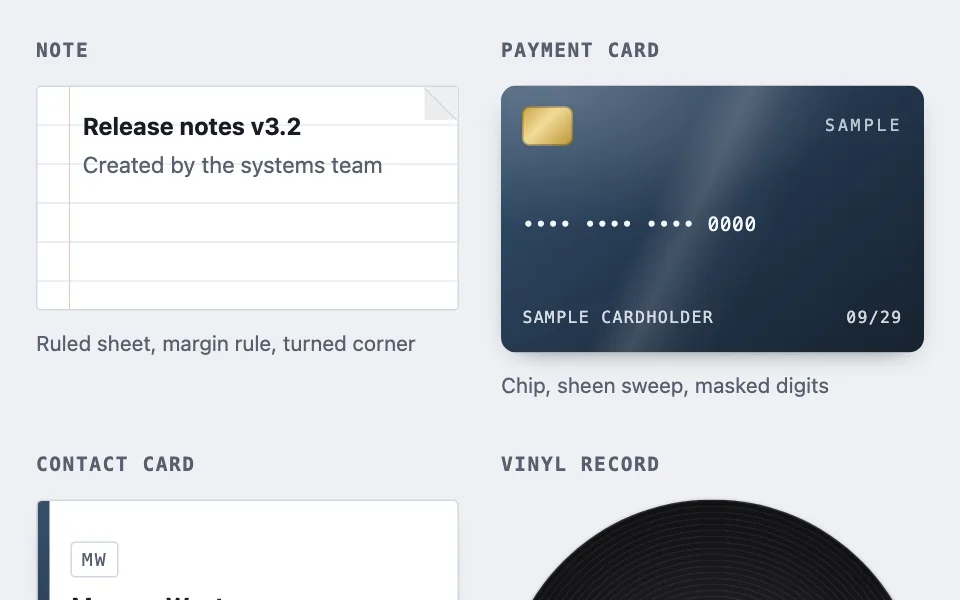
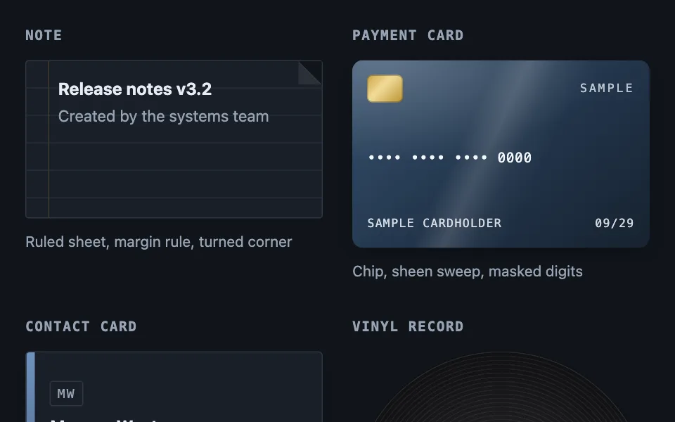
Where a record stands for a physical thing, the card is drawn as that thing. Nine variations — note, payment card, contact card, vinyl record, disc, instant print, folder, notebook, and a device shell holding live content — all in gradients, with no image assets.
Reach for it when building
- file browser
- document library
- wallet and billing screens
- address book
- media catalogue
- saved payment methods
- photo album and gallery tiles
- notebook and collection covers
<div class="osc-set">
<section class="osc-variation">
<h2 class="osc-title">Note</h2>
<div class="osc-note">
<div class="osc-note-fold" aria-hidden="true"></div>
<div class="osc-note-body">
<strong>Release notes v3.2</strong>
<span class="osc-sub">Created by the systems team</span>
</div>
</div>
<p class="osc-caption">Ruled sheet, margin rule, turned corner</p>
</section>
<section class="osc-variation">
<h2 class="osc-title">Payment card</h2>
<div class="osc-pay">
<div class="osc-pay-sheen" aria-hidden="true"></div>
<div class="osc-pay-top">
<span class="osc-chip" aria-hidden="true"></span>
<span class="osc-pay-mark">SAMPLE</span>
</div>
<span class="osc-pay-number">•••• •••• •••• 0000</span>
<div class="osc-pay-foot">
<span>SAMPLE CARDHOLDER</span>
<span>09/29</span>
</div>
</div>
<p class="osc-caption">Chip, sheen sweep, masked digits</p>
</section>
<section class="osc-variation">
<h2 class="osc-title">Contact card</h2>
<div class="osc-contact">
<div class="osc-contact-rule" aria-hidden="true"></div>
<div class="osc-contact-body">
<span class="osc-monogram" aria-hidden="true">MW</span>
<strong>Morgan West</strong>
<span class="osc-sub">Platform engineer</span>
<span class="osc-contact-meta">Nexus Labs</span>
</div>
</div>
<p class="osc-caption">Landscape stock, spine rule, monogram</p>
</section>
<section class="osc-variation">
<h2 class="osc-title">Vinyl record</h2>
<div class="osc-disc osc-vinyl">
<div class="osc-vinyl-label" aria-hidden="true"><span>Platform 2026</span></div>
<div class="osc-hole osc-hole-wide" aria-hidden="true"></div>
</div>
<p class="osc-caption">Grooves, paper label, wide spindle</p>
</section>
<section class="osc-variation">
<h2 class="osc-title">Disc</h2>
<div class="osc-disc osc-cd">
<div class="osc-cd-print" aria-hidden="true"><span>Release 3.2</span></div>
<div class="osc-cd-sheen" aria-hidden="true"></div>
<div class="osc-cd-hub" aria-hidden="true"></div>
<div class="osc-hole" aria-hidden="true"></div>
</div>
<p class="osc-caption">Edge-to-edge print, clear hub, iridescence</p>
</section>
<section class="osc-variation">
<h2 class="osc-title">Instant print</h2>
<div class="osc-print">
<div class="osc-print-image" aria-hidden="true"></div>
<span class="osc-print-caption">Harbour, October</span>
<div class="osc-print-gloss" aria-hidden="true"></div>
</div>
<p class="osc-caption">Deep bottom margin, tilt, gloss sweep</p>
</section>
<section class="osc-variation">
<h2 class="osc-title">Folder</h2>
<div class="osc-folder">
<div class="osc-folder-tab" aria-hidden="true"></div>
<div class="osc-folder-body">
<strong>Field recordings</strong>
<span class="osc-sub">31 items</span>
</div>
</div>
<p class="osc-caption">Cut tab, fused seam, asymmetric radius</p>
</section>
<section class="osc-variation">
<h2 class="osc-title">Notebook</h2>
<div class="osc-book">
<div class="osc-book-spine" aria-hidden="true"></div>
<div class="osc-book-body">
<strong>Reading log</strong>
<span class="osc-sub">2026</span>
</div>
<div class="osc-book-ribbon" aria-hidden="true"></div>
</div>
<p class="osc-caption">Page stack, stitched spine, ribbon tail</p>
</section>
<section class="osc-variation">
<h2 class="osc-title">Device shell</h2>
<div class="osc-device">
<div class="osc-device-bezel">
<div class="osc-device-screen">
<strong>No. 025</strong>
<span class="osc-sub">Electric · 0.4 m · 6.0 kg</span>
</div>
</div>
<div class="osc-device-knobs" aria-hidden="true">
<span class="osc-device-knob"></span>
<span class="osc-device-knob"></span>
</div>
</div>
<p class="osc-caption">Moulded body, recessed bezel, lit panel — a container, not a record</p>
</section>
</div>Colors come from shared theme tokens — --surface, --ink, --border, --accent and friends — so this CSS carries no palette
of its own. Use Runnable file to copy the tokens along with it.
.osc-set {
	display: grid;
	grid-template-columns: repeat(auto-fill, minmax(210px, 1fr));
	gap: 2rem 1.75rem;
}

.osc-variation { margin: 0; }

.osc-title {
	margin: 0 0 0.75rem;
	font-family: var(--mono);
	font-size: 0.8125rem;
	font-weight: 600;
	letter-spacing: 0.08em;
	text-transform: uppercase;
	color: var(--dim);
}

.osc-sub { color: var(--dim); font-size: 0.9375rem; }

.osc-caption {
	margin: 0.7rem 0 0;
	font-size: 0.875rem;
	color: var(--dim);
}

/* ---- Note: rules and a margin stripe, both gradients on one element ---- */
.osc-note {
	position: relative;
	height: 150px;
	border: 1px solid var(--border);
	border-radius: 3px;
	background-color: var(--surface);
	background-image:
		repeating-linear-gradient(
			to bottom,
			transparent 0 25px,
			color-mix(in srgb, var(--border) 45%, transparent) 25px 26px
		),
		linear-gradient(
			to right,
			transparent 0 21px,
			color-mix(in srgb, var(--signal) 30%, transparent) 21px 22px,
			transparent 22px
		);
}

.osc-note-body {
	display: flex;
	flex-direction: column;
	padding: 14px 34px 12px 30px;
}

/* Page colour, a 1px line exactly on the diagonal, then the flap over the gap. */
.osc-note-fold {
	position: absolute;
	top: 0;
	right: 0;
	width: 22px;
	height: 22px;
	background: linear-gradient(
		to bottom left,
		var(--ground) 0 50%,
		var(--border) 50% calc(50% + 1px),
		color-mix(in srgb, var(--surface) 92%, var(--ink)) calc(50% + 1px) 100%
	);
}

/* ---- Payment card: ISO/IEC 7810 ID-1 proportions ---- */
.osc-pay {
	position: relative;
	overflow: hidden;
	aspect-ratio: 1.586;
	display: flex;
	flex-direction: column;
	justify-content: space-between;
	padding: 0.9rem;
	border-radius: 10px;
	color: #f4f7fb;
	background:
		radial-gradient(120% 90% at 12% 0%, rgba(255, 255, 255, 0.22), transparent 60%),
		linear-gradient(140deg, #35506d 0%, #22344a 55%, #16222f 100%);
	box-shadow: 0 6px 18px -12px rgba(0, 0, 0, 0.8);
}

/* A single wide highlight sweep sells the laminate without a texture file. */
.osc-pay-sheen {
	position: absolute;
	inset: 0;
	pointer-events: none;
	background: linear-gradient(
		115deg,
		transparent 0 38%,
		rgba(255, 255, 255, 0.14) 46%,
		rgba(255, 255, 255, 0.03) 54%,
		transparent 62%
	);
}

.osc-pay-top,
.osc-pay-foot {
	position: relative;
	display: flex;
	align-items: center;
	justify-content: space-between;
	gap: 0.5rem;
}

.osc-pay-mark {
	font-family: var(--mono);
	font-size: 0.6875rem;
	letter-spacing: 0.18em;
	opacity: 0.75;
}

.osc-chip {
	width: 34px;
	height: 26px;
	border-radius: 5px;
	background: linear-gradient(135deg, #c9a23f 0%, #f2dc9a 42%, #b9922f 100%);
	box-shadow: inset 0 0 0 1px rgba(0, 0, 0, 0.25);
}

.osc-pay-number {
	position: relative;
	font-family: var(--mono);
	/* Sized so the full masked group stays on one line in the narrowest track. */
	font-size: 0.8125rem;
	letter-spacing: 0.03em;
	white-space: nowrap;
}

.osc-pay-foot {
	font-family: var(--mono);
	font-size: 0.6875rem;
	letter-spacing: 0.08em;
	opacity: 0.85;
}

/* ---- Contact card: landscape stock with a printed spine rule ---- */
.osc-contact {
	position: relative;
	overflow: hidden;
	aspect-ratio: 1.75;
	display: flex;
	border: 1px solid var(--border);
	border-radius: 4px;
	background: var(--surface);
	box-shadow: 0 4px 14px -12px rgba(0, 0, 0, 0.7);
}

.osc-contact-rule {
	flex: 0 0 8px;
	background: linear-gradient(
		to bottom,
		var(--accent) 0%,
		color-mix(in srgb, var(--accent) 70%, black) 100%
	);
}

.osc-contact-body {
	display: flex;
	flex-direction: column;
	justify-content: center;
	gap: 1px;
	padding: 0.75rem 0.9rem;
	min-width: 0;
}

.osc-monogram {
	align-self: flex-start;
	margin-bottom: 0.35rem;
	padding: 0.1rem 0.4rem;
	border: 1px solid var(--border);
	border-radius: 3px;
	font-family: var(--mono);
	font-size: 0.75rem;
	letter-spacing: 0.1em;
	color: var(--dim);
}

.osc-contact-meta {
	margin-top: 0.2rem;
	font-family: var(--mono);
	font-size: 0.75rem;
	letter-spacing: 0.04em;
	color: var(--dim);
}

/* ---- Discs ---- */
.osc-disc {
	position: relative;
	aspect-ratio: 1;
	border-radius: 50%;
	box-shadow: 0 1px 3px rgba(0, 0, 0, 0.4), inset 0 0 0 1px rgba(255, 255, 255, 0.06);
}

/* The spindle hole is painted in the page colour, so it reads as a hole rather
   than a dot and re-themes for free. */
.osc-hole {
	position: absolute;
	inset: 43.75%;
	border-radius: 50%;
	background: var(--ground);
	box-shadow: 0 0 0 1px rgba(0, 0, 0, 0.35);
}

.osc-hole-wide { inset: 47.5%; }

.osc-vinyl {
	background:
		repeating-radial-gradient(
			circle at 50% 50%,
			rgba(255, 255, 255, 0.05) 0,
			rgba(255, 255, 255, 0.05) 1px,
			rgba(0, 0, 0, 0) 1px,
			rgba(0, 0, 0, 0) 4px
		),
		conic-gradient(
			from 210deg,
			rgba(255, 255, 255, 0.12),
			rgba(255, 255, 255, 0) 25%,
			rgba(255, 255, 255, 0) 55%,
			rgba(255, 255, 255, 0.09) 72%,
			rgba(255, 255, 255, 0) 92%
		),
		radial-gradient(circle at 50% 50%, #2a2a2e 0%, #111113 70%, #08080a 100%);
}

.osc-vinyl-label {
	position: absolute;
	inset: 30%;
	border-radius: 50%;
	display: grid;
	/* Sits above the spindle rather than centred on it: a centred label reads
	   straight through the hole. */
	align-content: start;
	justify-items: center;
	/* The label spans 30%-70% of the disc and the spindle sits dead centre, so
	   the text has to live in the band above it. */
	padding: 6% 12% 0;
	text-align: center;
	background: radial-gradient(circle at 50% 30%, #d8c9a8 0%, #c2ae86 100%);
	box-shadow: inset 0 0 0 1px rgba(0, 0, 0, 0.35);
	color: #40331d;
	font-size: 0.625rem;
	font-weight: 650;
	line-height: 1.15;
}

/* A disc is printed edge to edge, so the art fills the face and the clear hub
   sits on top of it rather than replacing it with a label. */
.osc-cd {
	background: linear-gradient(140deg, #3a6ea5 0%, #1d3557 60%, #0d1b2a 100%);
	overflow: hidden;
}

.osc-cd-print {
	position: absolute;
	inset: 0;
	display: grid;
	place-items: start center;
	padding-top: 12%;
	color: #eef3fa;
	font-size: 0.75rem;
	font-weight: 650;
	letter-spacing: 0.02em;
}

.osc-cd-sheen {
	position: absolute;
	inset: 0;
	border-radius: 50%;
	pointer-events: none;
	background: conic-gradient(
		from 200deg,
		rgba(255, 255, 255, 0.3),
		rgba(255, 255, 255, 0) 16%,
		rgba(255, 255, 255, 0) 44%,
		rgba(255, 255, 255, 0.16) 58%,
		rgba(255, 255, 255, 0) 76%,
		rgba(255, 255, 255, 0.08) 96%,
		rgba(255, 255, 255, 0.3)
	);
	box-shadow: inset 0 0 0 1px rgba(255, 255, 255, 0.18), inset 0 0 14px rgba(0, 0, 0, 0.3);
}

/* Kept low-alpha on purpose: it is clear plastic, so the print stays visible
   through it. At full opacity it reads as a sticker punched through the art. */
.osc-cd-hub {
	position: absolute;
	inset: 32%;
	border-radius: 50%;
	pointer-events: none;
	background: conic-gradient(
		from 30deg,
		rgba(255, 255, 255, 0.26),
		rgba(190, 220, 255, 0.1) 22%,
		rgba(255, 255, 255, 0.22) 48%,
		rgba(225, 195, 255, 0.1) 72%,
		rgba(255, 255, 255, 0.26)
	);
	box-shadow: inset 0 0 0 1px rgba(255, 255, 255, 0.28), 0 0 0 1px rgba(0, 0, 0, 0.25);
}

/* ---- Instant print: the whole object is asymmetric padding ---- */
.osc-print {
	position: relative;
	padding: 6.5% 6.5% 24%;
	background: #f6f5f1;
	border-radius: 2px;
	rotate: -2deg;
	box-shadow:
		0 1px 1px rgba(0, 0, 0, 0.16),
		0 6px 12px -6px rgba(0, 0, 0, 0.35),
		0 14px 28px -18px rgba(0, 0, 0, 0.5);
}

.osc-print-image {
	aspect-ratio: 1;
	background: linear-gradient(160deg, #7fa8c9 0%, #3d6285 55%, #1d2f42 100%);
	box-shadow: inset 0 0 0 1px rgba(0, 0, 0, 0.25);
}

/* The caption sits in the deep margin, so it is fixed dark on fixed paper
   rather than theme ink — the print's stock is a material, not a surface. */
.osc-print-caption {
	position: absolute;
	left: 0;
	right: 0;
	bottom: 7%;
	text-align: center;
	color: #4a4742;
	font-size: 0.8125rem;
}

.osc-print-gloss {
	position: absolute;
	inset: 0;
	pointer-events: none;
	border-radius: 2px;
	background: linear-gradient(
		118deg,
		rgba(255, 255, 255, 0.42) 0 18%,
		rgba(255, 255, 255, 0) 38%,
		rgba(255, 255, 255, 0) 100%
	);
	box-shadow: inset 0 0 0 1px rgba(0, 0, 0, 0.08);
}

/* ---- Folder: the tab fuses to the body by sharing its fill ---- */
.osc-folder { position: relative; }

/* No bottom border and the same fill as the body, so the seam between them
   disappears and the two read as one cut piece of card. */
.osc-folder-tab {
	width: 46%;
	height: 14px;
	background: color-mix(in srgb, var(--signal) 22%, var(--surface));
	border: 1px solid var(--border);
	border-bottom: none;
	border-radius: 6px 0 0 0;
	clip-path: polygon(0 0, calc(100% - 10px) 0, 100% 100%, 0 100%);
}

/* Square inside corner under the tab; rounded everywhere else. */
.osc-folder-body {
	display: flex;
	flex-direction: column;
	min-height: 108px;
	padding: 0.85rem 0.9rem;
	background: color-mix(in srgb, var(--signal) 22%, var(--surface));
	border: 1px solid var(--border);
	border-radius: 0 8px 8px 8px;
}

/* ---- Notebook: a stack of pages drawn entirely in offset shadows ---- */
.osc-book {
	position: relative;
	display: flex;
	min-height: 140px;
	background: linear-gradient(150deg, #3f5c78 0%, #2b4159 60%, #1d2c3d 100%);
	/* Square at the bound edge, rounded at the fore-edge. */
	border-radius: 4px 10px 10px 4px;
	/* Each layer is one more page showing past the cover. */
	box-shadow:
		2px 0 0 -1px #e8e4da,
		4px 0 0 -1px #d8d3c7,
		6px 0 0 -1px #c9c3b5,
		8px 2px 10px -6px rgba(0, 0, 0, 0.55);
}

.osc-book-spine {
	width: 16px;
	flex: 0 0 auto;
	border-radius: 4px 0 0 4px;
	background:
		repeating-linear-gradient(
			to bottom,
			transparent 0 9px,
			rgba(255, 255, 255, 0.32) 9px 15px
		),
		linear-gradient(to right, rgba(0, 0, 0, 0.45), rgba(0, 0, 0, 0.1));
}

.osc-book-body {
	display: flex;
	flex-direction: column;
	padding: 0.85rem 0.9rem;
	color: #eef3fa;
}

.osc-book-body .osc-sub { color: rgba(238, 243, 250, 0.72); }

.osc-book-ribbon {
	position: absolute;
	top: 0;
	right: 22px;
	width: 10px;
	height: 46px;
	background: linear-gradient(to bottom, #b4553f, #8d3f2d);
	clip-path: polygon(0 0, 100% 0, 100% 100%, 50% calc(100% - 7px), 0 100%);
}
/* ---------------------------------------------------------------
   Ninth variation - a casing around live content, rather than a
   record drawn as a thing. Its palette is fixed in both themes on
   purpose; only what sits inside the screen is themed.
   --------------------------------------------------------------- */

.osc-device {
	--dev-body: #c8ccd4;
	--dev-edge: #99a0ac;
	--dev-bezel: #2b2f36;
	--dev-screen: #0f1b16;
	--dev-ink: #bff3d2;
	background: linear-gradient(150deg, var(--dev-body), var(--dev-edge));
	border-radius: 18px;
	padding: 0.9rem;
	box-shadow: inset 0 2px 0 rgba(255, 255, 255, 0.5), inset 0 -3px 0 rgba(0, 0, 0, 0.28);
}

.osc-device-bezel {
	background: var(--dev-bezel);
	border-radius: 10px;
	padding: 0.7rem;
	box-shadow: inset 0 3px 8px rgba(0, 0, 0, 0.6);
}

.osc-device-screen {
	position: relative;
	display: flex;
	flex-direction: column;
	gap: 0.15rem;
	background: var(--dev-screen);
	color: var(--dev-ink);
	border-radius: 6px;
	padding: 0.75rem;
	font-family: var(--mono);
	font-size: 0.9375rem;
	overflow: hidden;
}

/* Scanlines and glass sheen are one pseudo-element, so the screen's own
   content never has to know it is behind glass. */
.osc-device-screen::after {
	content: '';
	position: absolute;
	inset: 0;
	pointer-events: none;
	background:
		linear-gradient(160deg, rgba(255, 255, 255, 0.14), transparent 42%),
		repeating-linear-gradient(to bottom, rgba(255, 255, 255, 0.06) 0 1px, transparent 1px 3px);
}

.osc-device-screen .osc-sub { color: color-mix(in srgb, var(--dev-ink) 70%, #000000); }

.osc-device-knobs { display: flex; gap: 0.5rem; margin-top: 0.7rem; }

.osc-device-knob {
	width: 24px;
	height: 24px;
	border-radius: 50%;
	background: radial-gradient(circle at 30% 30%, #eef0f3, #8b929d);
}
Paste this into an agent to rebuild the pattern from scratch.
Build a set of card variations where each one is drawn as the physical object its record stands for, using only CSS gradients, shadows and clip paths — no images, no icon font, no sprite sheet. Ship eight: a note, a payment card, a contact card, a vinyl record, a disc, an instant print, a folder, and a notebook.
Use it when a listing is a wall of identical rectangles and an icon is doing all the work of telling one kind from another. It suits file browsers, document libraries, wallet and billing screens, address books, and media catalogues. It is presentation only: every card stays an ordinary link or button, keyboard reachable, with the affordance on the wrapper. Reach for it when the kinds are few and stable. Skip it when a listing holds a dozen types, because a dozen invented objects is a vocabulary nobody learns, and skip it for anything with no agreed physical form — a spreadsheet, an image and a text file are not the same object, and inventing one shape for all of them states something untrue about the record.
Lay the variations out in a grid of auto-filled tracks with a 210px minimum, each under a small uppercase monospace heading, each with a caption naming the technique.
**Note.** A sheet at around 150px tall with only 3px of corner radius, so it reads as paper rather than as a card. Draw the ruling and the margin stripe as two layered gradients on one element: a repeating horizontal rule set, plus a single vertical line about 21px in. Pad the body so text clears the margin stripe on the left and the fold on the right. Add a turned-down corner as one 22px square in the top right filled with a three-stop diagonal gradient — page colour for the cut-away half, a 1px border line exactly on the diagonal, then a slightly darkened surface for the flap lying over the gap.
**Payment card.** Use the real ID-1 proportion, an aspect ratio of 1.586, so it reads as a card at any width. Fill it with a dark diagonal gradient plus a soft radial highlight in the top-left corner, and lay one wide angled sheen band over the whole face to suggest laminate. Draw the chip as a small rounded rectangle with a metallic three-stop gradient and an inset hairline. Set the number in the monospace face with generous letter-spacing, masked to the last four digits only. Never render a plausible complete number, and never a real one: mask everything but the final group, and keep the holder name and expiry obviously invented.
**Contact card.** Landscape stock at roughly 1.75, a printed spine rule down the left edge as a narrow vertical gradient bar, and a stack of name, role and company. Give it a small bordered monogram set in monospace rather than an avatar, so the card needs no image and no loading state.
**Vinyl record.** A circle carrying three stacked backgrounds in one declaration: a repeating radial gradient at a 4px period for the grooves, a conic sweep for the sheen, and a dark radial base. Inset a paper label at 30% with its own warm radial fill and an inset hairline. The spindle hole is wider than a disc's — inset it to about 47.5%.
**Disc.** The face is printed edge to edge, which is exactly why it suits a thumbnail: the art fills the whole circle instead of shrinking into a small label. Lay a conic sheen over the art for the polycarbonate, then a clear hub ring inset to 32% built from a low-alpha iridescent conic gradient. Keep that ring translucent — at full opacity it stops reading as clear plastic and starts reading as a sticker punched through the artwork. Inset the spindle hole to about 43.75%.
**Instant print.** The entire object is asymmetric padding: pad the frame roughly 6.5% on three sides and 24% on the bottom, and the deep lower margin does all the work of saying what this is. Give the image area an aspect ratio of 1 and a hairline inset shadow so it sits *in* the paper rather than on it. Tilt the whole thing about -2deg and lift it with three stacked shadows at increasing blur and offset — one tight contact shadow, one mid, one wide and soft. A single angled gloss band across the face finishes the plastic. Set the caption in the bottom margin in a fixed dark ink on fixed paper stock rather than theme tokens: the print's material is not one of your surfaces, and re-theming it would make it stop reading as a print.
**Folder.** The cheapest variation here and the most recognisable. Draw a 14px tab above the body, give it the *same fill* as the body and no bottom border, and the seam between them vanishes so the two read as one cut piece of card. Slant the tab's trailing edge with a clip-path taking the top-right corner in about 10px. Then make the body's corner radius asymmetric — square at the top left, rounded on the other three — so the inside corner under the tab stays sharp the way a real folder's does. A rounded corner there is the detail that breaks the illusion.
**Notebook.** Asymmetric radius again, and for the same reason: square at the bound edge, rounded at the fore-edge. Draw the page stack entirely in offset box-shadows — three layers stepping 2px right at slightly darker paper tones, each one reading as another page showing past the cover — then a fourth soft shadow for the lift. The spine is a narrow column with a repeating linear gradient for the stitching, over a dark left-to-right gradient for the fold's shade. A ribbon at the top edge with a notched tail, cut by a clip-path that pulls the bottom centre up about 7px, is the one flourish worth keeping; it costs four lines and it is the thing that makes people recognise it immediately.
**The ninth variation is a container, not a record.** The first eight draw a record as the thing it stands for. A device shell inverts that: the casing is furniture, and live interactive content sits inside its screen. Reach for it when the frame is part of what the product is — a handheld reference, a console, an instrument — and never for a list, where nine casings mean nine frames competing with the data.
Ship the casing palette as custom properties set once on its root, so every sub-part reads them with no props threaded through and one set of screen components can sit inside several casings.
Fix the casing colours in both themes on purpose and theme only what is inside the screen. A moulded plastic body that inverts with the page stops reading as an object. Leave a comment saying so, or the next person will "fix" it.
**Hide the casing from assistive tech, never the screen it holds.** The knobs are pure decoration and take `aria-hidden`. The sheen and the scanlines are a pseudo-element and were never in the accessibility tree to begin with, so they need no attribute at all. The bezel is the one wrapper that has to stay unhidden: it is also the screen's own container, and `aria-hidden` on an ancestor hides every descendant regardless of that descendant's own attributes, so hiding the bezel takes the live content inside it — the model number, the spec line — with it.
Paint both spindle holes in the page background colour rather than a fixed dark value, so each reads as a hole rather than a dot and re-themes for free. Take every surface, border and accent from theme custom properties so the whole set recolours with the palette and there is no asset library to keep in sync; the only fixed colours should be the ones that describe a material rather than the interface — the metal of a chip, the wax of a record, the paper of a label. Every variation must read correctly in light and dark themes.