Ledge-press buttons
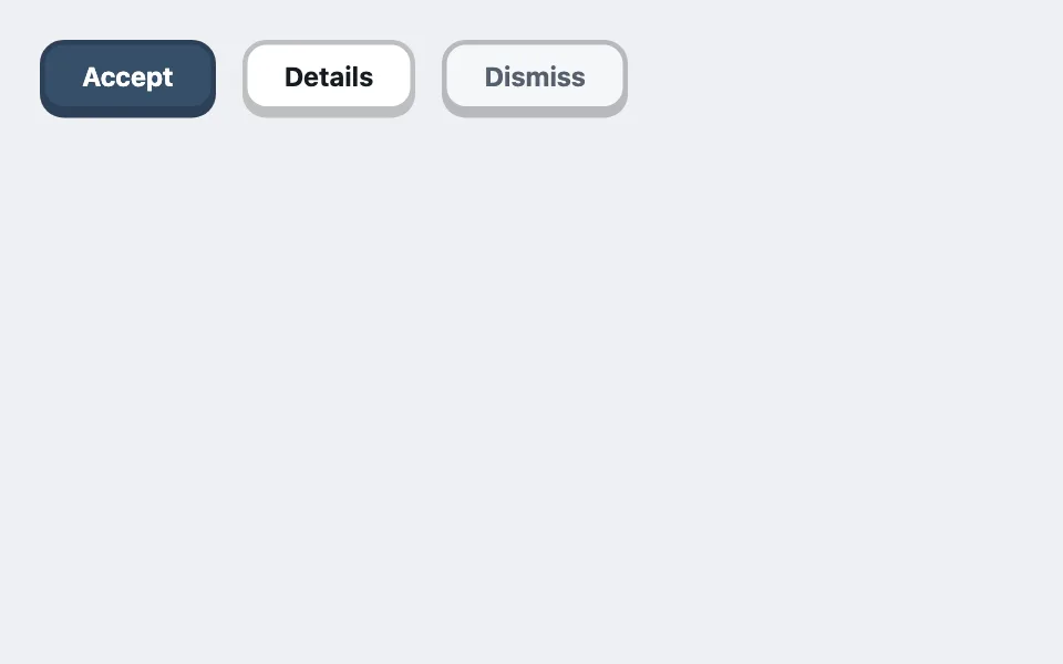
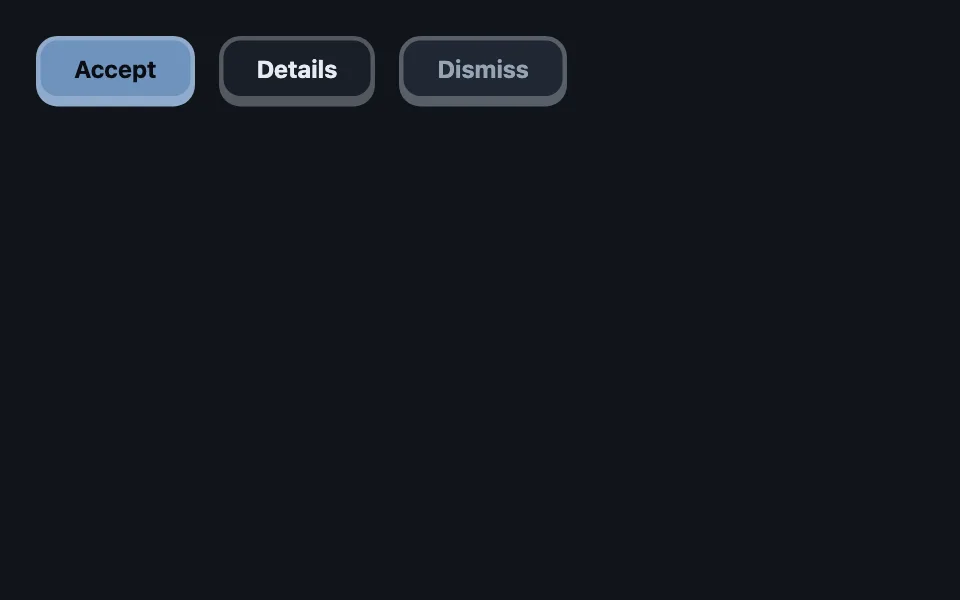
Buttons that sit proud of the panel on a solid unblurred ledge shadow and travel down exactly onto it when pressed — with the ledge tint mixed toward ink so the mechanic flips correctly between themes on its own.
Reach for it when building
- primary calls to action in playful products
- game and quiz interfaces
- kiosk and touch-first screens
- marketing page buttons with personality
- toolbar actions in creative tools
<div class="lpb-row">
	<button type="button" class="lpb lpb-accent">Accept</button>
	<button type="button" class="lpb">Details</button>
	<button type="button" class="lpb lpb-quiet">Dismiss</button>
</div>
Colors come from shared theme tokens — --surface, --ink, --border, --accent and friends — so this CSS carries no palette
of its own. Use Runnable file to copy the tokens along with it.
.lpb-row {
	display: flex;
	gap: 1rem;
	flex-wrap: wrap;
	/* Room for the ledge below the buttons. */
	padding-bottom: 6px;
}

.lpb {
	--lpb-press: 4px;
	--lpb-bg: var(--surface);
	/* Mixing toward ink is the trick that makes one rule serve both themes:
	   ink is dark on light (edge darkens) and light on dark (edge lightens
	   into a lit bezel), which is exactly what each theme needs. */
	--lpb-edge: color-mix(in srgb, var(--lpb-bg) 72%, var(--ink));
	font-family: var(--sans);
	font-size: 1rem;
	font-weight: 700;
	color: var(--ink);
	background: var(--lpb-bg);
	border: 3px solid var(--lpb-edge);
	border-radius: 0.9rem;
	padding: 0.6rem 1.4rem;
	cursor: pointer;
	box-shadow: 0 var(--lpb-press) 0 var(--lpb-edge);
	transition:
		transform 0.08s ease,
		box-shadow 0.08s ease,
		filter 0.1s ease;
}

.lpb:hover {
	filter: brightness(1.08);
	transform: translateY(-1px);
	box-shadow: 0 calc(var(--lpb-press) + 1px) 0 var(--lpb-edge);
}

/* The press: travel down exactly the ledge's height, onto it. */
.lpb:active {
	transform: translateY(var(--lpb-press));
	box-shadow: 0 0 0 var(--lpb-edge);
}

.lpb-accent {
	--lpb-bg: var(--accent);
	color: var(--accent-ink);
}

.lpb-quiet {
	--lpb-bg: var(--surface-2);
	color: var(--dim);
}
Paste this into an agent to rebuild the pattern from scratch.
Build buttons that read as physical hardware sitting proud of the panel, pressed by traveling down onto their own shadow.
The rest state casts a solid, unblurred ledge: `box-shadow: 0 4px 0 <edge>` where the edge color is the button's own background mixed about 28% toward the theme's ink token, and the 3px border uses the same edge color. Mixing toward ink — not toward black — is the load-bearing decision: ink is dark in a light theme, so the edge darkens like a shadow should, and ink is light in a dark theme, so the edge lightens into a lit bezel, which is what keeps the edge visible against a dark panel. One expression, both themes correct.
The press mechanic is exact, not decorative: `:active` translates the button down by precisely the ledge height (`translateY(var(--press))`) while the ledge collapses to zero (`box-shadow: 0 0 0`), so the button lands on the spot its shadow occupied. Hover lifts 1px and grows the ledge by 1px. Keep the transitions fast — 80ms for transform and shadow — because a slow press reads as animation, not mechanism.
Parameterize everything through two custom properties on the button — `--press` (the depth) and `--bg` — with the edge derived from them. Variants then set only `--bg`: an accent-filled primary with the accent's contrast ink, a neutral surface default, a quiet sunken variant. The mechanic re-skins for free.
Reserve room below the row (padding equal to the press depth) so the ledge never clips against the container, and keep a visible `:focus-visible` outline — the ledge is not a focus indicator.
Every color comes from theme custom properties, and the ledge must stay visible against the panel in both light and dark themes.