Linked month bars
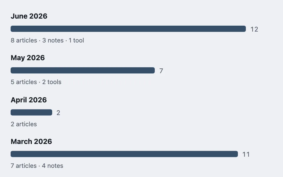
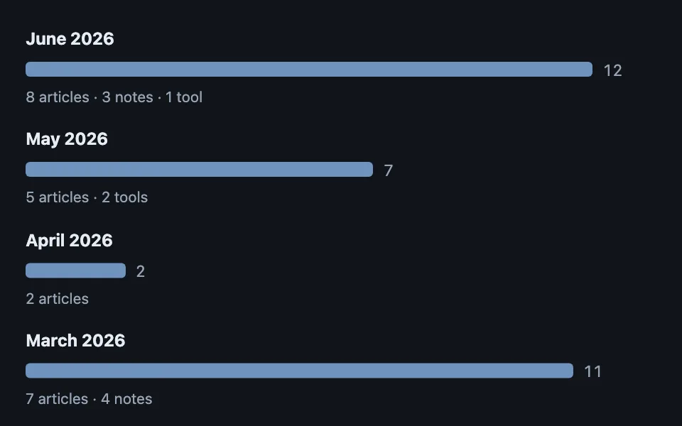
A month-by-month volume timeline built from plain divs where every aggregate row links to the filtered view that produced it — the bar shows the shape, the link does the work.
Reach for it when building
- archive pages grouped by month
- activity history overviews
- usage reports with drill-down
- changelog volume by release window
- content calendars in review tools
<div class="lmb-list">
<div class="lmb-row">
<a href="#search-2026-06">June 2026</a>
<div class="lmb-barline">
<div class="lmb-bar" style="width: 100%;"></div>
<span class="lmb-count">12</span>
</div>
<p class="lmb-cats">8 articles · 3 notes · 1 tool</p>
</div>
<div class="lmb-row">
<a href="#search-2026-05">May 2026</a>
<div class="lmb-barline">
<div class="lmb-bar" style="width: 58.3%;"></div>
<span class="lmb-count">7</span>
</div>
<p class="lmb-cats">5 articles · 2 tools</p>
</div>
<div class="lmb-row">
<a href="#search-2026-04">April 2026</a>
<div class="lmb-barline">
<div class="lmb-bar" style="width: 16.7%;"></div>
<span class="lmb-count">2</span>
</div>
<p class="lmb-cats">2 articles</p>
</div>
<div class="lmb-row">
<a href="#search-2026-03">March 2026</a>
<div class="lmb-barline">
<div class="lmb-bar" style="width: 91.7%;"></div>
<span class="lmb-count">11</span>
</div>
<p class="lmb-cats">7 articles · 4 notes</p>
</div>
</div>Colors come from shared theme tokens — --surface, --ink, --border, --accent and friends — so this CSS carries no palette
of its own. Use Runnable file to copy the tokens along with it.
.lmb-list { max-width: 560px; display: flex; flex-direction: column; gap: 1rem; }

.lmb-row a {
	font-weight: 700;
	color: var(--ink);
	text-decoration: none;
}

.lmb-row a:hover { color: var(--accent); text-decoration: underline; }

.lmb-barline {
	display: flex;
	align-items: center;
	gap: 0.6rem;
	margin: 0.2rem 0;
}

/* The count sits beside the bar, never inside it — a short bar has no room
   for a label, and moving the label in and out by width is visual noise. */
.lmb-bar {
	height: 14px;
	border-radius: 4px;
	background: var(--accent);
	min-width: 2px;
}

.lmb-count {
	font-size: 0.9375rem;
	color: var(--dim);
	font-variant-numeric: tabular-nums;
}

.lmb-cats {
	margin: 0;
	font-size: 0.875rem;
	color: var(--dim);
}
Paste this into an agent to rebuild the pattern from scratch.
Build a month-by-month volume timeline with no chart library: each bucket is a heading link, a horizontal bar, a count, and a breakdown line, all plain elements.
The rule that makes the pattern worth having: every aggregate row links to the filtered view that produced its number. The month heading is a real anchor into the listing filtered to that date range — the bar answers "what does the shape look like" and the link answers "show me those" — so the timeline is navigation wearing a chart's clothes, not a dead-end picture. If a row cannot link anywhere, question whether the aggregate belongs on the page.
Bar widths are percentages of the maximum bucket (`count / maxCount * 100`), floored with a `min-width: 2px` so a month with one item still renders a visible sliver rather than nothing — an invisible bar next to a real heading reads as a rendering bug.
Put the count beside the bar in dimmed tabular figures, never inside it: short bars have no room for an interior label, and switching label position by bar width is visual noise. Under the bar line, a third dimmed line breaks the count down per category joined with middle dots ("8 articles · 3 notes · 1 tool"), which keeps the categorical detail available without a stacked-bar's legend tax.
Layout is a flex column of rows with consistent gaps; the bar line is a flex row with the bar and count. No axes, no gridlines, no ticks — the counts are printed, so axis furniture would only restate them.
Every color comes from theme custom properties, and the bars have to hold their contrast against the ground in both light and dark themes.