Guarded control
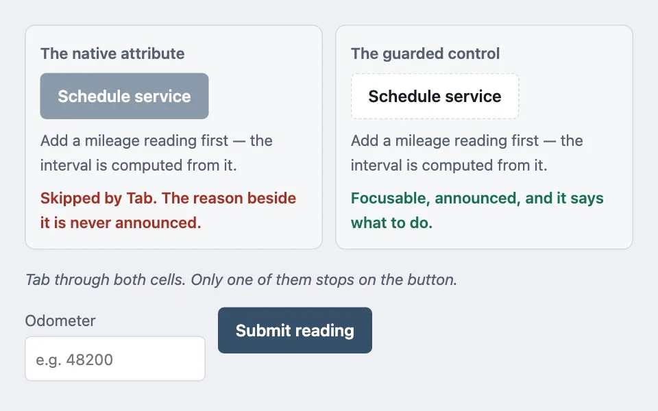
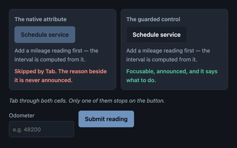
A control blocked by a precondition someone can fix stays in the tab order, carries the reason as real text, and refuses the action in its handler — because the native disabled attribute takes the control and its explanation out of reach together.
Reach for it when building
- a save button waiting on a required field
- an action that needs a higher permission level
- a submit blocked until a file finishes uploading
- a feature that needs a setting turned on first
- a schedule button waiting on a reading or measurement
- an export gated behind a plan or quota
- a publish button waiting on a review
<div class="gc-demo">
	<div class="gc-grid">
		<section class="gc-cell">
			<h3 class="gc-h">The native attribute</h3>
			<button type="button" class="gc-btn" disabled>Schedule service</button>
			<p class="gc-why">Add a mileage reading first — the interval is computed from it.</p>
			<p class="gc-verdict gc-bad">Skipped by Tab. The reason beside it is never announced.</p>
		</section>

		<section class="gc-cell">
			<h3 class="gc-h">The guarded control</h3>
			<button type="button" class="gc-btn" id="gc-guarded" aria-disabled="true" aria-describedby="gc-reason">Schedule service</button>
			<p class="gc-why" id="gc-reason">Add a mileage reading first — the interval is computed from it.</p>
			<p class="gc-verdict gc-good">Focusable, announced, and it says what to do.</p>
		</section>
	</div>

	<p class="gc-hint">Tab through both cells. Only one of them stops on the button.</p>

	<div class="gc-fix">
		<label class="gc-field">
			<span>Odometer</span>
			<input type="number" id="gc-miles" inputmode="numeric" placeholder="e.g. 48200" />
		</label>
		<button type="button" class="gc-btn gc-busy-btn" id="gc-busy">Submit reading</button>
	</div>

	<p class="gc-log" id="gc-log" role="status"></p>
</div>

<div class="gc-shop">
	<div class="gc-shop-head">
		<h3 class="gc-h">Every "can't" gets its own look</h3>
		<label class="gc-shop-wallet">
			<span>Wallet</span>
			<input type="number" id="gc-wallet" inputmode="numeric" value="220" min="0" step="10" />
			<span>g</span>
		</label>
	</div>

	<ul class="gc-shop-list">
		<li class="gc-shop-row">
			<div class="gc-shop-text">
				<span class="gc-shop-name">Iron Shield</span>
				<span class="gc-shop-reason" id="gc-shop-reason-1">Already in your inventory.</span>
			</div>
			<button type="button" class="gc-shop-btn" id="gc-shop-owned-btn" aria-disabled="true" aria-describedby="gc-shop-reason-1">Owned</button>
		</li>
		<li class="gc-shop-row">
			<div class="gc-shop-text">
				<span class="gc-shop-name">Twin Blades</span>
				<span class="gc-shop-reason" id="gc-shop-reason-2">This is your equipped weapon.</span>
			</div>
			<button type="button" class="gc-shop-btn" id="gc-shop-equipped-btn" aria-disabled="true" aria-describedby="gc-shop-reason-2">Equipped</button>
		</li>
		<li class="gc-shop-row">
			<div class="gc-shop-text">
				<span class="gc-shop-name">Health Potion</span>
				<span class="gc-shop-reason" id="gc-shop-reason-3">Carrying the most you can hold — 9 of 9.</span>
			</div>
			<button type="button" class="gc-shop-btn" id="gc-shop-maxed-btn" aria-disabled="true" aria-describedby="gc-shop-reason-3">Maxed</button>
		</li>
		<li class="gc-shop-row">
			<div class="gc-shop-text">
				<span class="gc-shop-name">Griffin Mount — 480g</span>
				<span class="gc-shop-reason" id="gc-shop-reason-4">Costs 480g — you have <span id="gc-shop-wallet-amount">220</span>g.</span>
			</div>
			<button type="button" class="gc-btn" id="gc-shop-buy" aria-disabled="true" aria-describedby="gc-shop-reason-4">Buy</button>
		</li>
		<li class="gc-shop-row">
			<div class="gc-shop-text">
				<span class="gc-shop-name">Ranger's Cloak</span>
				<span class="gc-shop-reason" id="gc-shop-reason-5">Found during the coastal survey quest — not sold at any price.</span>
			</div>
			<button type="button" class="gc-shop-btn" id="gc-shop-unavailable-btn" aria-disabled="true" aria-describedby="gc-shop-reason-5">Not for sale</button>
		</li>
		<li class="gc-shop-row">
			<div class="gc-shop-text">
				<span class="gc-shop-name">Dragon Armor</span>
				<span class="gc-shop-reason" id="gc-shop-reason-6">Needs Forge level 2 — you're at level 1.</span>
			</div>
			<button type="button" class="gc-shop-btn" id="gc-shop-locked-btn" aria-disabled="true" aria-describedby="gc-shop-reason-6">Locked</button>
		</li>
	</ul>

	<p class="gc-shop-log" id="gc-shop-log" role="status"></p>
</div>
Colors come from shared theme tokens — --surface, --ink, --border, --accent and friends — so this CSS carries no palette
of its own. Use Runnable file to copy the tokens along with it.
.gc-demo { display: flex; flex-direction: column; gap: 1rem; max-width: 620px; }

.gc-grid { display: grid; gap: 0.75rem; }

@media (min-width: 34rem) {
	.gc-grid { grid-template-columns: 1fr 1fr; }
}

.gc-cell {
	display: flex;
	flex-direction: column;
	gap: 0.5rem;
	padding: 0.875rem;
	background: var(--surface-2);
	border: 1px solid var(--border);
	border-radius: var(--radius);
}

.gc-h { margin: 0; font-size: 0.9375rem; color: var(--dim); font-weight: 600; }

.gc-btn {
	align-self: flex-start;
	font: inherit;
	font-weight: 600;
	min-height: 44px;
	padding: 0.55rem 1rem;
	border-radius: calc(var(--radius) - 4px);
	border: 1px solid var(--accent);
	background: var(--accent);
	color: var(--accent-ink);
	cursor: pointer;
}

/* The guarded state keeps text contrast: it is styled by attribute, and the
   attribute does not carry the browser's own dimming. */
.gc-btn[aria-disabled='true'] {
	background: var(--surface);
	color: var(--ink);
	border-style: dashed;
	border-color: var(--border);
	cursor: not-allowed;
}

/* The native attribute, for comparison. Nothing here can bring it back into the
   tab order. */
.gc-btn:disabled { opacity: 0.55; cursor: not-allowed; }

.gc-why { margin: 0; font-size: 0.9375rem; color: var(--dim); }
.gc-verdict { margin: 0; font-size: 0.9375rem; font-weight: 600; }
.gc-bad { color: var(--bad); }
.gc-good { color: var(--ok); }
.gc-hint { margin: 0; font-size: 0.9375rem; color: var(--dim); font-style: italic; }

.gc-fix { display: flex; flex-wrap: wrap; gap: 0.75rem; align-items: flex-end; }
.gc-field { display: flex; flex-direction: column; gap: 0.25rem; font-size: 0.9375rem; color: var(--dim); }

.gc-field input {
	font: inherit;
	min-height: 44px;
	padding: 0.45rem 0.6rem;
	border-radius: calc(var(--radius) - 4px);
	border: 1px solid var(--border);
	background: var(--surface);
	color: var(--ink);
	width: 11rem;
}

/* Busy is the one state the native attribute is right for: it is not a
   precondition anybody can act on, and it lasts a moment. */
.gc-busy-btn[aria-busy='true'] { background: var(--surface-2); color: var(--dim); border-color: var(--border); }

.gc-log { margin: 0; min-height: 1.6em; font-size: 0.9375rem; font-weight: 600; }
.gc-log[data-tone='blocked'] { color: var(--bad); }
.gc-log[data-tone='done'] { color: var(--ok); }

.gc-shop { display: flex; flex-direction: column; gap: 0.75rem; max-width: 620px; }

.gc-shop-head { display: flex; align-items: center; justify-content: space-between; flex-wrap: wrap; gap: 0.75rem; }

.gc-shop-wallet { display: inline-flex; align-items: center; gap: 0.4rem; font-size: 0.9375rem; color: var(--dim); }

.gc-shop-wallet input {
	font: inherit;
	min-height: 44px;
	width: 6rem;
	padding: 0.35rem 0.5rem;
	border-radius: calc(var(--radius) - 4px);
	border: 1px solid var(--border);
	background: var(--surface);
	color: var(--ink);
}

.gc-shop-list {
	list-style: none;
	margin: 0;
	padding: 0;
	border: 1px solid var(--border);
	border-radius: var(--radius);
	background: var(--surface);
	overflow: hidden;
}

.gc-shop-row {
	display: flex;
	align-items: center;
	justify-content: space-between;
	gap: 1rem;
	padding: 0.7rem 0.9rem;
	border-bottom: 1px solid var(--border);
}

.gc-shop-row:last-child { border-bottom: none; }

.gc-shop-row .gc-btn { align-self: center; min-width: 9rem; }

.gc-shop-text { display: flex; flex-direction: column; gap: 0.15rem; min-width: 0; }

.gc-shop-name { font-weight: 600; }

.gc-shop-reason { font-size: 0.9375rem; color: var(--dim); }

.gc-shop-btn {
	font: inherit;
	font-weight: 600;
	min-height: 44px;
	min-width: 9rem;
	padding: 0.5rem 0.9rem;
	border-radius: calc(var(--radius) - 4px);
	cursor: not-allowed;
	flex: 0 0 auto;
}

/* Owned and Maxed share this state deliberately: Maxed means "nothing left to
   buy," the same kind of state as already owning it, and it must not read as
   the plain blocked look below -- that look means "you're short," not
   "you're done." */
.gc-shop-btn[data-state='owned'] {
	border: 2px solid var(--accent);
	background: color-mix(in srgb, var(--accent) 14%, var(--surface));
	color: var(--accent);
}

/* Equipped reuses the owned accent and turns up only the border weight, so
   it reads as the same kind of state, more emphasised, rather than a fourth
   colour. */
.gc-shop-btn[data-state='equipped'] {
	border: 3px solid var(--accent);
	background: color-mix(in srgb, var(--accent) 22%, var(--surface));
	color: var(--accent);
}

/* Not for sale carries no price to refuse, so it gets a plain, quiet look --
   distinct from the accent above (you have this) and the warm tone below
   (this is coming) -- because there is nothing here to work toward either. */
.gc-shop-btn[data-state='unavailable'] {
	border: 1px solid var(--border);
	background: var(--surface);
	color: var(--dim);
}

/* Locked names what is missing rather than just refusing, and gets a warm
   tone of its own so it reads as "not yet" rather than "you're short on
   gold" (the plain blocked look on the Buy button above, reserved for
   Can't afford) or "you're done" (the owned accent above it). */
.gc-shop-btn[data-state='locked'] {
	border: 1px dashed var(--warn);
	background: color-mix(in srgb, var(--warn) 12%, var(--surface));
	color: var(--warn);
}

.gc-shop-log { margin: 0; min-height: 1.6em; font-size: 0.9375rem; font-weight: 600; }
.gc-shop-log[data-tone='blocked'] { color: var(--bad); }
.gc-shop-log[data-tone='done'] { color: var(--ok); }
const guarded = document.getElementById('gc-guarded');
const reason = document.getElementById('gc-reason');
const miles = document.getElementById('gc-miles');
const busyButton = document.getElementById('gc-busy');
const log = document.getElementById('gc-log');
function report(message, tone) {
log.textContent = message;
log.dataset.tone = tone;
}
/* The guard lives in the handler. The attribute is a signal to assistive tech
and to CSS; it is not what stops the action. */
guarded.addEventListener('click', () => {
if (guarded.getAttribute('aria-disabled') === 'true') {
report('Blocked: ' + reason.textContent, 'blocked');
miles.focus();
return;
}
report('Service scheduled for 52,000 miles.', 'done');
});
busyButton.addEventListener('click', () => {
const value = Number(miles.value);
if (!Number.isFinite(value) || value <= 0) {
report('Enter a reading above zero.', 'blocked');
miles.focus();
return;
}
/* Transient work is the exception: the control is genuinely inert for a
moment, nobody can act on it, so the native attribute is correct here. */
busyButton.disabled = true;
busyButton.setAttribute('aria-busy', 'true');
busyButton.textContent = 'Saving…';
window.setTimeout(() => {
busyButton.disabled = false;
busyButton.removeAttribute('aria-busy');
busyButton.textContent = 'Submit reading';
guarded.setAttribute('aria-disabled', 'false');
reason.textContent = 'Reading recorded at ' + value.toLocaleString() + ' miles.';
report('Reading saved. The schedule button is live now.', 'done');
}, 900);
});
const GRIFFIN_PRICE = 480;
const walletInput = document.getElementById('gc-wallet');
const walletAmountSpan = document.getElementById('gc-shop-wallet-amount');
const buyButton = document.getElementById('gc-shop-buy');
const shopLog = document.getElementById('gc-shop-log');
function reportShop(message, tone) {
shopLog.textContent = message;
shopLog.dataset.tone = tone;
}
/* Mirrors the "state NONE clears prior overrides" rule this variant is built
from: every recompute clears the previous data-state before setting the
new one, so a row a real shop recycles across renders -- after a
purchase, a sort, a filter -- never keeps an accent left over from
whatever it used to represent. */
function setShopRowState(button, state) {
button.removeAttribute('data-state');
if (state) button.setAttribute('data-state', state);
}
function wireShopRow(buttonId, reasonId, focusTarget) {
const button = document.getElementById(buttonId);
const reason = document.getElementById(reasonId);
button.addEventListener('click', () => {
if (button.getAttribute('aria-disabled') === 'true') {
reportShop('Blocked: ' + reason.textContent, 'blocked');
if (focusTarget) focusTarget.focus();
return;
}
reportShop(button.textContent + ' confirmed.', 'done');
});
}
/* Griffin Mount is the one row the wallet actually changes. Everything else
here is a fixed state to show what each "can't" looks like, but
affordability really does move, so this is the only row wired live. */
function refreshGriffinRow() {
const wallet = Number(walletInput.value) || 0;
const canAfford = wallet >= GRIFFIN_PRICE;
walletAmountSpan.textContent = String(wallet);
buyButton.setAttribute('aria-disabled', canAfford ? 'false' : 'true');
}
setShopRowState(document.getElementById('gc-shop-owned-btn'), 'owned');
setShopRowState(document.getElementById('gc-shop-equipped-btn'), 'equipped');
setShopRowState(document.getElementById('gc-shop-maxed-btn'), 'owned');
setShopRowState(document.getElementById('gc-shop-unavailable-btn'), 'unavailable');
setShopRowState(document.getElementById('gc-shop-locked-btn'), 'locked');
wireShopRow('gc-shop-owned-btn', 'gc-shop-reason-1');
wireShopRow('gc-shop-equipped-btn', 'gc-shop-reason-2');
wireShopRow('gc-shop-maxed-btn', 'gc-shop-reason-3');
wireShopRow('gc-shop-buy', 'gc-shop-reason-4', walletInput);
wireShopRow('gc-shop-unavailable-btn', 'gc-shop-reason-5');
wireShopRow('gc-shop-locked-btn', 'gc-shop-reason-6');
walletInput.addEventListener('input', refreshGriffinRow);
refreshGriffinRow();Paste this into an agent to rebuild the pattern from scratch.
Build a control that is unavailable rather than disabled. It stays in the tab order, it carries the reason as real text next to it, and the action is refused inside the handler.
Reach for this whenever the block is a precondition somebody can act on: a required field still empty, a permission they do not hold, a setting not turned on, a measurement not taken yet. Walk away for transient busy states — a request in flight, a file still uploading. Nobody can act on those, they last a moment, and the native `disabled` attribute is exactly right there because blocking a double submit is the whole job.
The rule that makes it work: **set `aria-disabled="true"`, never the `disabled` attribute.** A natively disabled control leaves the tab order and is exempt from contrast requirements. That means the button *and* the sentence explaining it both become unreachable — for exactly the people who needed the explanation most. Someone navigating by keyboard tabs straight past the thing they are stuck on and never learns why.
The reason is required, not optional. Treat it as a required parameter of the component, so a guarded control cannot be built without one. "Save" greyed out with nothing beside it sends people to support; "Save — add a billing address first" sends them to the billing form. Wire it with `aria-describedby` so it is announced with the button rather than found by luck.
Style the state by attribute, not by the browser's default dimming. `[aria-disabled="true"]` gets its own rule — a dashed border, a flat fill, a not-allowed cursor — and the label keeps full text contrast. The 4.5:1 floor still applies here; the exemption people rely on belongs to the native attribute they are no longer using.
Refuse the action in the handler as the first statement, and return early. The attribute is a signal to assistive tech and to CSS, and nothing else. A control that looks blocked but still runs its handler is worse than one that was never guarded.
When the click is refused, say so and point at the fix: move focus to the field that would unblock it, and announce the reason through a `role="status"` region. A silent refusal is indistinguishable from a broken button.
Every colour comes from theme custom properties, and the guarded state has to stay legible in both themes — a fill that reads as "off" in light mode often reads as "missing" in dark.
A guarded control often blocks for more than one reason, and treating every reason as the same disabled look erases a distinction the person reading it needs. Owned, maxed, out of reach on price, never for sale, and not yet unlocked are five different situations, and each earns its own visual treatment rather than one shared grey.
**Owned and equipped reuse the same accent, and equipped only turns up the border weight.** They are the same kind of state — you already have this — so a second, competing colour would suggest a difference that is not there; equipped is that same state with more emphasis, not a different one.
**Maxed borrows the owned look rather than the blocked one.** It means there is nothing left to buy, not that the person is short — the two read as the same failure if both use the dimmed disabled treatment, and only one of them is actually about money.
**Reserve the plain blocked look for the one state it actually describes: short on the price shown.** Every other reason a control refuses gets its own treatment, precisely so that this one keeps meaning exactly one thing — reusing it for "maxed" or "locked" trains people to stop reading the reason text at all, because the look has stopped being informative.
**A price is an offer; something not for sale gets no offer to refuse.** Replace the price with how the item is actually obtained. Showing a price on a thing that cannot be bought at any price is worse than showing nothing, because it invites someone to try.
**A locked reason spells out the missing requirement, not just the word "locked."** "Needs Forge level 2" tells someone what to go do; "Locked" on its own tells them only that they cannot do the thing they were trying to do, which they already knew from the control refusing them.
A capped action — a pin slot, a loadout, a roster already at its limit — refuses and names the limit rather than quietly evicting whatever was chosen first. Bumping an older choice to make silent room for a new one is a second surprising action riding along on the one the person actually asked for; a tooltip or a describedby reason naming the cap and asking them to clear a slot themselves keeps the refusal a single, legible event.
Drive the look from one state value per control, not a set of classes added and removed independently. Clearing it back to nothing before applying the next state — rather than toggling individual overrides — is what keeps a control a real app reuses across renders from carrying an accent left over from whatever it used to represent a moment ago.
Every state here still uses `aria-disabled`, never the native attribute, and still carries its reason through `aria-describedby` — the variant only changes which look a refusal gets, not whether the control stays reachable or whether the reason reaches a screen reader. A state with nothing nearby to fix, like maxed or not-for-sale, still reports its reason on click; there is just no field to send focus to afterwards, because none exists.
Every colour in the new states comes from theme custom properties, including the accent reused for owned and equipped and the warm tone reserved for locked, and all four have to stay distinguishable from the plain blocked look in both themes.