Single-property color variants
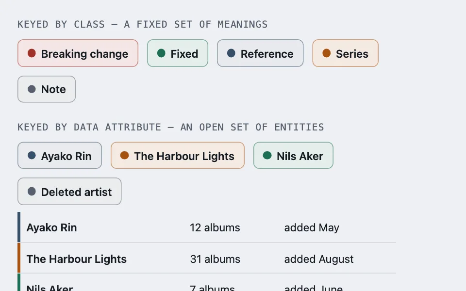
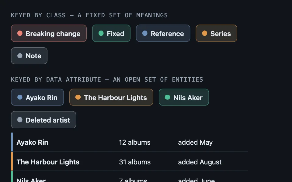
No component ever holds a hex: one custom property carries the hue, a base rule derives the border, fill, spine, and dot from it at fixed strengths, and each variant sets that one property — keyed by class for semantic tones, by data attribute for entity identity, or derived from the name once the entity set has no end.
Reach for it when building
- category and status badges
- label systems in issue trackers
- callout and admonition variants
- legend chips beside charts
- per-author coloring in collaborative tools
- calendar owners and participants
- multi-party conversation views
- series or project identity colors
<div class="spcv-demo">
<section class="spcv-block">
<p class="spcv-label">Keyed by class — a fixed set of meanings</p>
<div class="spcv-row">
<span class="spcv-chip spcv-breaking"><i></i>Breaking change</span>
<span class="spcv-chip spcv-fixed"><i></i>Fixed</span>
<span class="spcv-chip spcv-reference"><i></i>Reference</span>
<span class="spcv-chip spcv-series"><i></i>Series</span>
<span class="spcv-chip"><i></i>Note</span>
</div>
</section>
<section class="spcv-block">
<p class="spcv-label">Keyed by data attribute — an open set of entities</p>
<div class="spcv-row">
<span class="spcv-chip" data-tone="0"><i></i>Ayako Rin</span>
<span class="spcv-chip" data-tone="1"><i></i>The Harbour Lights</span>
<span class="spcv-chip" data-tone="2"><i></i>Nils Aker</span>
<span class="spcv-chip" data-tone="9"><i></i>Deleted artist</span>
</div>
<table class="spcv-table">
<tbody>
<tr data-tone="0"><td>Ayako Rin</td><td>12 albums</td><td>added May</td></tr>
<tr data-tone="1"><td>The Harbour Lights</td><td>31 albums</td><td>added August</td></tr>
<tr data-tone="2"><td>Nils Aker</td><td>7 albums</td><td>added June</td></tr>
</tbody>
</table>
</section>
<section class="spcv-block">
<p class="spcv-label">Past the end of the palette — a hue derived from the name</p>
<label class="spcv-field" for="spcv-name">
<span>Artist</span>
<input type="text" id="spcv-name" value="The Harbour Lights" autocomplete="off" />
</label>
<div class="spcv-marks" id="spcv-marks"></div>
<p class="spcv-note" id="spcv-note"></p>
</section>
</div>Colors come from shared theme tokens — --surface, --ink, --border, --accent and friends — so this CSS carries no palette
of its own. Use Runnable file to copy the tokens along with it.
.spcv-demo { display: flex; flex-direction: column; gap: 1.5rem; max-width: 520px; }

.spcv-block { display: flex; flex-direction: column; gap: 0.6rem; }

.spcv-label {
	margin: 0;
	font-family: var(--mono);
	font-size: 0.8125rem;
	letter-spacing: 0.06em;
	text-transform: uppercase;
	color: var(--dim);
}

.spcv-row { display: flex; gap: 0.75rem; flex-wrap: wrap; }

/* The entire system. Every colored property derives from --tone at a fixed
   strength, so retuning the whole scheme is one edit here and adding a
   variant is one declaration below. Text stays at the page ink — the tone
   lives in the frame and the dot, never under the words, which is what
   keeps every variant readable without per-variant contrast checking. */
.spcv-chip {
	--tone: var(--dim);
	display: inline-flex;
	align-items: center;
	gap: 0.45rem;
	font-size: 0.9375rem;
	font-weight: 600;
	padding: 0.35rem 0.8rem;
	border-radius: calc(var(--radius) - 2px);
	border: 1.5px solid color-mix(in srgb, var(--tone) 50%, transparent);
	background: color-mix(in srgb, var(--tone) 12%, var(--surface));
	color: var(--ink);
}

.spcv-chip i {
	width: 0.7rem;
	height: 0.7rem;
	border-radius: 50%;
	background: var(--tone);
	flex: 0 0 auto;
}

/* Keying one: a class per meaning. Each is exactly one declaration. */
.spcv-breaking { --tone: var(--bad); }
.spcv-fixed { --tone: var(--ok); }
.spcv-reference { --tone: var(--accent); }
.spcv-series { --tone: var(--signal); }

/* Keying two: a numbered slot per entity. The bare attribute selector is
   the neutral fallback — an unknown, deleted, or overflowed entity lands on
   the muted default rather than breaking or stealing slot 0's identity. */
[data-tone] { --tone: var(--dim); }
[data-tone='0'] { --tone: var(--accent); }
[data-tone='1'] { --tone: var(--signal); }
[data-tone='2'] { --tone: var(--ok); }

.spcv-table {
	border-collapse: collapse;
	width: 100%;
	font-size: 0.9375rem;
}

.spcv-table td {
	padding: 0.55rem 0.75rem;
	border-bottom: 1px solid var(--border);
	color: var(--ink);
}

/* The identity spine is an inset box-shadow, not a border: border-collapse
   would merge a real border with the row rule. Text stays at var(--ink),
   inherited from .spcv-table td above — the tone lives in the spine, never
   under the words, same as every other variant in this file. */
.spcv-table td:first-child {
	box-shadow: inset 4px 0 0 var(--tone);
	font-weight: 600;
}
/* ---------------------------------------------------------------
   Past the end of the palette - the entity set is unbounded, so the
   slot is computed from the name rather than stored.
   --------------------------------------------------------------- */

.spcv-field { display: flex; flex-direction: column; gap: 0.25rem; font-size: 0.9375rem; color: var(--dim); }

.spcv-field input {
	font: inherit;
	min-height: 44px;
	padding: 0.45rem 0.6rem;
	border-radius: calc(var(--radius) - 4px);
	border: 1px solid var(--border);
	background: var(--surface);
	color: var(--ink);
	width: 100%;
}

.spcv-marks { display: flex; flex-wrap: wrap; align-items: center; gap: 0.6rem; margin-top: 0.6rem; }

/* Only the hue varies. Lightness and chroma are pinned in oklch, a
   perceptual color space, which is what keeps the white initials legible
   across all 360 outcomes — the same pin in hsl() still lets a color's
   perceived lightness drift with its hue, and pale hues like yellow fall
   well under a 4.5:1 white-text floor even with saturation and lightness
   held fixed. */
.spcv-mark {
	width: 40px;
	height: 40px;
	border-radius: 10px;
	display: grid;
	place-items: center;
	color: #ffffff;
	font-weight: 700;
	flex: none;
}

.spcv-note { margin: 0.5rem 0 0; font-size: 0.9375rem; color: var(--dim); }
const SAMPLES = ['Ayako Rin', 'Nils Aker', 'Bramble & Vine', 'Quiet Machines'];

const nameInput = document.getElementById('spcv-name');
const marks = document.getElementById('spcv-marks');
const note = document.getElementById('spcv-note');

// The hash picks a hue and nothing else. Hashing chroma or lightness too is
// how a pale yellow avatar with invisible initials turns up once a month.
function hueFor(text) {
	let hash = 0;
	for (let index = 0; index < text.length; index += 1) {
		hash = (hash * 31 + text.charCodeAt(index)) % 360;
	}
	return hash;
}

function initialsFor(text) {
	const words = text.trim().split(/\s+/).filter(Boolean);
	if (words.length === 0) return '?';
	return (words[0].charAt(0) + (words[1] ? words[1].charAt(0) : '')).toUpperCase();
}

function markFor(text) {
	const mark = document.createElement('span');
	mark.className = 'spcv-mark';
	// oklch pins perceived lightness the way hsl's lightness never quite does:
	// the same L and C hold the white initials' contrast steady across every
	// hue, where the equivalent hsl(h 55% 42%) fails white-on-fill contrast
	// on roughly half the color wheel.
	mark.style.background = 'oklch(50% 0.12 ' + hueFor(text) + ')';
	mark.textContent = initialsFor(text);
	mark.title = text;
	mark.setAttribute('aria-label', text);
	return mark;
}

function render() {
	const typed = nameInput.value || 'Unnamed';
	marks.innerHTML = '';
	marks.append(markFor(typed));

	const label = document.createElement('strong');
	label.textContent = typed;
	marks.append(label);

	for (const sample of SAMPLES) {
		marks.append(markFor(sample));
	}

	note.textContent =
		'Hue ' + hueFor(typed) + '°, lightness 50%, chroma 0.12 (oklch) — the last two never vary, so the white initials hold at every hue.';
}

nameInput.addEventListener('input', render);
render();
Paste this into an agent to rebuild the pattern from scratch.
Build a color-variant system where no component ever holds a hex value. One custom property carries the hue, a single base rule derives every colored property from it at fixed strengths, and each variant is exactly one declaration.
The base rule declares the property with a neutral default — call it --tone — then derives the treatment from it and nothing else: the border via color-mix(in srgb, var(--tone) 50%, transparent), the fill via color-mix(in srgb, var(--tone) 12%, var(--surface)), and a small solid dot or spine at full strength. Keep the text itself at the page's ink color. The tone lives in the frame and the dot, never under the words, and that is what lets every variant be readable without checking contrast one variant at a time.
Adding a hue is then one line, and retuning the whole system's strength is one edit to the base rule. Compare the usual approach — a border color, a background, and an icon color hand-written per variant — where the strengths drift apart the third time someone adds one.
Point every tone at the theme's own semantic tokens (danger, success, accent, signal), never a raw hex, so each variant means one thing everywhere it appears and gets a correct light and dark answer for free with no per-theme rules in the file at all.
There are two ways to key the variants, and the choice follows from whether the set is closed.
**A class per variant, when the set of meanings is fixed.** Status badges, callout kinds, log-row types: these are a vocabulary the design owns, so a named class reads correctly in the markup and the CSS is self-documenting.
**A numbered data attribute, when the set is open.** Authors, projects, calendar owners, conversation participants: entities arrive at runtime and there is no fixed vocabulary to name. Declare the tone on the bare [data-tone] attribute selector first so it resolves to the neutral default, then override per slot. That fallback is the whole reason to prefer the attribute form — the failure mode for an unknown, deleted, or overflowed entity is a muted chip rather than a broken style or a stolen identity.
Assign those slots in application code as (entityId - 1) % slotCount from a stable id, never from a list index, so an entity keeps its color across re-sorts, filters, and pagination. Nothing is more obviously broken than a person changing color because someone sorted the table.
Keep the dot. It makes the hue legible when the 12% fill is too subtle to name, and it gives a colorblind reader a second, denser sample of the same color to judge. In tables using border-collapse: collapse, draw an entity's identity spine on the first cell with box-shadow: inset 4px 0 0 var(--tone) rather than a left border, which the collapse algorithm would merge into the row rule.
The one-property contract generalizes past chips — callout boxes, log-row icons, legend swatches, table spines. Share the same property name across all of them and the system stays coherent; give each component its own property and you are back to hand-tuning.
**Past the end of the palette, derive the hue and nothing else — but pin the lightness and chroma in a perceptual color space, not HSL.** A fixed set of entities gets numbered slots. An unbounded one — every artist, every sender, every uploader — has to compute its colour, and the rule is that the hash picks the hue while lightness and chroma stay pinned. HSL's lightness is not perceptual: hsl(h 55% 42%) measures 2.59:1 for white initials at hue 60 and fails a 4.5:1 white-text floor on 172 of 360 possible hues, because the same lightness number reads far brighter at yellow than it does at blue. oklch(50% 0.12 h) pins the same two values in a space where lightness tracks how light a colour actually looks, and the white initials clear 4.5:1 at every hue, worst case around 5.37:1.
Hash a stable identifier, not the display name, wherever one exists: a renamed entity that changes colour looks like a different entity. Where only the name is available, say so in a comment, because that is the tradeoff being accepted.
Order a numbered palette by how distinct *consecutive* entries are, since dense ids land on consecutive slots. An unknown entity gets no attribute at all rather than a null one, which matches nothing while still looking deliberate.
Every color comes from theme custom properties, and every tone has to stay distinguishable from the neutral default, and from its neighbours, in both light and dark themes.