Section rail
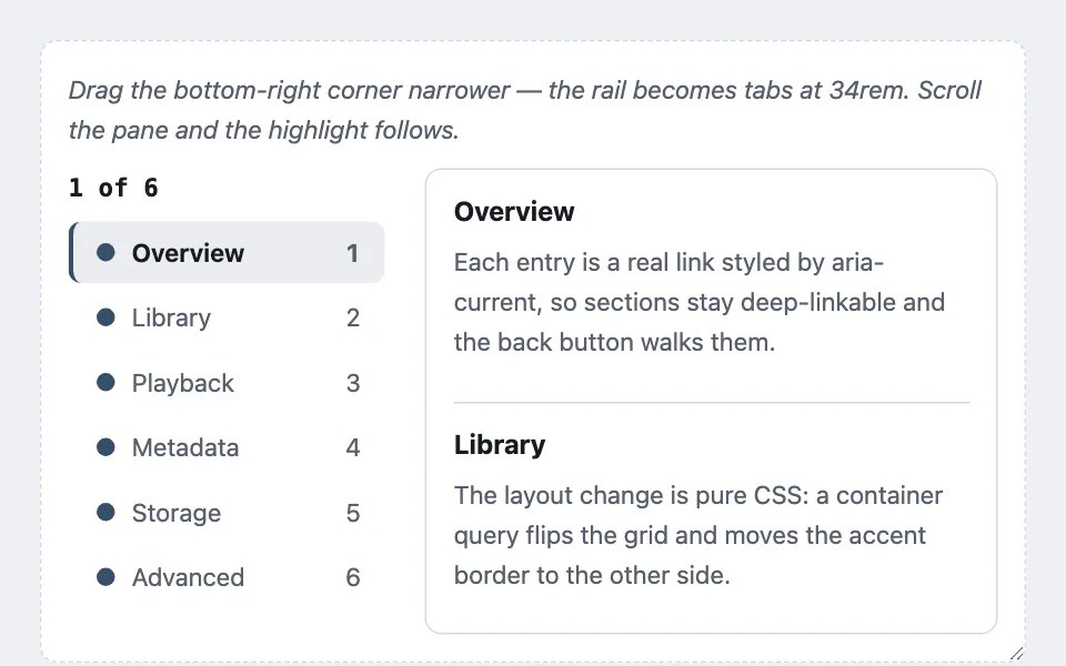
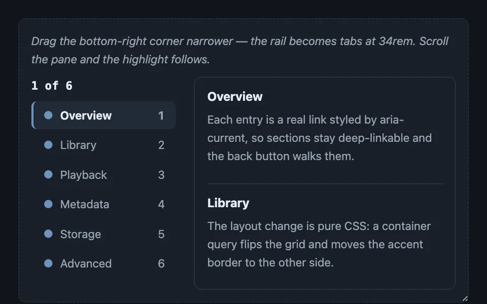
Section navigation that is a sticky vertical rail on wide screens and a wrapping tab row on narrow ones from the same markup, with an optional observer layer that tracks reading position rather than last-heading-crossed.
Reach for it when building
- long-form article tables of contents
- settings page section nav
- detail page with many sections
- account or admin subnavigation
- transcript and log navigation
- legal and policy documents
- multi-section reports
<div class="srl-frame">
<p class="srl-hint">Drag the bottom-right corner narrower — the rail becomes tabs at 34rem. Scroll the pane and the highlight follows.</p>
<div class="srl-body">
<nav class="srl-rail" aria-label="Sections">
<p class="srl-pos">1 of 6</p>
<div class="srl-links"></div>
</nav>
<div class="srl-scroll">
<section id="srl-s0"><h4>Overview</h4><p>Each entry is a real link styled by aria-current, so sections stay deep-linkable and the back button walks them.</p></section>
<section id="srl-s1"><h4>Library</h4><p>The layout change is pure CSS: a container query flips the grid and moves the accent border to the other side.</p></section>
<section id="srl-s2"><h4>Playback</h4><p>The observer picks the topmost section inside the reading band, not the last heading you crossed.</p></section>
<section id="srl-s3"><h4>Metadata</h4><p>The current entry gets a tinted pill, a heavier weight, and aria-current at the same time.</p></section>
<section id="srl-s4"><h4>Storage</h4><p>The position readout at the top of the rail recomputes from the current entry.</p></section>
<section id="srl-s5"><h4>Advanced</h4><p>Below four sections the rail removes itself, because a three-item map beside three visible headings is furniture.</p></section>
</div>
</div>
</div>Colors come from shared theme tokens — --surface, --ink, --border, --accent and friends — so this CSS carries no palette
of its own. Use Runnable file to copy the tokens along with it.
.srl-frame {
	container-type: inline-size;
	/* The resize handle exists so the demo can be squeezed; in production the
	   container query responds to real layout width. */
	resize: horizontal;
	overflow: auto;
	min-width: 320px;
	max-width: 100%;
	border: 1px dashed var(--border);
	border-radius: var(--radius);
	padding: 1rem;
	background: var(--surface);
}

.srl-hint { margin: 0 0 0.75rem; font-size: 0.9375rem; color: var(--dim); font-style: italic; }

.srl-body {
	display: grid;
	grid-template-columns: 190px minmax(0, 1fr);
	gap: 1.5rem;
	align-items: start;
}

.srl-rail { position: sticky; top: 1rem; font-size: 0.9375rem; }

.srl-pos {
	margin: 0 0 0.5rem;
	font-family: var(--mono);
	font-weight: 700;
	color: var(--ink);
	font-variant-numeric: tabular-nums;
}

.srl-links { display: flex; flex-direction: column; gap: 2px; }

.srl-links a {
	display: flex;
	align-items: center;
	gap: 0.6rem;
	padding: 0.5rem 0.9rem;
	border-radius: calc(var(--radius) - 2px);
	color: var(--dim);
	text-decoration: none;
	border-left: 3px solid transparent;
	line-height: 1.4;
}

.srl-links a:hover { color: var(--ink); background: var(--surface-2); }

/* aria-current is the only source of the active treatment, so the
   accessibility signal and the visual signal cannot drift apart. */
.srl-links a[aria-current='true'] {
	color: var(--ink);
	font-weight: 650;
	border-left-color: var(--accent);
	background: color-mix(in srgb, var(--accent) 10%, transparent);
}

.srl-dot {
	width: 11px;
	height: 11px;
	border-radius: 50%;
	background: var(--accent);
	flex: 0 0 auto;
}

.srl-count {
	margin-left: auto;
	color: var(--dim);
	font-variant-numeric: tabular-nums;
}

.srl-scroll {
	height: 280px;
	overflow-y: auto;
	border: 1px solid var(--border);
	border-radius: var(--radius);
	background: var(--surface);
	padding: 0 1rem;
}

.srl-scroll section {
	min-height: 140px;
	border-bottom: 1px solid var(--border);
	padding: 0.75rem 0;
}

.srl-scroll section:last-child { border-bottom: none; }
.srl-scroll h4 { margin: 0 0 0.25rem; }
.srl-scroll p { margin: 0; color: var(--dim); font-size: 0.9375rem; }

/* The whole responsive move: collapse to one column, let the rail wrap
   horizontally, and carry the same 3px accent from the left edge to the
   bottom edge. Nothing else is restyled, which is why the two layouts
   stay visibly related. */
@container (max-width: 34rem) {
	.srl-body { grid-template-columns: minmax(0, 1fr); }
	.srl-rail { position: static; }
	.srl-links { flex-direction: row; flex-wrap: wrap; }
	.srl-links a { border-left: none; border-bottom: 3px solid transparent; }
	.srl-links a[aria-current='true'] {
		border-left: none;
		border-bottom-color: var(--accent);
	}
	.srl-count { margin-left: 0; }
}
var MINIMUM_SECTIONS = 4;
var scroller = document.querySelector('.srl-scroll');
var rail = document.querySelector('.srl-rail');
var linksHost = document.querySelector('.srl-links');
var position = document.querySelector('.srl-pos');
var sections = Array.prototype.slice.call(scroller.querySelectorAll('section'));
// Self-suppression: below the minimum there is nothing to navigate.
if (sections.length < MINIMUM_SECTIONS) {
rail.remove();
} else {
sections.forEach(function (section, index) {
var link = document.createElement('a');
link.href = '#' + section.id;
var dot = document.createElement('i');
dot.className = 'srl-dot';
link.appendChild(dot);
link.appendChild(document.createTextNode(section.querySelector('h4').textContent));
var count = document.createElement('span');
count.className = 'srl-count';
count.textContent = String(index + 1);
link.appendChild(count);
link.addEventListener('click', function (event) {
event.preventDefault();
section.scrollIntoView({ block: 'start', behavior: 'smooth' });
});
linksHost.appendChild(link);
});
var links = Array.prototype.slice.call(linksHost.querySelectorAll('a'));
function setCurrent(index) {
links.forEach(function (link, linkIndex) {
if (linkIndex === index) link.setAttribute('aria-current', 'true');
else link.removeAttribute('aria-current');
});
position.textContent = index + 1 + ' of ' + sections.length;
}
// Track the topmost section inside the reading band — the top 40% of the
// pane — so the highlight follows reading position, not last-crossed.
var observer = new IntersectionObserver(
function () {
var hostRect = scroller.getBoundingClientRect();
var band = hostRect.top + hostRect.height * 0.4;
var topmost = -1;
sections.forEach(function (section, index) {
var rect = section.getBoundingClientRect();
if (rect.bottom > hostRect.top + 10 && rect.top < band) {
if (topmost === -1 || rect.top < sections[topmost].getBoundingClientRect().top) {
topmost = index;
}
}
});
if (topmost !== -1) setCurrent(topmost);
},
{ root: scroller, threshold: [0, 0.25, 0.5, 0.75, 1] }
);
sections.forEach(function (section) { observer.observe(section); });
setCurrent(0);
}Paste this into an agent to rebuild the pattern from scratch.
Build section navigation with one markup and two layouts, plus an optional layer that tracks where the reader actually is. Start with the layout; add the tracking only when the document is long enough to need it.
**The base is CSS only.** The rail is a flex column of real links — never buttons — so every section is deep-linkable, shareable, and the back button walks the reading history. Style the active entry through aria-current alone: keeping the accessibility signal and the visual signal on the same attribute makes it impossible for them to drift apart. The active treatment is a 3px accent border, a light accent-tinted background, and a heavier weight; hover gets a neutral background so the accent stays reserved for the active state.
The responsive move is the whole point. Inside the narrow query, do not restyle the entries — collapse the two-column grid to one, let the rail wrap horizontally, and move the 3px accent from border-left to border-bottom. The same accent on a different side is what turns a sidebar entry into a tab, and because nothing else changes, the two layouts stay visually related with zero JavaScript. Prefer a container query over a media query when the component can appear at different widths on one page, and give a demo container resize: horizontal so the breakpoint can be exercised by hand. In the wide layout the rail is position: sticky with a small top offset; in the narrow one it is static.
**The tracking layer is what earns the rail its space in a long document.** Use an IntersectionObserver over all sections, but ignore the entries argument — on each callback, scan every section's getBoundingClientRect() against the scroll container's rect and choose the topmost section whose bottom is below the container top and whose top is above a reading band at roughly 40% of the container height. Picking topmost-in-band makes the highlight follow reading position; the naive "last heading crossed" approach jumps a full section early and feels broken to anyone reading rather than skimming. The callback then sets aria-current, which is already the only thing the CSS reads, so the layer adds no styling of its own.
Pair it with a position readout — "3 of 6" in the mono face at the top of the rail — recomputed from the current entry. It earns its space in documents long enough that the scrollbar has stopped being a useful ruler.
Each entry can carry a marker dot before the title and a right-aligned number or count pushed over with margin-left: auto in tabular figures; drop that auto margin in the narrow layout, where the entries sit side by side and pushing to the right edge makes no sense.
**Self-suppression:** below a minimum section count, around four, render no rail at all. A three-item map beside three visible headings is furniture, and the tracking layer makes it worse by drawing the eye to a control that never tells the reader anything they could not already see.
Every color comes from theme custom properties, and both layouts, plus the current-entry pill, have to read correctly in light and dark themes.