Uniform slot shell
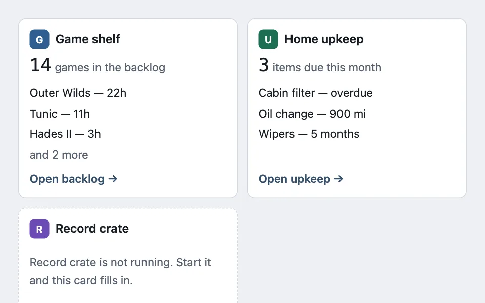
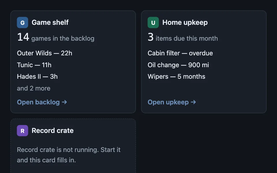
One card shell that many independent sources render through — a mark, one headline figure, a capped list with an overflow count, a footer link — where the shell does the capping rather than trusting each source, and an unavailable source is named specifically instead of showing a generic error.
Reach for it when building
- a dashboard of widgets from separate services
- a home screen aggregating several apps
- an integrations overview page
- a status board across environments
- a summary page pulling from several APIs
- a plugin or extension panel list
<div class="uss-demo">
	<div class="uss-grid" id="uss-grid"></div>
	<p class="uss-note">Every card is the same shell. The only thing the sources decide is what goes in the slots.</p>
</div>
Colors come from shared theme tokens — --surface, --ink, --border, --accent and friends — so this CSS carries no palette
of its own. Use Runnable file to copy the tokens along with it.
.uss-demo { display: flex; flex-direction: column; gap: 0.75rem; }

.uss-grid { display: grid; grid-template-columns: repeat(auto-fit, minmax(15rem, 1fr)); gap: 0.75rem; }

.uss-card {
	display: flex;
	flex-direction: column;
	gap: 0.5rem;
	padding: 0.875rem;
	border: 1px solid var(--border);
	border-radius: var(--radius);
	background: var(--surface);
}

.uss-head { display: flex; align-items: center; gap: 0.5rem; font-weight: 600; }

/* The mark is the only place a source's own colour appears, and it is an opaque
   plate so the letter keeps its contrast whatever hue arrives. */
.uss-mark {
	width: 26px;
	height: 26px;
	border-radius: 6px;
	display: grid;
	place-items: center;
	color: #ffffff;
	font-size: 0.8125rem;
	font-weight: 700;
	flex: none;
}

.uss-figure { font-family: var(--mono); font-variant-numeric: tabular-nums; font-size: 1.5rem; line-height: 1.1; }
.uss-caption { font-size: 0.9375rem; color: var(--dim); }

.uss-rows { list-style: none; margin: 0; padding: 0; display: flex; flex-direction: column; gap: 0.2rem; font-size: 0.9375rem; }
.uss-more { color: var(--dim); }

/* Pushed to the bottom so the link sits on the same line across every card,
   however much the slots above it hold. */
.uss-foot { margin-top: auto; font-size: 0.9375rem; color: var(--accent); font-weight: 600; }

.uss-down {
	margin: 0;
	font-size: 0.9375rem;
	color: var(--dim);
	padding: 0.6rem 0;
}

.uss-card[data-state='down'] { border-style: dashed; }
/* The shell caps the rows. Letting each source decide produced cards between
115px and 458px tall, with a quarter of the tall ones dead padding. */
const ROW_CAP = 3;
const SOURCES = [
{
name: 'Game shelf',
mark: 'G',
hue: '#2f5d8f',
figure: '14',
caption: 'games in the backlog',
rows: ['Outer Wilds — 22h', 'Tunic — 11h', 'Hades II — 3h', 'Pentiment — 0h', 'Citizen Sleeper — 6h'],
link: 'Open backlog'
},
{
name: 'Home upkeep',
mark: 'U',
hue: '#1c6e52',
figure: '3',
caption: 'items due this month',
rows: ['Cabin filter — overdue', 'Oil change — 900 mi', 'Wipers — 5 months'],
link: 'Open upkeep'
},
{
name: 'Record crate',
mark: 'R',
hue: '#6c4bb6',
/* Three named reasons, never a generic error: they have three different
fixes, and "something went wrong" fits none of them. */
down: 'is not running. Start it and this card fills in.',
link: 'Start Record crate'
}
];
const grid = document.getElementById('uss-grid');
for (const source of SOURCES) {
const card = document.createElement('section');
card.className = 'uss-card';
card.dataset.state = source.down ? 'down' : 'ready';
const head = document.createElement('div');
head.className = 'uss-head';
const mark = document.createElement('span');
mark.className = 'uss-mark';
mark.style.background = source.hue;
mark.textContent = source.mark;
head.append(mark, document.createTextNode(source.name));
card.append(head);
if (source.down) {
const down = document.createElement('p');
down.className = 'uss-down';
down.textContent = source.name + ' ' + source.down;
card.append(down);
} else {
const figure = document.createElement('div');
figure.innerHTML = '<span class="uss-figure"></span> <span class="uss-caption"></span>';
figure.querySelector('.uss-figure').textContent = source.figure;
figure.querySelector('.uss-caption').textContent = source.caption;
card.append(figure);
const rows = document.createElement('ul');
rows.className = 'uss-rows';
for (const row of source.rows.slice(0, ROW_CAP)) {
const item = document.createElement('li');
item.textContent = row;
rows.append(item);
}
const hidden = source.rows.length - ROW_CAP;
if (hidden > 0) {
const more = document.createElement('li');
more.className = 'uss-more';
more.textContent = 'and ' + hidden + ' more';
rows.append(more);
}
card.append(rows);
}
const foot = document.createElement('span');
foot.className = 'uss-foot';
foot.textContent = source.link + ' →';
card.append(foot);
grid.append(card);
}Paste this into an agent to rebuild the pattern from scratch.
Build one card shell that many independent sources render through. The shell owns the slots — a mark, a headline figure with its caption, a capped list of rows, a footer link — and each source only supplies what goes in them.
Reach for this on any dashboard assembling several services, apps, or integrations that know nothing about each other. Walk away when every card comes from the same source with the same shape; that is a list, and a slot system around it is indirection with no payoff.
The rule that makes it work: **the shell caps the rows, not the cards.** Letting each source decide how much to show produces a grid of cards between 115 and 458 pixels tall, with a quarter of the tall ones being dead padding, and nobody notices until a slow week makes one source return forty rows. Cap at three or four, then add one "and N more" line computed from the untruncated length.
**Name the reason a source is unavailable.** It is not running, it needs you to sign in, or it did not respond — three states with three different fixes. A generic "something went wrong" fits none of them and turns a one-click repair into a support question. The unavailable body replaces the figure and rows; it does not sit beneath them.
Keep the footer link pinned to the bottom with `margin-top: auto`, so the links line up across a row of cards whose middles differ in height. That alignment is most of what makes a mixed grid read as one system.
Let the source's own colour appear in exactly one place — the mark — and make that mark an opaque plate with its own text colour. A brand hue you do not control cannot be trusted behind body text, and a card that tints its whole surface per source turns a dashboard into a paint chart.
Size the grid with `auto-fit` and a sensible minimum so cards reflow rather than squeeze, and let each card's height come from its own content. Every colour but the mark comes from theme custom properties, and the dashed border on an unavailable card is what keeps that state readable without relying on colour.