Controls beside the anchor
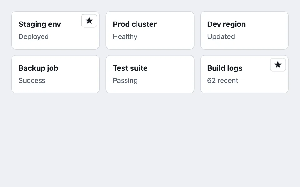

Per-card controls that sit visually on top of a card whose whole surface is a link, without nesting an interactive element inside the anchor that invalid HTML forbids.
Reach for it when building
- pin or unpin on a card
- favorite and star listings
- archive from a grid
- remove-from-list controls
- bookmark grids
- saved search tiles
<div class="cco-grid" id="cco-cells"></div>Colors come from shared theme tokens — --surface, --ink, --border, --accent and friends — so this CSS carries no palette
of its own. Use Runnable file to copy the tokens along with it.
.cco-grid {
	display: grid;
	grid-template-columns: repeat(auto-fill, minmax(180px, 1fr));
	gap: 12px;
	max-width: 620px;
}

.cco-cell { position: relative; height: 100%; }

.cco-object {
	display: block;
	height: 100%;
	color: inherit;
	text-decoration: none;
	background: var(--surface);
	border: 1px solid var(--border);
	border-radius: var(--radius);
	padding: 0.9rem;
	/* Hover changes the edge and nothing else. A lift or a shadow pop would
	   pull the card out of line with its grid neighbours, and in a multi-column
	   grid that misalignment reads louder than the affordance it buys. */
	transition: border-color 120ms;
}

.cco-object:hover,
.cco-cell:focus-within .cco-object {
	border-color: var(--accent);
}

.cco-control {
	position: absolute;
	z-index: 1;
	top: 6px;
	right: 6px;
	opacity: 0;
	transition: opacity 120ms;
	background: var(--surface);
	border: 1px solid var(--border);
	border-radius: 6px;
	cursor: pointer;
	font-size: 1rem;
	line-height: 1;
	padding: 0.35rem 0.5rem;
	color: var(--ink);
}

/* The four-part reveal contract: hover, keyboard focus anywhere in the cell,
   focus on the control itself, and a state-driven opt-out for a control that
   is already active and must stay visible even with no pointer nearby. */
.cco-cell:hover .cco-control,
.cco-cell:focus-within .cco-control,
.cco-control:focus-visible,
.cco-control[data-visible='true'] {
	opacity: 1;
}

/* No pointer, no hover, nothing to reveal with -- show every control plainly. */
@media (hover: none) {
	.cco-control { opacity: 1; }
}

.cco-title { font-weight: 650; }
.cco-sub { color: var(--dim); font-size: 0.9375rem; }
(function () {
var cellRecords = [
{ id: 'doc-1', title: 'Staging env', sub: 'Deployed', pinned: true },
{ id: 'doc-2', title: 'Prod cluster', sub: 'Healthy', pinned: false },
{ id: 'doc-3', title: 'Dev region', sub: 'Updated', pinned: false },
{ id: 'doc-4', title: 'Backup job', sub: 'Success', pinned: false },
{ id: 'doc-5', title: 'Test suite', sub: 'Passing', pinned: false },
{ id: 'doc-6', title: 'Build logs', sub: '62 recent', pinned: true }
];
var gridNode = document.getElementById('cco-cells');
function renderGrid() {
gridNode.innerHTML = '';
cellRecords.forEach(function (record) {
var cell = document.createElement('div');
cell.className = 'cco-cell';
// The whole card is a link. A <button> nested inside an <a> is invalid
// HTML and behaves inconsistently across browsers, so the control below
// is a sibling, not a child -- positioned to sit visually on the card.
var link = document.createElement('a');
link.className = 'cco-object';
link.href = '#';
link.addEventListener('click', function (event) {
// Demo only: a real card would navigate to the record instead.
event.preventDefault();
});
link.innerHTML =
'<span class="cco-title">' +
record.title +
'</span><br><span class="cco-sub">' +
record.sub +
'</span>';
var control = document.createElement('button');
control.type = 'button';
control.className = 'cco-control';
// A stable key for re-focusing this exact control after the rebuild
// below destroys and recreates it -- the record's id, never its index,
// for the same reason the click handler keys off the record itself.
control.dataset.id = record.id;
control.textContent = record.pinned ? '\u2605' : '\u2606';
control.setAttribute('aria-label', (record.pinned ? 'Unpin ' : 'Pin ') + record.title);
control.setAttribute('aria-pressed', record.pinned ? 'true' : 'false');
// An already-pinned control stays visible with no hover and no focus --
// a control a user cannot see they have active is a state they cannot
// discover how to undo.
if (record.pinned) control.setAttribute('data-visible', 'true');
control.addEventListener('click', function () {
// Toggled on the captured record reference, not by array position --
// a grid that re-renders from a server response after every write
// would otherwise point this handler at whatever record now occupies
// the same index, which is not necessarily the one the user clicked.
record.pinned = !record.pinned;
renderGrid();
// renderGrid() just destroyed the control that had focus. Find its
// replacement by the same stable id and hand focus back to it, or a
// keyboard user tabbing through the grid loses their place on every
// pin.
var refocused = gridNode.querySelector('.cco-control[data-id="' + record.id + '"]');
if (refocused) refocused.focus();
});
cell.appendChild(link);
cell.appendChild(control);
gridNode.appendChild(cell);
});
}
renderGrid();
})();Paste this into an agent to rebuild the pattern from scratch.
Build a grid of cards where the entire card surface is a link, but each card also carries a small per-item control -- a pin, a favorite, a quick delete -- rendered in a corner, without nesting the control inside the anchor.
Reach for this whenever a listing needs one lightweight, always-available action per row alongside a primary "open this" interaction: pin/unpin, star, archive, remove-from-list. It is not the right shape for a card that needs several actions -- reach for an overflow menu once there is more than one control competing for the same corner, since stacking two or three always-visible icon buttons on a card usually reads as cluttered before it reads as efficient.
The reason the control cannot live inside the anchor is not stylistic. A `<button>` nested inside an `<a>` is invalid HTML, and browsers handle it inconsistently -- clicks on the inner control often still trigger the outer navigation. The common workaround, a `<div role="button">` sitting inside the link, trades that bug for a worse one: a plain div has no tab stop, so a keyboard-only user can never reach the control at all, including to undo a state they didn't mean to set. The fix is structural, not visual: render the control as a real `<button>` positioned as a sibling of the anchor, both wrapped in a position-relative cell, so it sits visually on the card without being a descendant of it. That same separation is also what lets a click on the control activate it without the click bubbling into a navigation.
The reveal has four parts, and each is there to close a specific gap the others leave open. `.cell:hover` shows the control to a pointer user. `.cell:focus-within` does the same for a keyboard user tabbing through the grid -- without it, the control exists in the DOM and is reachable by Tab, but is invisible while focused, which is functionally as broken as no tab stop at all. `.cell-control:focus-visible` keeps the control's own focus ring visible once it's the focused element. And a state-driven opt-out -- something like `[data-visible="true"]` set whenever the control's underlying state is active -- keeps an already-pinned control visible with no hover and no focus nearby, because a control that only appears on interaction is a state the user has no way to discover they're in, including when they want to turn it back off. Drop the whole reveal under `@media (hover: none)`, showing every control unconditionally, since a touch device has no hover state to reveal anything with.
Limit what hover changes on the card itself to its border or background -- not a lift, not a shadow pop. A translateY on hover pulls that one card out of vertical alignment with its row neighbours, and in a multi-column grid that jump is more noticeable, and more distracting, than the affordance it was meant to add.
Key the control's state to a stable identifier on the record -- an id, never the record's index in the rendered array. A grid backed by a server list re-renders after every write, and rows can reorder or shift position between renders; an index-keyed toggle then silently mutates whatever record now happens to sit at that position instead of the one the user actually clicked.