Audio-First / Podcast
A warm-paper podcast-network page: a square show-cover portrait with an ON AIR badge and waveform beside a chunky headline, then a wide two-part release card with a blueprint illustration and a dark panel holding a 40 / 5 / 0 stat strip and an orange Browse the library button.
Paste this into an agent to rebuild the whole page from scratch.
Build a personal homepage presented as a podcast network: the writing is a feed of numbered episodes, the collections are shows with their own cover art, and the featured project is a headline release. It should feel like a good podcast app's web page, warm and confident, with one on-air orange used only for play buttons, waveforms and the main call to action.
Use a centred wrap of about `1200px`. The header is a light bar with a square logo mark and a mono tagline, pill nav links (the current one a filled dark pill), a search field and a theme button. Sections are separated by generous padding and the occasional full-width dark studio band.
Type: **Bricolage Grotesque** at weight 800 for display, tight (`-0.03em`, line height `1.02`); **Figtree** at `17px` for UI and body; **JetBrains Mono** at `13px` uppercase for episode numbers, timecodes and labels. The light theme is warm paper: ground `#f3eee5`, surfaces `#fffdf8` and `#ebe4d6`, lines `#d9d0bf`, ink `#17191f`, text `#2c2f38`, muted `#5b5e68`. The studio band is `#141b24` with `#1d2733` dividers, text `#eef1f5` and muted `#aab6c4`. The signal orange is `#b83a0b` on paper and `#ff8a5b` on dark. The dark theme moves the ground to `#0f1216` and surfaces to `#171b21`. Four show colours appear only on cover art, always with white text: slate `#364f6a` for AI, moss `#2f5d45` for the Digital Garden, ochre `#8a4b0f` for tools and plum `#5b3a6e` for fiction. Persist the theme in `localStorage` inside try/catch.
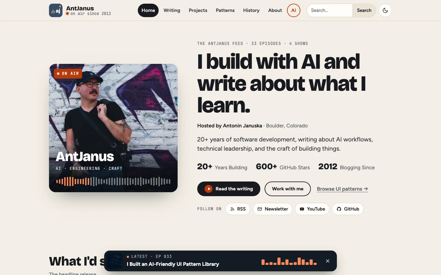
The hero is a grid of `minmax(0, 420px)` and the rest. The left column is a square show cover: the portrait filling it, a rounded large radius, a deep soft shadow, an orange ON AIR badge with a pulsing white dot in the top corner, and a label pinned to the bottom over a dark gradient with the show title in Bricolage 800, a mono meta line and a small waveform whose played part is orange. The right column has a mono kicker (the feed, episode and show counts), the H1 at `clamp(2.4rem, 5.4vw, 4.4rem)`, a Hosted by line, a `1.25rem` lede, an inline stat line, a dark primary button, a ghost button, a text link and a row of Follow on pills (RSS, Newsletter, YouTube, GitHub).
**The release callout is the signature block.** Make it a two-part card with a large radius and hidden overflow on the studio band colour: a grid of `1.2fr` and `1fr`, the left part a blueprint illustration filling a dark navy `#0e1a28` panel at least `320px` tall, the right part padded `clamp(24px, 4vw, 44px)` with a muted eyebrow, a white H2 at `clamp(1.9rem, 3.6vw, 2.8rem)`, a `#cfd7e1` description, a mono tech line, a three-cell stat strip (cells on the band colour separated by `1px` `#1d2733` gaps inside a `12px`-radius border, mono uppercase labels over large numbers) and a signal-orange button with near-black text that turns white on hover.
Then build the feed: a dark latest-episode band with an episode cover, the title, a round orange play button and a waveform; three start-here episode cards; four show covers as colour blocks with the show name in Bricolage and a white waveform; and two episode tracklists under a `2px` ink top rule, each row a round play button, a mono EP number, a thumbnail or a coloured number tile, a title, a description and a mono date. Experiments are segment cards with a numbered mark and a type badge, and the closing row ends with a dark Book the host card. Pin a mini player to the bottom of the viewport (`max-width: 760px`, centred, `18px` radius, studio colour, deep shadow) with the latest episode's art, label and title, a 14-bar orange equaliser whose bars animate between 22% and 100% height over about `1.1s` with staggered delays, and a dismiss button.
Keep orange rare and the show colours on covers only; a coloured page background or more accents would make it look like an ad. Below `820px` the release card stacks with the art at `16 / 9`, the hero stacks with the cover capped at `420px`, and lists keep their play buttons but drop secondary columns; below `640px` the mini player hides its equaliser. Nothing scrolls sideways at `400px`. Under `prefers-reduced-motion` the ON AIR pulse and the equaliser stop, leaving the bars at a fixed height.
One self-contained file: markup, styles and scripts together.
Loading the page source…
The big pattern-library release callout comes straight after the show-cover hero, then the writing runs as a podcast feed: a latest-episode player band, start-here episode cards, four colour-block show covers, numbered episode tracklists for AI and the Digital Garden, segment cards for experiments and a dark Book the host card. A floating mini player with an animated equaliser sits at the bottom of the viewport until dismissed.
Sections, top to bottom
- Show-cover hero
- Pattern library feature callout
- Latest episode player band
- New here? Start with these three
- The network: four show covers
- AI & Machine Learning episode list
- Digital Garden episode list
- AI Experiments segments
- Connect, Projects and Work With Me
- Studio footer with newsletter
- Floating latest-episode mini player
- Type
- Bricolage Grotesque (display, headings) · Figtree (UI and body) · Source Serif 4 (article prose, prompts) · JetBrains Mono (episode numbers, timecodes, labels, code)
- Themes
- light+dark
- Palette
#f3eee5#fffdf8#17191f#364f6a#b83a0b#ff8a5b#141b24#0f1216#2f5d45#8a4b0f#5b3a6e