Music Player Metaphor
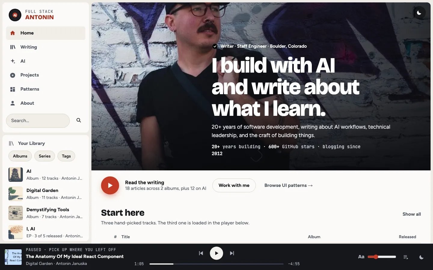
A home page shaped like a streaming music app: a dark library sidebar with nav, search and album rows, an artist-style full-bleed hero with a big round play button, tracklists and album shelves in the main view, and a fixed player bar along the bottom.
Paste this into an agent to rebuild the whole page from scratch.
Build a personal home page that borrows the layout of a streaming music app. Articles are tracks, collections are albums, a fiction series is an EP, and a fixed player bar at the bottom holds the article the reader was last reading. The app shell is the point: a library sidebar, a rounded main view, and a persistent player.
Lay out a full-height grid: a sticky 300px sidebar on the left and the main view filling the rest, both inset 8px from the window edges with 8px between them, and the player bar fixed along the bottom (about 84px tall) with matching bottom padding on the page so nothing hides behind it. The sidebar stacks a lockup (a vinyl-record monogram with `Aj` on a red label beside `FULL STACK / ANTONIN`), a nav list with icons, a search field, and a `Your library` panel with filter chips and rows of album covers. The main view is a rounded 8px panel holding a full-bleed hero and then sections, each with a heading row and a `Show all` link.
Set titles and cover type in **Bricolage Grotesque** at weight 800 with negative tracking, UI and body in **Figtree** at 18px, and timestamps, dates and labels in **JetBrains Mono**. The hero name is very large, around `clamp(2.6rem, 6vw, 5.5rem)`, set tight like an artist page.
The light theme is warm stone `#efebe4` behind panels of `#fbfaf7`, ink `#15171c`, dim text `#525a66`, and a vermilion accent `#c23a24` for the play button and progress. The dark theme is the expected streaming look: near-black `#07080b` behind panels `#13161d`, ink `#f2f4f8`, dim `#a6afbe`, accent `#ff7058`, with slate `#6f92bd` as a secondary. Persist the theme toggle in `localStorage` wrapped in try/catch.
The hero is an artist header: the portrait as a full-bleed background with a dark gradient rising from the bottom, a verified badge and small label above the huge headline, a line of monthly-listener-style stats (`20+ years building · 600+ GitHub stars · blogging since 2012`), and an action row with a 64px round accent play button, a two-line `Read the writing` label and a quiet text link. Start here is a numbered tracklist: a grid of number, cover and title with a two-line description, album, and release date; the number turns into a play glyph on hover, and the current track shows three animated equaliser bars instead. Shelves are horizontal grids of album cards with square covers, a small label on the cover, and a round play button that slides up on hover. Where an article has no image, generate a cover: a coloured sleeve with faint concentric record grooves drawn with `repeating-radial-gradient` and the title in heavy display type sized with container query units.
The player bar has three columns: now playing (cover, kicker, title, collection), transport (previous, a round play button, next, and a scrubber with elapsed and remaining times), and a right group with an `Aa` slider that sets reading text size, a queue button that opens an Up Next panel, and the theme toggle. Highlight the sidebar nav item for the section currently in view.
Animate only the equaliser bars (three bars scaling on staggered 0.9 to 1.2 second loops) and the hover play buttons (about 200ms). Under `prefers-reduced-motion` the equaliser freezes at mid height. Below 1024px the sidebar becomes a top bar with a horizontally scrolling chip nav, shelves become horizontally scrolling rows, and the player shrinks to a floating mini player with a hairline progress bar. Never invent durations for tracks that have no real reading time; the metaphor works because it stays honest.
One self-contained file: markup, styles and scripts together.
Loading the page source…
The full streaming-app shell from the demo's home page: sidebar library, artist hero, a numbered Start here tracklist with one track playing, album-cover shelves for AI and the Digital Garden, a discography of collections, AI Experiments as singles, and a footer, with the reading player pinned to the bottom. The metaphor maps cleanly: collections are albums, the I, AI series is an EP, articles are tracks, and the player holds the article you were reading.
Sections, top to bottom
- Library sidebar with nav, search and album rows
- Artist hero with portrait and big play button
- Start here tracklist
- AI and Machine Learning shelf
- Digital Garden shelf
- Discography of collections
- AI Experiments singles
- Connect, projects and work-with-me panels
- Footer with newsletter
- Fixed player bar and Up Next queue
- Type
- Bricolage Grotesque (display: page titles, section heads, cover type) · Figtree (body and UI) · JetBrains Mono (timestamps, dates, code, labels)
- Themes
- light+dark
- Palette
#efebe4#fbfaf7#15171c#525a66#c23a24#364f6a#07080b#13161d#f2f4f8#a6afbe#ff7058#6f92bd