Split Screen
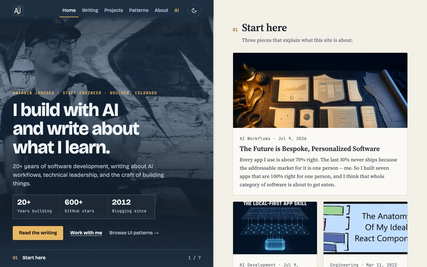
A permanent 50/50 diptych: a fixed slate-blue identity pane with a desaturated portrait, headline, stats and a live section caption on the left, and a scrolling warm-paper reading pane of posts and projects on the right.
Paste this into an agent to rebuild the whole page from scratch.
Build a personal blog home page as a permanent 50/50 diptych. The left half is a fixed slate-blue identity pane that never scrolls; the right half is the ordinary document, a warm-paper reading pane that scrolls normally. The left pane does a real job: it captions whatever the right pane is showing. Keep the right side as plain document scroll so keyboard scrolling, find-in-page and scroll restoration keep working.
Make the left pane `position: fixed`, 50vw wide and 100vh tall; give the content a matching left margin so at 1440px the reading pane is exactly 720px, a good measure. Between 900px and 1180px move the split to 42/58. Below 900px drop the fixed pane: it becomes the first normal section and the bar becomes a sticky 64px strip. Put a 3px seam between the halves whose inner bar fills top to bottom with the accent via `transform: scaleY(var(--progress))` as the page scrolls.
Set the identity pane in **Bricolage Grotesque**: the headline around 4rem at 800 weight with tight `-0.03em` tracking, the lede at 20px. Set the reading pane in **Source Serif 4**: section titles around 2.4rem, body at 18px. Use **JetBrains Mono** for eyebrows, dates, counts and stat labels. The change of typeface tells the reader which half they are in.
The identity pane is always deep slate `#1e2f42` with white text and a warm gold accent `#e8b865`, in both themes. The reading pane is warm paper `#f3efe7` with cards at `#fbf9f5`, ink `#18212c` and a darker gold `#935509` for section numbers in light mode; in dark mode it goes near-black `#0f1318` and the numbers take the bright gold. Desaturate the portrait into the pane with `mix-blend-mode: luminosity` at 0.62 opacity and lay a vertical scrim over it (dark at the top, lighter in the middle, near-solid pane color at the bottom) so the copy holds contrast anywhere. A faint 48px blueprint grid sits behind the pane, masked to fade at top and bottom.
Put the nav at the top of the left pane: an outlined `AJ` monogram, then links in white with a gold underline bar under the current one and AI always in gold, then a round theme button. Below the headline place a three-cell outlined stat grid and a gold primary button with two text links. Pin the sync caption to the foot of the pane: the current section's mono number in gold, its title, and `1 / 7` on the right, all updated by an `IntersectionObserver` over every right-hand section with a `data-sync` label, and move the nav underline with it.
In the reading pane, each section opens with a small gold mono number beside the serif title and a short muted lede, separated by hairline rules. Start here is one wide card over two half cards; AI writing is a list of rows with a small thumbnail on the right; the Digital Garden is a numbered ledger; experiments are a hairline-joined two-column tile grid; project rows put a small screenshot or a dark terminal tile beside the text with inline metric cells. Keep motion to the seam fill and the caption swap; the fixed pane should feel like a still caption, not an animation.
Under `prefers-reduced-motion`, update the caption and seam instantly. At 400px wide the identity pane stacks above the content with the portrait as a dimmed background, the sticky strip shows the monogram and a live caption of the current section, grids go to one column, and nothing scrolls sideways.
One self-contained file: markup, styles and scripts together.
Loading the page source…
The approved split layout is the whole page: the left pane holds the nav, the portrait hero and a sync caption that names the right-hand section in view (number, title, n of total), while the right pane scrolls through Start here, AI writing, the Digital Garden list, experiments, the open-source repositories from the projects page, Elsewhere and the footer. A 3px seam between the halves fills with gold as you scroll, and the type changes from grotesk to serif as you cross from one half to the other.
Sections, top to bottom
- Fixed identity pane with portrait, stats and sync caption
- 01 Start here
- 02 AI and Machine Learning
- 03 Digital Garden
- 04 AI Experiments
- 05 Open Source
- 06 Elsewhere
- Footer with newsletter
- Type
- Bricolage Grotesque (identity pane, display, UI) · Source Serif 4 (reading pane headings and body) · JetBrains Mono (meta, labels, code)
- Themes
- light+dark
- Palette
#1e2f42#283d55#e8b865#f3efe7#fbf9f5#18212c#38424f#2b4764#935509#0f1318#93b6de