Index Card Catalog
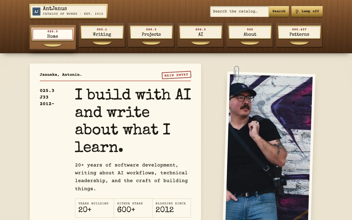
A library card-catalog home page: an oak cabinet header whose nav items are drawer fronts with brass label holders, a typed main-entry card beside a paperclipped portrait, and trays of ruled catalog cards on a beige desk.
Paste this into an agent to rebuild the whole page from scratch.
Build a personal home page as a library card catalog. The header is an oak cabinet whose navigation items are drawer fronts, and every piece of content is a typed catalog card filed under a decimal call number. The metaphor should be complete and literal, so readers learn it once and then stop noticing it.
Centre everything in a `.wrap` of about 1200px with 1.25rem padding. The cabinet spans the full width: a top row with a brass name plate on the left (a small square `AJ` badge in slate `#364f6a` with a dashed inner border, the name and `Catalog of works · est. 2012`) and a search field plus a lamp-shaped theme button on the right, then a row of six equal drawer fronts. Below it, the hero is a two-column grid of a large main-entry card and a portrait; content trays below use three-column card grids, a two-column variant for the garden, and four compact columns for experiments.
Type everything like a typewriter: **Special Elite** for headings and drawer labels, **Courier Prime** at 18px with 1.65 line height for body, cards and UI, and **Caveat** in stamp blue only for pencil marginalia and captions at 20px or larger.
The desk ground is beige `#e8dec8` with card stock `#fcf8ec`, ink `#1f1c17`, a catalog red rule `#c0473c`, stamp blue `#2c4763`, and oak in `#6d4526` with brass `#caa250`. Draw the oak with stacked gradients rather than an image: a vertical light-to-dark brown gradient, a `repeating-linear-gradient` at about 92deg for grain streaks, and a 6px darker bottom border. Dark mode is lamp on: a walnut cabinet, charcoal card stock `#25211b`, ground `#14110d` and cream type `#efe6d2`. Persist the toggle in `localStorage` inside try/catch and fall back to `prefers-color-scheme`; label the button `Lamp off` or `Lamp on`.
The drawer nav is the signature. Each drawer front is an oak panel with an inset bevel shadow, a brass label holder (a small rectangle with a gold gradient border and two rivet dots), a paper label inside showing the call number on one line and the page name below, and a round brass pull underneath. The current drawer is pulled out: translate it down about 6px, deepen its shadow, give it a lighter face, and outline its label in the red rule colour with a negative outline offset. On phones the six drawers become a 3x2 grid, never a hamburger. As the reader scrolls, move the pulled-out state to the drawer whose section is in view.
The hero is an oversized main-entry card: a header line `Januska, Antonin.` with a red `Main entry` stamp, a left column holding the call number `025.3 / J33 / 2012–` set large, and a right column with the `h1`, lede, a three-field stat list styled as catalog fields, buttons, and a tracings line (`1. Artificial intelligence. 2. Software engineering…`). Beside it, the portrait sits slightly rotated with a grey SVG paperclip over its top edge and a pencil caption. Each section opens with a guide card, a coloured tab sticking up from a card (AI slate blue, Garden green, Tools ochre, Fiction oxblood, Projects tan) holding the class number and section name. Catalog cards have a header row with the call number and a boxed date stamp, a single red rule, a bold typed title, an imprint line, an indented description, tracings at the foot and a punch hole near the bottom edge; hovering lifts a card 4px as if pulled from the drawer. A ruled `Schedule of classes` table maps numbers to drawers, and the footer is an oak plinth holding one wide shelf-list card with link columns and a newsletter form.
Keep motion physical and small: drawer and card lifts over about 180ms, and no ambient animation. Under `prefers-reduced-motion`, drop the transforms. At 400px the hero stacks with the portrait below the card, card grids go to one column, the schedule table scrolls inside its own wrapper, and the cabinet's top row wraps search beneath the name plate. Keep colour coding on the guide tabs only; the cards stay neutral so a full tray reads calm.
One self-contained file: markup, styles and scripts together.
Loading the page source…
The card-cabinet drawer nav heads the demo's full home page: a main-entry hero card, colour-tabbed guide cards over trays of catalog cards for Start here, AI, Digital Garden and AI Experiments, a schedule of classes, and an oak plinth footer. Every item uses real library conventions, with call numbers, date stamps, a red rule and tracings, so the metaphor carries the whole site instead of decorating it.
Sections, top to bottom
- Oak cabinet header with drawer-front nav
- Main-entry hero card with paperclipped portrait
- Start here card tray
- AI and Machine Learning cards
- Digital Garden cards
- AI Experiments compact cards
- Schedule of classes table
- Connect, projects and work-with-me panels
- Oak plinth footer with shelf-list card
- Type
- Special Elite (display headings, drawer labels) · Courier Prime (body, cards, UI — typewriter) · Caveat (pencil marginalia and photo captions, 20px+ only)
- Themes
- light+dark
- Palette
#e8dec8#fcf8ec#1f1c17#c0473c#a12f28#364f6a#2c4763#6d4526#caa250#43603a#7d5a17#7a2e2a#14110d#25211b#efe6d2