Keyboard-First / Command Palette
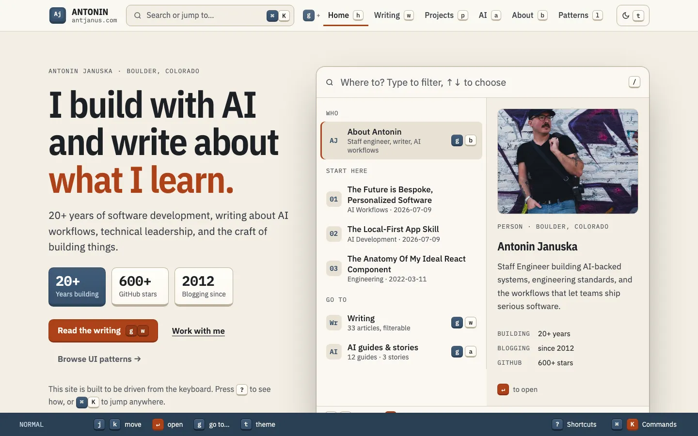
A warm cream page drawn in keycaps: a headline with a burnt-orange phrase and keycap stat tiles beside an inline Where to? launcher with a filter input, grouped results with g-chord keys and a live preview pane, above a fixed slate vim-style status line.
Paste this into an agent to rebuild the whole page from scratch.
Build a personal homepage that is meant to be driven from the keyboard, and that looks like a keyboard. Its centrepiece is an inline launcher in the hero, a Where to? box that filters a grouped list of destinations and previews whichever one is selected, and every destination on the page has one keyboard path that is shown the same way everywhere.
Keep a `1320px` wrap. The top bar carries the name with a small slate key logo, a wide Search or jump to button showing `⌘` `K` keycaps, the nav links each followed by its chord letter as a small keycap (with a leading `g +` hint), and a theme key labelled `t`. The hero is a two-column grid: copy on the left, the launcher on the right at roughly equal width.
Type is the IBM Plex family: **IBM Plex Sans Condensed** 600 for headings (the H1 at `clamp(2.6rem, 5.4vw, 4.75rem)`, line height `1.02`), **IBM Plex Sans** at `17px` for body, and **IBM Plex Mono** for keycaps, dates, eyebrows and counts. Nothing goes under `13px`.
Colour it like a GMK keycap set. The light ground is cream `#f3eee4` with surfaces `#fbf8f2` and `#e8e1d3`, lines `#d6cdbb` and `#b9ae98`, and charcoal ink `#1d2025`. Alpha keys are cream; modifier keys are slate `#364f6a` with a lighter `#405c7a` top and a `#2a3f54` edge; the accent and Enter key are burnt orange `#ad4119`. The H1's last phrase is set in that orange. The dark theme is charcoal `#15181c` and `#1c2026` with the same key roles, orange lifting to `#f08a5d`. Persist the theme in `localStorage` inside try/catch.
Keycaps are the visual system. A `kbd` is an inline-flex box `1.85em` high, mono `13px`, with a vertical gradient from a light key-top to the surface, a `1px` border whose bottom is `3px` thick, a `6px` radius and an inset `1px` shine; pressing one moves it down `2px` and thins the bottom border to `1px`. Stat tiles in the hero are big keys: at least `118px` wide, mono numbers at `1.75rem`, a `5px` bottom border, the first one a slate modifier key with white text. Buttons work the same way and carry their chord as keycaps inside the label.
The launcher is a raised surface panel with a large search input at the top reading Where to? Type to filter, with a `/` key hint. Below it a two-column body (`1.05fr` and `1fr`, at least `420px` tall): on the left a list of groups (Who, Start here, Go to) with mono uppercase group labels and rows holding a two-letter mono icon tile, a title with a sub-line, and the row's g-chord on the right; on the right a detail pane that shows the selected row's image, a mono eyebrow, a title, a description and a small key-value list. The active row gets the darker surface and a `3px` inset orange spine. Typing filters the rows live and updates a result count in the footer strip, and arrow keys move the selection while the preview follows it.
Below the hero, list the writing as numbered result rows (index, thumbnail or a letter tile, title, full description, ISO date and tags), give experiments as four action tiles that depress `3px` when pressed, show the pattern library as a feature panel with three stat keys and an orange button, then three closing panels with a dark slate Work With Me panel, and a footer whose navigation lists each link with its `g then x` chord. Back all of it with one registry of pages, posts and actions that feeds a Cmd-K palette in a dialog, the g-chords and a ? shortcut sheet with an on/off switch for single-key shortcuts; ignore keys while typing in inputs.
Fix a `vim`-style status line to the bottom of the viewport: a slate band showing NORMAL, a pending-chord slot, and key groups for move, open, go to and theme, with Shortcuts and Commands buttons on the right. **The two ideas that make this work** are the launcher and the consistency of keycaps; do not add decorative keys that do nothing. Below `1100px` the optional status-line groups hide; on touch devices or below `700px` the status line is replaced by a round orange Jump to… button in the corner, all key hints disappear, and the launcher stacks list over preview with no sideways scroll at `400px`. The only motion is the `90ms` key press, which is dropped under `prefers-reduced-motion`.
One self-contained file: markup, styles and scripts together.
Loading the page source…
The Where to? launcher hero is the centrepiece: type to filter, arrow to choose, and the right pane previews the selected item. One registry also drives a Cmd-K palette, g-chord shortcuts and a ? sheet, so the AI and Digital Garden result lists, the experiment action tiles, the pattern-library feature and the footer all show the same keycap for the same destination.
Sections, top to bottom
- Where to? launcher hero
- AI & Machine Learning result rows
- Digital Garden result rows
- AI Experiments action tiles
- Featured project: UI Pattern Library
- Connect, Projects and Work With Me panels
- Footer with chord-labelled navigation and newsletter
- Fixed keyboard status line
- Type
- IBM Plex Sans Condensed (headings) · IBM Plex Sans (body) · IBM Plex Mono (keycaps, metadata, labels)
- Themes
- light+dark
- Palette
#f3eee4#fbf8f2#e8e1d3#1d2025#364f6a#2a3f54#ad4119#f08a5d#8a5a06#d4a853#15181c#1c2026