Hypertext Wiki
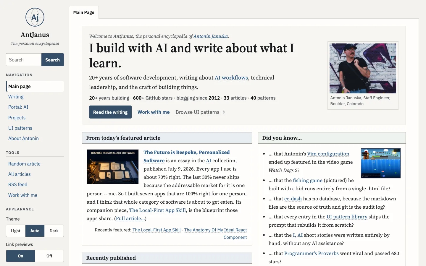
A personal-encyclopedia main page on warm off-white paper: a left sidebar with a globe monogram, search and settings, a framed portrait hero, and boxed portal sections whose every internal link opens a nested hover preview card.
Paste this into an agent to rebuild the whole page from scratch.
Build a personal homepage that reads like the main page of a private encyclopedia, where the real feature is that every internal link previews its destination on hover. A reader can walk the whole site's link graph from cards that open over the page, and the page itself is a quiet frame of boxed portal sections around that behaviour. Keep the encyclopedia feel in the type and the boxes, but leave out the reference-site chrome: no Talk tab, no View source, no History, no edit links.
Lay the page out as a two-column shell: a sticky left sidebar about `14rem` wide that is `100vh` tall and scrolls on its own, and a main column holding one bordered paper sheet. Above the sheet sit a single tab reading **Main Page**, joined to the sheet's top border. The sidebar stacks a circular globe monogram (a circle, an equator, two meridian curves, and the initials in bold serif) over the site name and an italic subtitle, then a joined search input and button, then small uppercase headings over Navigation, Tools and Appearance lists. The current nav item gets a white pill with a `3px` accent left border. Appearance holds two segmented controls: Light / Auto / Dark theme, and link previews On / Off.
Set reading text in **Source Serif 4** at about `17px` with a `19px` lead paragraph and a `1.6` line height, chrome and tables in **IBM Plex Sans**, and the small uppercase kind labels in **IBM Plex Mono**. Nothing goes below `13px`. Headings are serif, the H1 around `2.6rem` at weight 600.
Use a warm paper ground `#f3f2ee` with sheet surfaces `#fffefb`, ink `#17191c`, muted text `#595e66`, and `#364f6a` as the accent for buttons, the active nav item and box headers. Links are `#2f5d8f` with a visible underline, visited links `#6b4c8a`, and links to pages that do not exist yet are red `#b3261e`, which is what makes the link system read as a wiki. Box headers get a pale blue `#e7edf3` band; give one box a sage band and one a warm cream band so the grid does not look uniform. In dark mode the ground goes to `#101215`, surfaces to `#171a1e`, and links lighten to `#8fb6e3`. Store the theme choice in `localStorage` inside try/catch and default to the system preference.
Open the sheet with a welcome panel: an italic one-line welcome, the H1, the lead, a bold-number stat line separated by middle dots, and three actions of falling weight (a filled button, an underlined link, a muted link with an arrow), with a portrait in a thin-bordered thumbnail frame and a caption on the right. Below it run two columns of boxed sections: the featured article with a floated banner image and a Full article link, a Recently published list grouped by collection with dates in muted sans, a Did you know list of real facts beside a small floated screenshot, an AI experiments list with one-line descriptions, and a short Work with me box. Follow with a full-width Selected projects box holding a feature card (kind label, title, three stat cells, tech line, button, blueprint image) and a sortable table with a sort arrow in each sortable header, then an Elsewhere box in an auto-fit grid of `13rem` columns.
**The previews are the design.** Drive them from one data table keyed by a `data-p` attribute on each link: title, kind line, a one-to-three sentence description, an optional image, a target, and a list of See also keys. Open a preview `350ms` after hover or keyboard focus, close it `300ms` after the pointer leaves both link and card, and keep it open while the pointer is inside it. A card is about `22rem` wide: optional image on top, a mono uppercase kind line, a serif title, the description, then See also links that are themselves preview links. Nest up to four cards deep, label nested ones with their depth, position each below its link and flip it above when it would leave the viewport, close the whole stack on Escape, and skip previews entirely on touch devices. Do not add hover animation to the cards; they appear instantly, which is what makes them feel like the page answering.
Below `1000px` the sidebar collapses into a sticky top bar with a horizontal monogram and a Menu button that expands the panel, the two-column box grid becomes one column, floated images go full width, and wide tables scroll inside their own wrapper so the page never scrolls sideways at `400px`. The only motion is the preview delay, so reduced-motion needs no special case beyond keeping it that way.
One self-contained file: markup, styles and scripts together.
Loading the page source…
The wiki main page carries the hover-preview concept: links open preview cards after 350ms, and the See also links inside a card open their own cards up to four deep. The encyclopedia tab chrome (Talk, Read, View source, History) is gone, leaving one Main Page tab, and a Selected projects box with the featured pattern-library card and a sortable open-source table is added from the projects page.
Sections, top to bottom
- Welcome hero with portrait and hover link previews
- From today's featured article
- Recently published
- Did you know…
- AI experiments
- Work with me
- Selected projects: featured pattern library and open-source table
- Elsewhere on the web
- Footer with navigation, links and newsletter
- Type
- Source Serif 4 (headings and body prose) · IBM Plex Sans (wiki chrome, tables, previews) · IBM Plex Mono (code, labels, preview kind lines)
- Themes
- light+dark
- Palette
#f3f2ee#fffefb#17191c#2a2d31#595e66#2f5d8f#6b4c8a#b3261e#364f6a#e7edf3#c9a44a#4d7a5c#101215#171a1e#8fb6e3#5d8ab4