The Candidate
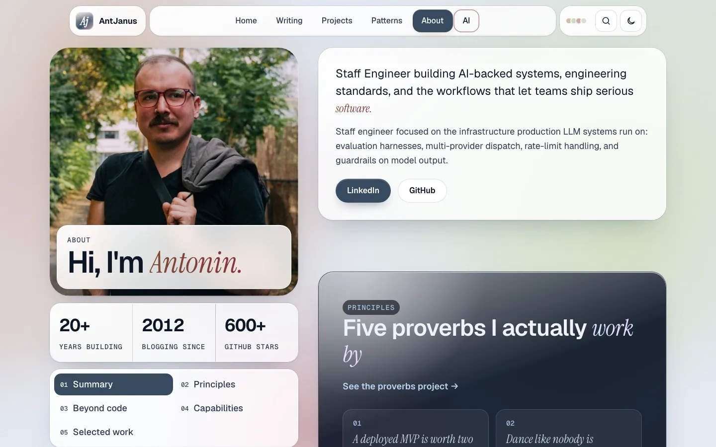
A two-column About page on an image-tinted glass mesh: a sticky left rail with the portrait under a frosted name card, a stat strip and a numbered section nav, beside a right column of glass summary, proverb, beyond-code, capability and selected-work panels.
Paste this into an agent to rebuild the whole page from scratch.
Build a personal About page as a two-column profile: a sticky left rail that always shows who this is (portrait, name, three numbers, and a numbered table of contents) beside a right column of glass panels that tell the story section by section. The page sits on a soft glass mesh whose colours are taken from the portrait itself, so the whole page feels like one photograph's light.
Use a wrap of `min(1240px, 100% - 2 * gutter)` and a grid of `minmax(0, 500px) minmax(0, 1fr)` with a 40px gap. The rail is `position: sticky; top: 96px` and stacks three blocks with 16px between them: the portrait (4:4.6, 28px radius) with a strong-glass name card overlapping its bottom edge inside the frame, a three-cell stat strip, and a glass nav listing `01 Summary` to `05 Selected work` in two columns, each with a mono number. The right column is a stack of sections with about 64px between them. Below 980px the rail stops being sticky and stacks above the content, with the stat strip turning into three rows on phones.
Set type in **Geist**: the name `Hi, I'm Antonin.` at about `clamp(2.4rem, 4vw, 3.6rem)` with the name in **Instrument Serif** italic tinted with the image's accent ink, section titles near `clamp(2rem, 3.6vw, 2.9rem)`, and body at 18px. Eyebrows, numbers, stat captions and chips use **Geist Mono**. Use only one serif accent word per heading.
Derive the palette from the portrait using a precomputed swatch table, never a canvas read. Skip near-grey, near-black and near-white swatches, rank the rest by coverage weighted toward saturation, keep a hue only if it sits 28 degrees from every kept hue, and fill any gaps by rotating the lead hue by +38, -34 and +70. Clamp light blobs to saturation 0.30 to 0.62 and lightness 0.74 to 0.84, dark blobs to saturation 0.35 to 0.62 and lightness 0.15 to 0.24, and derive two accent inks at lightness 0.34 (light) and 0.78 (dark) so every ink keeps 4.5:1 on the backdrop. The base is `#e6ecf6` with ink `#0c1626` in light mode and `#060a13` in dark mode, with slate `#364f6a` for primary buttons. Show the four derived colours as tiny dots in the nav as a key. Glass panels are translucent white with `backdrop-filter: blur(20px) saturate(160%)` and a soft rim; the principles and capabilities panels use a darker smoke glass (`#36425a` to `#0c1626` gradient at high opacity) with light text. Persist the theme in `localStorage` wrapped in try/catch.
The nav is split into three floating glass cells: the logo and word mark, the page links, and a tools cell with the palette dots, search and theme toggle. A glass lens pill sits under the current link (About). In the right column, the summary panel holds a large lede ending in a serif accent word, one sentence on focus areas, and LinkedIn and GitHub buttons. The principles panel lists five proverbs as numbered serif italic cards in a two-column grid. Beyond code pairs a tall landscape photo with three glass tiles (photography, fiction, podcasts and games). Capabilities is a smoke panel with four groups, each a heading, a one-line description and a wrap of mono chips. The last row splits into a selected-work link list, where hovering a link shows a small glass preview card, and a Let's talk panel with a primary button. The footer is a board of glass tiles: brand, navigation, connect and a newsletter form.
Highlight the rail nav item for the section in view with an `IntersectionObserver`, filling it with the slate primary. Keep motion gentle: slow mesh drift, the lens easing into place on load over about 500ms, and 200ms hover lifts; under `prefers-reduced-motion` stop the drift and place the lens without animation. At 400px everything is one column, the dock collapses to logo, search, theme and a menu button, chips wrap, and the smoke panels keep 24px padding. Leave the rail alone: its constant presence is the whole idea, so resist adding more blocks to it.
One self-contained file: markup, styles and scripts together.
Loading the page source…
The demo's About page as a whole, with its layout kept and its work-history section removed: the sticky rail (portrait, name card, stats, numbered nav with scroll-spy) runs beside the summary, five principles on a smoke-glass panel, a beyond-code photo and tiles, capabilities with chip lists, and selected work beside a Let's talk card, then a tiled glass footer. The colours come from the portrait's own palette, and the split dock nav with a sliding lens marks the current page.
Sections, top to bottom
- Split glass dock with palette swatches
- Sticky rail: portrait with name card, stat strip, numbered section nav
- Summary panel
- Principles: five proverbs on smoke glass
- Beyond code: photo and interest tiles
- Capabilities with chip lists
- Selected work and Let's talk
- Tiled glass footer with newsletter
- Type
- Geist (UI and body) · Instrument Serif Italic (one accent word per headline) · Geist Mono (labels, meta, code)
- Themes
- light+dark
- Palette
#364f6a#2a3f54#0c1626#e6ecf6#060a13#36425a#b4c0d0#a9c8ea