AI Design Is Bootstrap All Over Again
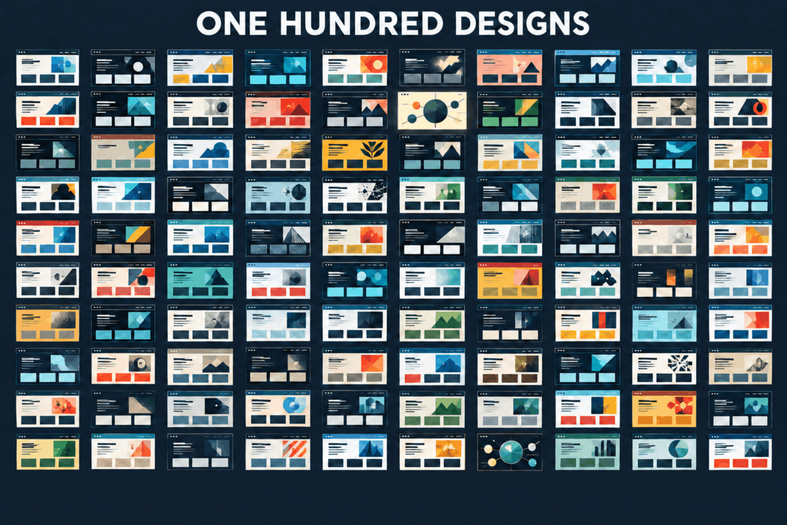
I had Claude generate 100 redesigns of my site and most of them looked the same. Here's the library I kept, the tells of AI-generated design, and two ways past the new Bootstrap.
“Every thought that can be thought has already been thought.” - idk
Having to redo work using an agent can be really annoying. I’ve had to ask an agent to create “unique” designs for ideas quite a few times and if you’ve ever tried it, you’ll know that feeling of “Wow!” and then “Ah, it looks like everything else”.
It’s an issue. I did an experiment where I asked Claude to generate 100 redesigns of my website. I figured it’d be a total waste of time but I was curious as to what would happen.
Explore the redesign library right away. And it’s not just the homepage that got a redesign, the writing page, AI page, and several others are included. Try to click around!
The Theory
“It’s like Bootstrap all over again” - Antonin Januska
The Shared Designs
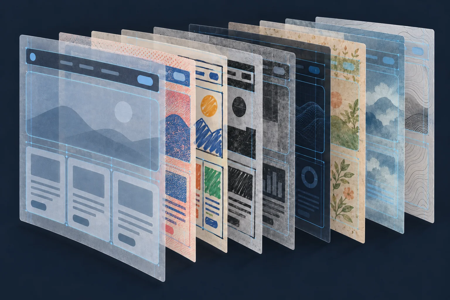
A lot of AI-generated websites are hitting the web. There’s a distinct feel to them and, honestly, about three-quarters of the 100 unique designs ended up looking like a generic site that explains a new tool, or perhaps, it looks like a demo you’ve seen online or report or an artifact.
Most of the results had to be trashed. That’s a lot of wasted time and energy and tokens. However, within that mediocrity were a few ideas I personally liked. They weren’t mind-blowing, they weren’t like the old days of stumbling upon a weirdly cool site, but they were a good start.
I’ve found that you can only get those “unique”-ish designs when you ask your agent to scrape the bottom of the barrel of its ideas, pushing it past its initial ideas to get somewhere.
Several rounds of refinement
Once I created the 100 designs, I asked Claude to create a “gallery” of the designs where I could provide feedback. Each design demo had space for notes and a grade. I went through each of the 100 designs, trying to pull something that resonated with me (a non-designer). That was hard because, like I said, most of the designs were useless and generic.
I pieced together some ideas and asked Claude to do a 2nd and 3rd and, finally, a 4th round of reviews. Each time, I asked Claude to use my feedback to generate the next, smaller, batch. It wasn’t great but it wasn’t bad. It definitely took a lot more effort than telling my agent to “make it look good”.
It’s like Bootstrap all over again
Do you remember Bootstrap? It was a revolutionary web UI library that was originally built by Twitter. My blog actually gained a big following because I wrote two very influential articles on how every website looked like Bootstrap at the time. Every single project, blog, new product looked like Bootstrap. The same menu, the same exact button, the same exact form.
One of the reasons it was so popular was that using Bootstrap was a huge step up from the general look of the web. Another one was that it was basically the first very-mainstream UI framework. Lastly, it was the simplest way to build a web UI and fast – especially for backend developers.
Now? Now everything fits into a dozen or so main designs that Anthropic produces.
Fun fact: I was prominently known for my guides on how to Customize Twitter Bootstrap To Not Look Bootstrap-y.
You still need a designer
I can spot an AI-generated website from a mile away. I can spot an AI-generated design from space. It gets worse with apps. Everything is “blah” right now.
It was great in the beginning, just like with Bootstrap. And, just like with Bootstrap, you need a bit more than just telling the AI “make it look good”.
The Redesign Library
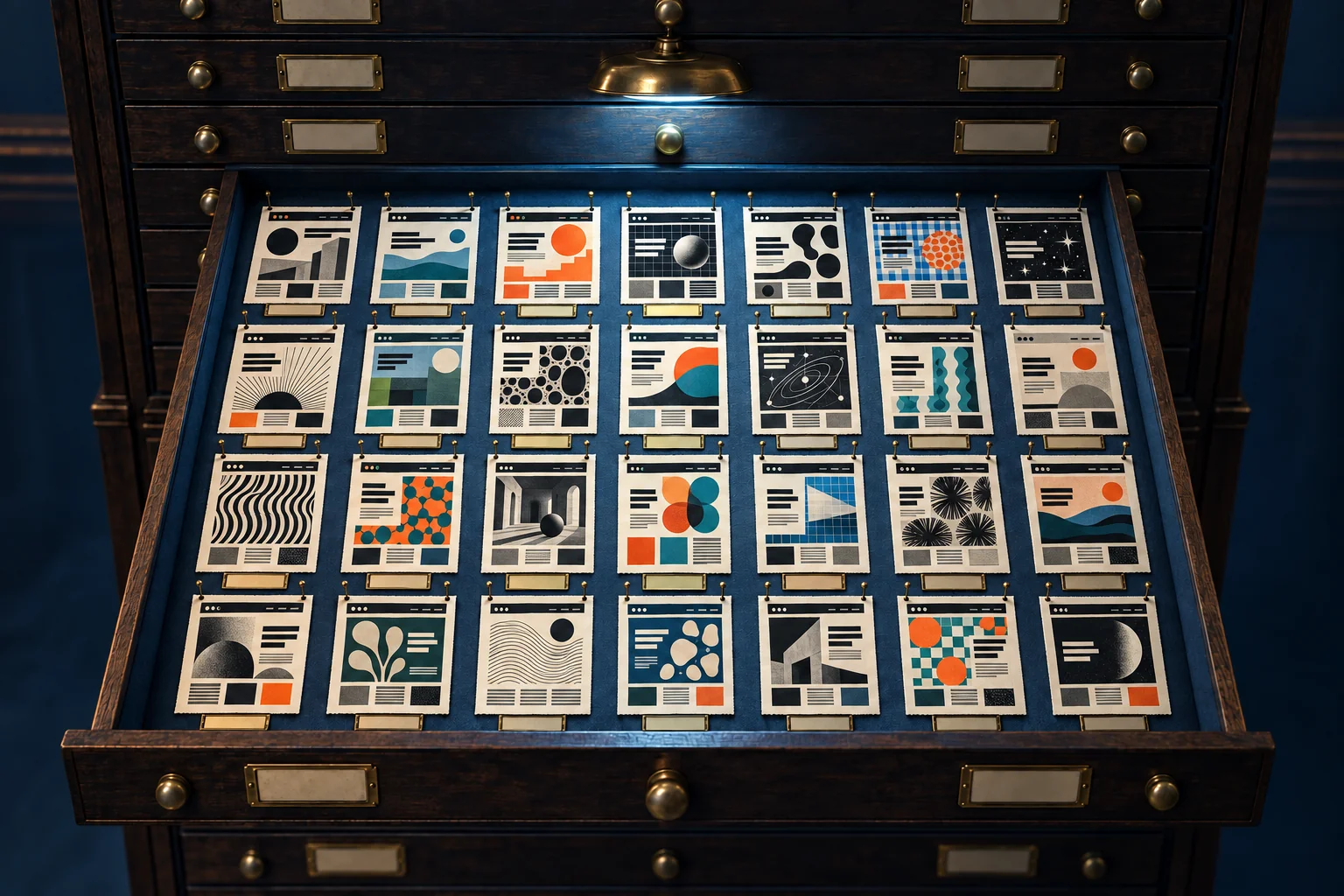
I decided to save all 100 designs because there’s really no point in regenerating them again, at least not until there are major improvements to generative AI. And I’m not talking about jumping from Opus 5 to Opus 5.5. It still looks the same.
I tested this theory out on an app I’m building and asked Claude to come up with unique designs. And lo and behold, the results looked just like these 100 redesigns. Nothing special. Nothing unique.
I’m honestly worried that there will be this feedback loop where people use Claude’s design ideas, which will feed the training data, which will just reinforce more of the same.
The common elements
There are a few “tells” for the AI-generated designs:
- heavy use of serifs
- heavy use of custom fonts and mixing and matching fonts
- wildly ranging font sizes
- strict adherence to a grid – rectangles everywhere
- color schemes that just feel “blah”
- tons of purple everywhere
- grid lines
- rounded edges for rectangles with that “rounded” border
- left-hand borders on everything
- overuse of gradients
And that’s just what I can easily identify.
The common designs
I figured it’d be fun to identify these “common” designs that you might have already seen yourself.
The 100 redesigns were the result of a failed batch of “10 redesigns”, which I told Claude to throw out, so I actually don’t have the “most popular” ones as heavily represented as I’d like.
I think a great example of one of these is the Openjev website. They have an “unsloppify site” toggle in the top right. I literally got the same exact design as Openjev in my first round of redesigns.
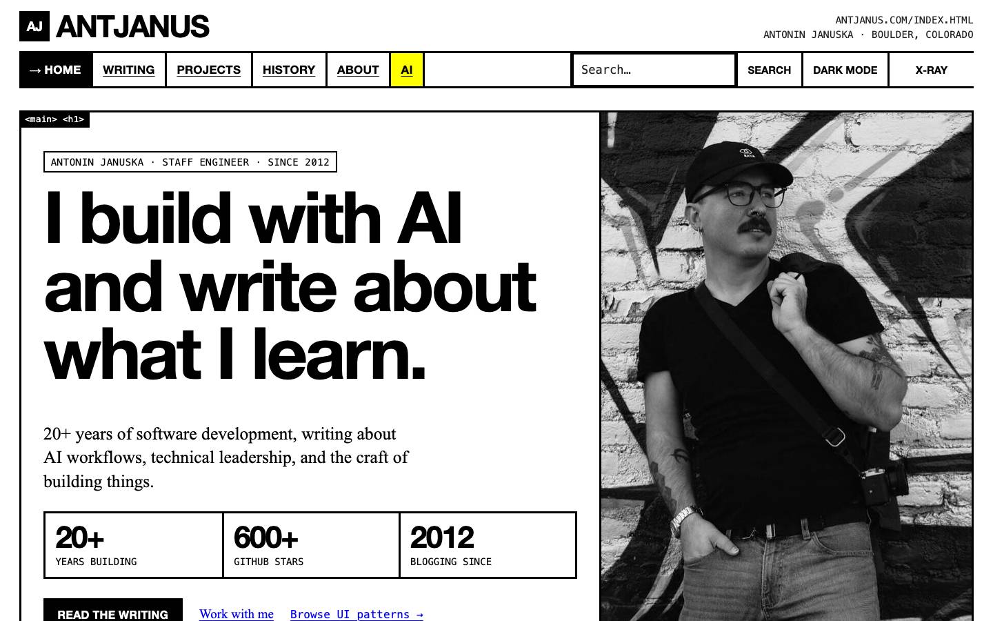
Web Brutalism
System fonts, default-blue underlined links, thick black rules, and every region stamped with its own HTML tag.
Open Web Brutalism →Image 1 of 15
The solution?
I have two ideas and I think they’re pretty straightforward:
- design things yourself
- iterate on slop until it’s not slop
DIY
For small side projects, fun little products, and personal-use software, it makes sense to use the default designs. Just like it made sense to use Bootstrap for that exact reason.
And in that same vein, it made sense to override UI frameworks to get a custom design and experience. The products that focused on design and experience really outshone their competitors.
Agentic AI can build all kinds of wild websites. Maybe it’s time to dig into Figma or Illustrator or MS Paint again and make something unique for agentic AI to build. Yes, even for developers.
Iterate on slop
You can iterate on slop. That’s what I did for my website. I created a smaller curated section of page designs that I actually liked or felt like they were more “unique” than before.
The problem with iterating on slop is that it’s hard to break out of that cycle. My website looks like Tumblr in 2010. I liked Tumblr in 2010 so I’m happy with the results. You might not be.
You might spend more time iterating on AI slop with agentic AI than actually trying to come up with a concept yourself.
I think it’s important to acknowledge here that AI can waste your time more than not. It can waste your time by having you go through each iteration, and then building more iterations, and eventually getting to something “ok”.
There’s also one more important lesson.
New Models Change Everything

Yes, I said that going from Opus 5 to Opus 5.5 and Fable 5.1 and Astra 6 didn’t make much of a difference when it comes to design. But a new model might surprise us.
You never know what they’ll train models on next. You never know if the next iteration will make this article immediately obsolete. But that’s just the nature of things right now.