I Built an AI-Friendly UI Pattern Library
A UI pattern library where every pattern ships the prompt that rebuilds it, so a coding agent can put it in your codebase instead of you copying CSS.

Just here for the library? It's at antjanus.com/patterns. Every pattern ships with its HTML, CSS, and JavaScript, plus a prompt written for a coding agent to read.
I’ve always been a fan of sites like Dribbble, or back in the day Forrst (later Tavern). Places where designers (and sometimes devs) could share interesting new ways to interact with an application.
Maybe it’s just me but the golden age of that era disappeared as soon as AI showed up. Suddenly, code didn’t matter. Suddenly, the best-ever experience for the user stopped mattering. What matters now is throughput and building out new features.
UI Slop
The word “slop” is just so fitting here. Coding agents tend to over-rely on a handful of UI patterns and try to fit everything into them. Due to this issue, AI-generated apps and websites all have a distinct “feel” to them. That includes my own site. Sure, I directed the AI how to build out certain sections and features. And sure, I worked with it to get a customized look.
But everyone can tell. Here’s what I usually see:
- the UI pattern of using thin wide cards – think notifications. And then highlighting the left side of the card with a thick border
- rounded borders everywhere
- gradients EVERYWHERE
- that purple. (Check my “AI” button in the navbar, THAT purple)
- that one blue that shows up whenever someone just doesn’t like purple.
- entirely too serif-y typography
I don’t have to go looking for an example. Here’s the top of my own AI section:
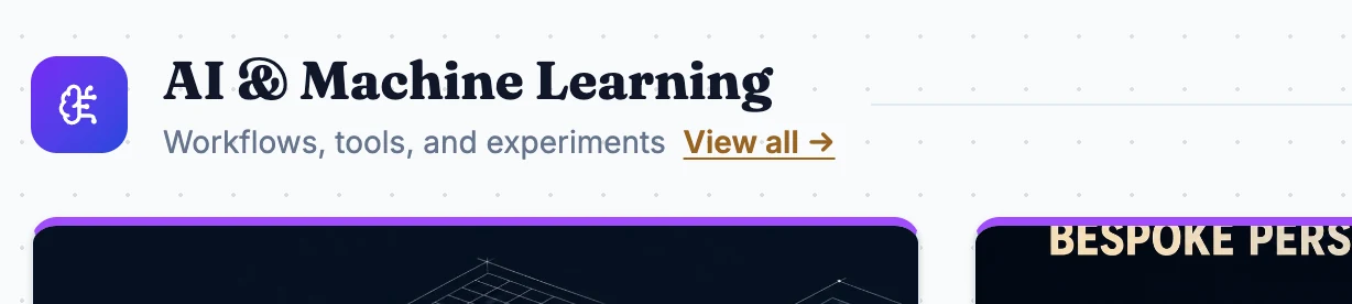
I rebuilt my website this year and these patterns show up everywhere. Let’s break this one down a bit:
- we have the stylish heading Serif typography
- we have the standard “purple”
- we have the gradient that mixes that AI purple with the AI blue
- the cards have rounded corners and, again, using the AI “purple”
The dots in the background were actually an addition from me.
There are tons more of these and it sucks because it’d be so wonderful to just point Claude at a website or app and say “Make it look good”. But is that even possible?
Skills
I created a few different skills recently:
- typography
- color-system
- local-first-app
- ui-ux-design
They’re all available through Skillbox. I had the highest hopes for the last one, because it’s built on aggregated research across multiple design guides. It definitely helped. It can IMPROVE existing design. However, it’s not that clever when it comes to coming up with new UI design.
For example, I built a filesystem-manager-like UI and it looked really bad at first. UI-slop bad, not me-at-12-bad. However, after I went back and forth with Claude and built out the UI I wanted, the ui-ux-design skill helped tremendously to clean up that work and think of any and all contingencies.
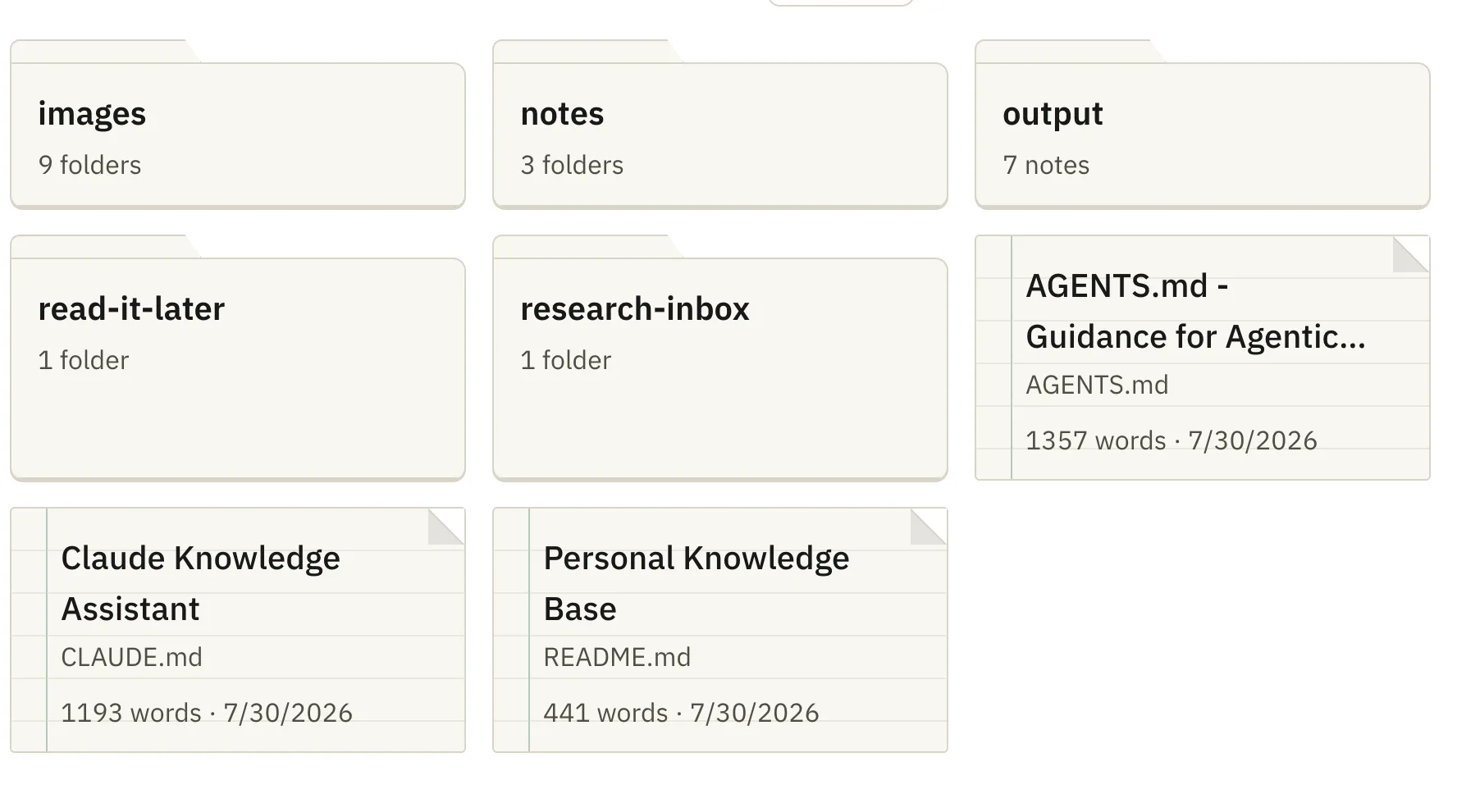
That looks a bit better, in my opinion.
Typical solutions, typical pitfalls
What you’ll run into with coding agents is that they’ll generally follow directions. For example:
Build a dashboard of my currently watched TV shows from my movie library
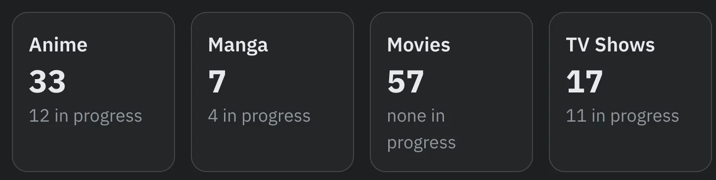
It’ll build it, but it’ll look generic and lose out on usability quite a bit. When I did this, Claude created a horizontally-scrolling list that is hard to understand and hard to use. It surfaced a ton of metrics I didn’t care that much about (watch time, potential watch time, time to finish, number of movies and TV shows, etc.) but nothing I actually needed.
Here’s an example of that:
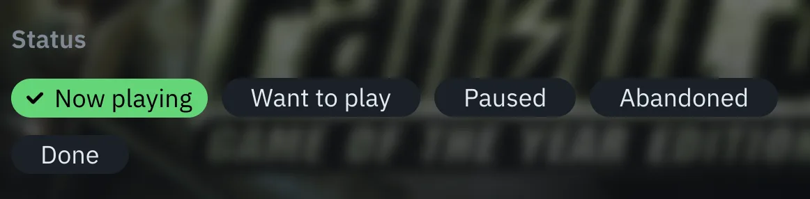
It also tends to add tags/pills everywhere, even when it’s to pick a state for a particular value.
It’s okay to prototype things quickly this way, but it doesn’t take long before you start racking your brain for a real UI/UX solution.
The UI Pattern Library
What the skills I have help with:
- picking legible typography and a good typography rhythm
- picking a base color system for theming
- building local-first apps
- auditing existing UI for the tiny details
They don’t help with coming up with new and unique ways of interacting with data. And to be frank, coding agents aren’t great at using well-established patterns either, unless those patterns are so prevalent that they’ve become a default.
So I built out a UI pattern library but this one isn’t Dribbble-worthy, this one is for the AI to check out and learn about alternative ways of interacting with data. Some patterns are well-established, others are ones that I really like.
My hope is that one day, I’ll be looking at a data page and wonder “How could I make this data easier to read?” and let Claude read over the patterns library and synthesize something worthy of actually implementing.
How?
Each UI pattern contains the HTML, CSS, and JavaScript to make it work. On top of that, each one contains a “Prompt” section to help coding agents understand the particular UI element — including how it’s supposed to be used, a description of how it looks and works, when not to reach for it, and even how to colorize it.
Here’s one of them running live, the windowed schedule grid. It’s rows of resources against a fixed time window, where each block is sized by how much it overlaps the window instead of by its own duration. Step the window forward and watch the blocks get clipped at the boundary:
This is the pattern I wish Claude had reached for instead of that horizontally-scrolling list. It’s a TV guide, a room booking board, an on-call rotation — same layout every time.
The interesting part isn’t the CSS, though. It’s the prompt that ships with it, which reads less like documentation and more like the notes I’d give a developer:
Reach for this whenever a schedule has to render arbitrary-duration entries inside a fixed viewport […] It is wrong for a full-day timeline that scrolls freely (there a duration-proportional layout with absolute positioning is simpler and correct), and wrong when entries never span more than a few minutes (then a plain list beats a grid).
Keep time as minutes-since-midnight integers everywhere in the layout — never construct a
Dateinside the render path.Below roughly 6% of window width a block has no room for its label — drop the text entirely and render a bare accent-colored sliver instead of letting text overflow or wrap. Keep the full label reachable anyway by putting it in the native
titleattribute.
Copy-paste CSS gives the AI a starting point and reference. A prompt gives it the reasoning — including the cases where it should walk away and build something simpler.
How an agent gets at it
This is the part that makes AI so nice to use. There’s no library, maybe there’ll be a Skill at some point, but generally, just ask an agent to hit up the patterns library, use the search to find elements for your usecase, and the AI agent can crawl it to find what it needs.
So an agent can fetch https://antjanus.com/patterns/windowed-schedule-grid, read the prompt, and never run a line of JavaScript.
Question
Should I open-source this? Would anyone actually want to contribute to an AI-first UI library?